Pieter Jansz. Quast Palette 4

Palette Analysis
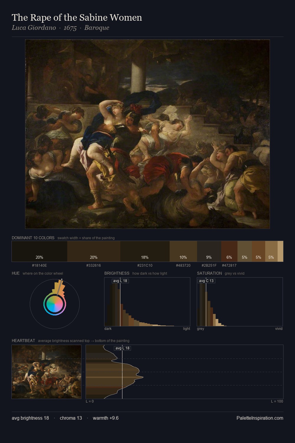
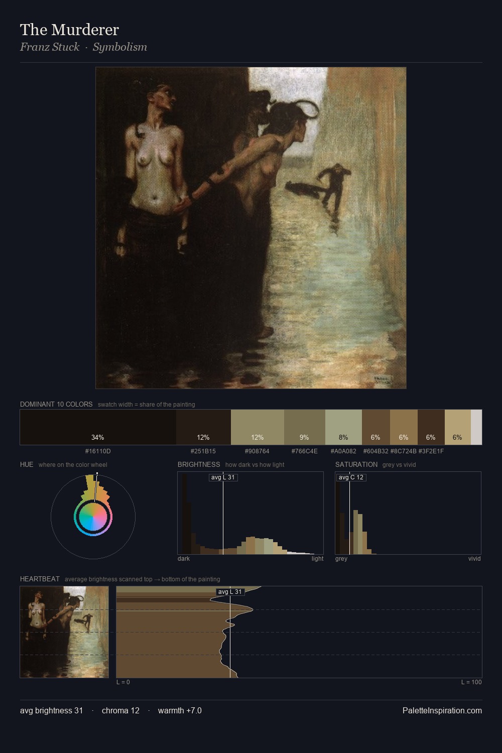
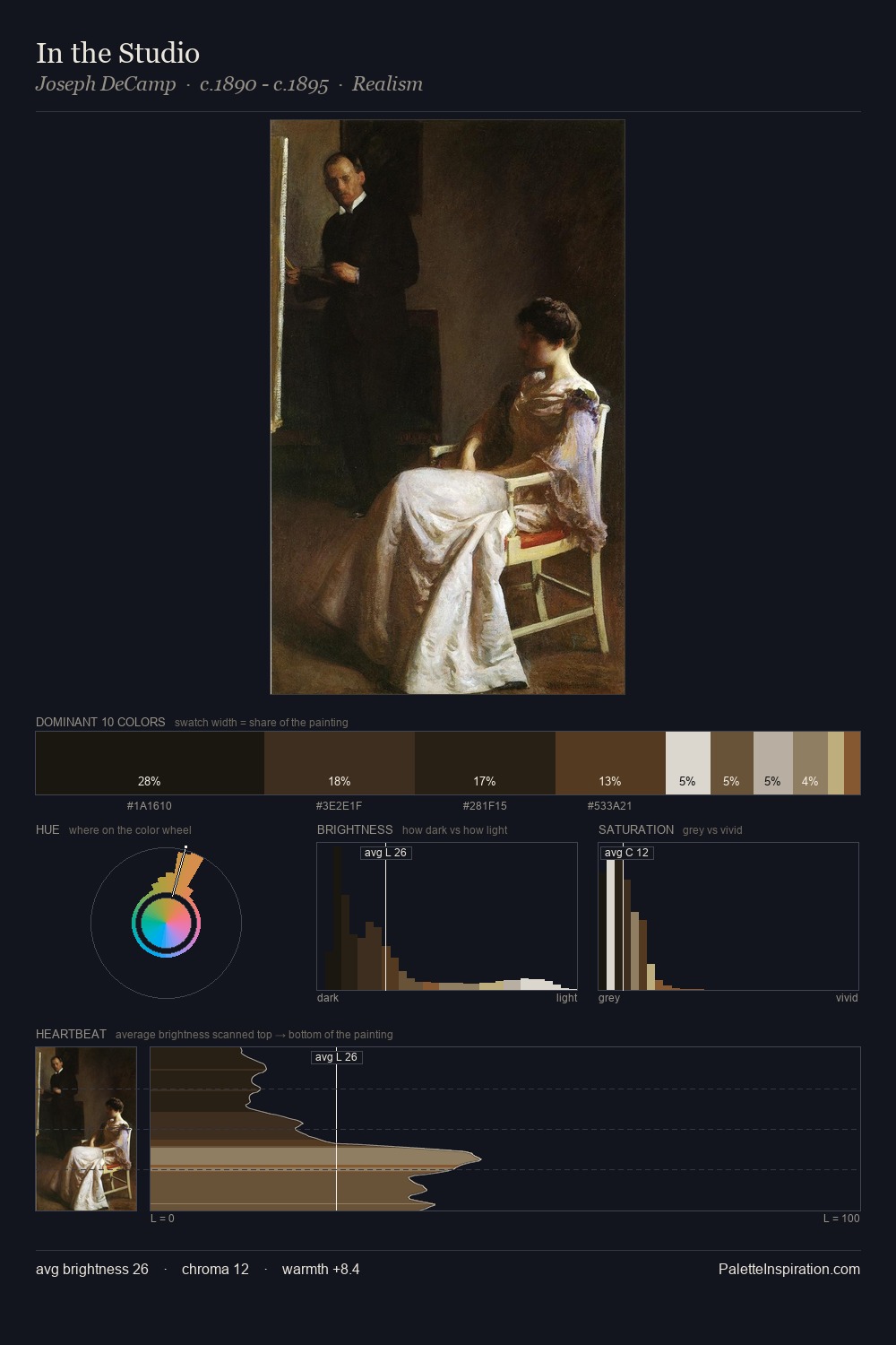
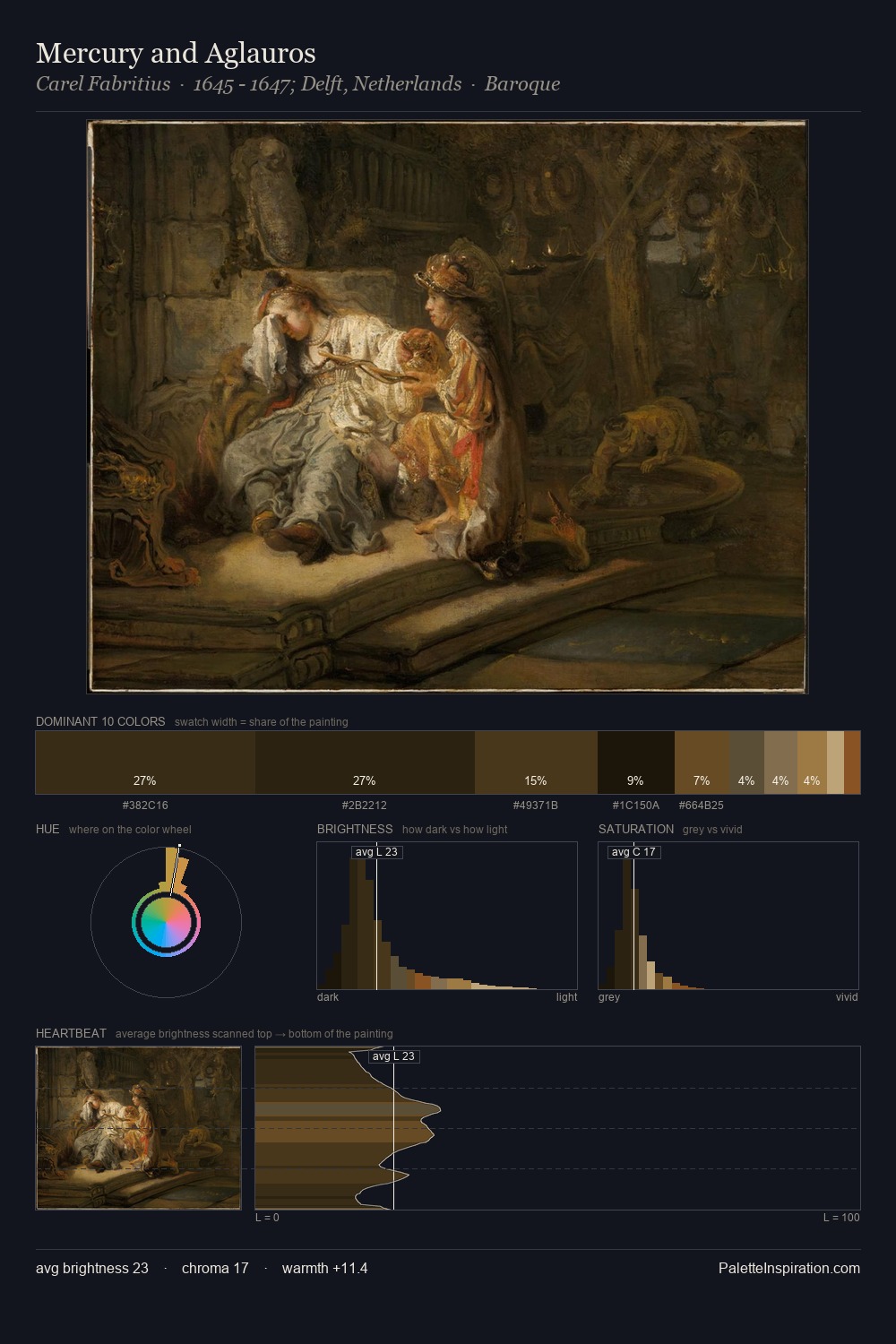
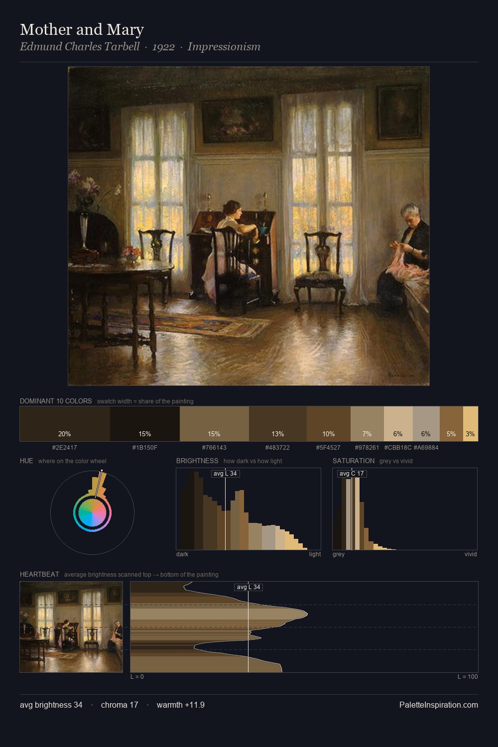
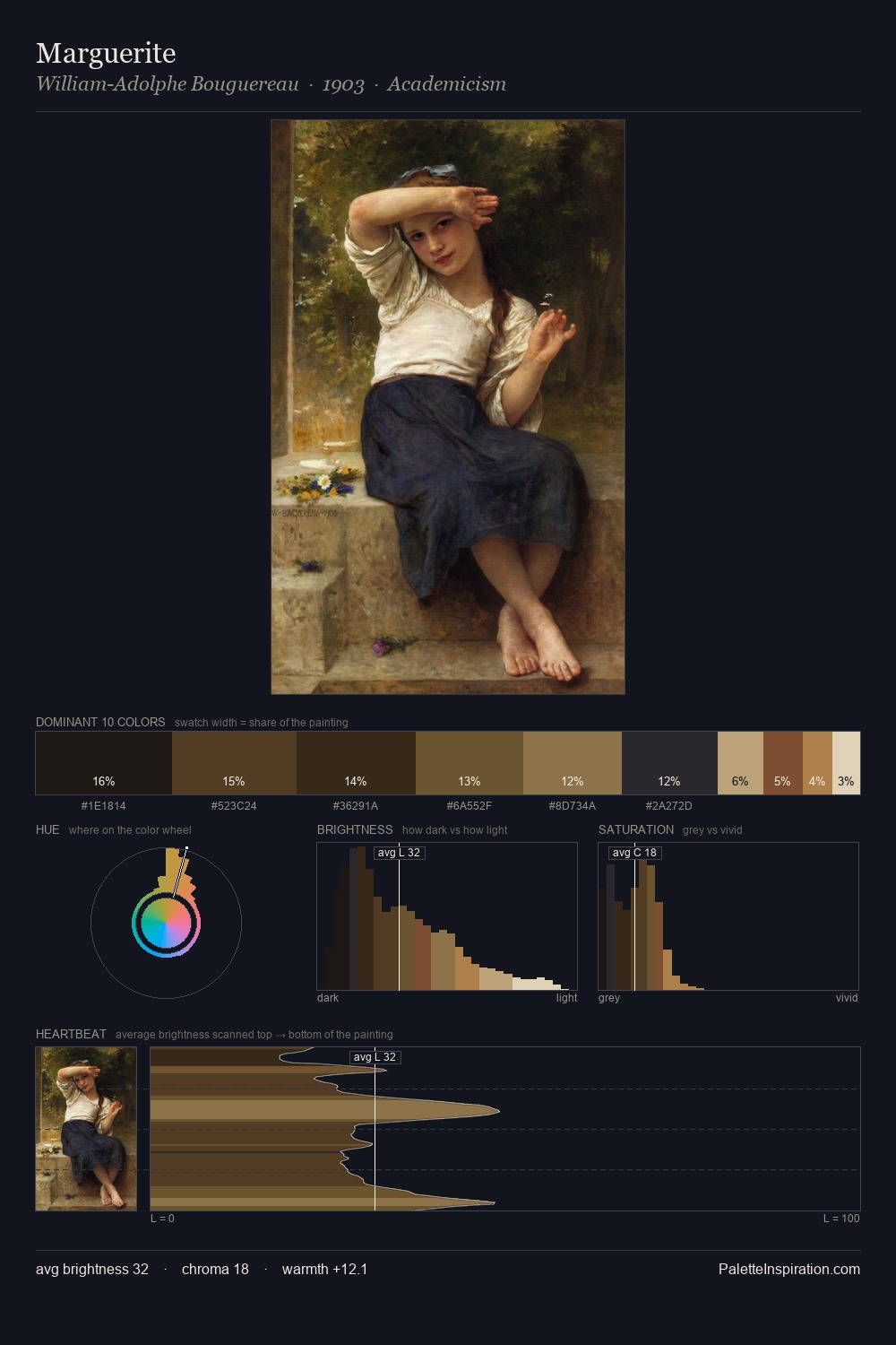
Pieter Jansz. Quast works almost entirely in the lower half of the value scale, privileging depth over brilliance. Heat pervades this palette; warm chromatic identities outweigh cool ones at almost every weight. The absence of saturated colour is itself an expressive choice: this is a palette of restraint and atmosphere. The saturated accent, #44311C, registers at 6.2% - sparse enough to feel like a deliberate surprise. The full value range is 56 units: broad enough to build convincing three-dimensional form. This tonal restraint is characteristic of the Pieter Jansz. Quast approach: colour serves light, not the reverse. In the context of Pieter Jansz. Quast's full range of palettes, group 4 represents one movement in an ongoing chromatic dialogue.
Example use cases
- theater design
- jewelry brands
- tobacco-adjacent retail
- event branding
- film & entertainment
I Love This!
Copy, export, or download for your project