Pierre-Jacques Pelletier Palette 1
Gleaming Reverie
Gleaming Bright and polished - high-key, often warm, suggesting reflective or luminous surfaces.
Reverie Dreamy pale violet - a soft, diffuse, slightly purple-gray, like a half-remembered dream.

Palette Analysis
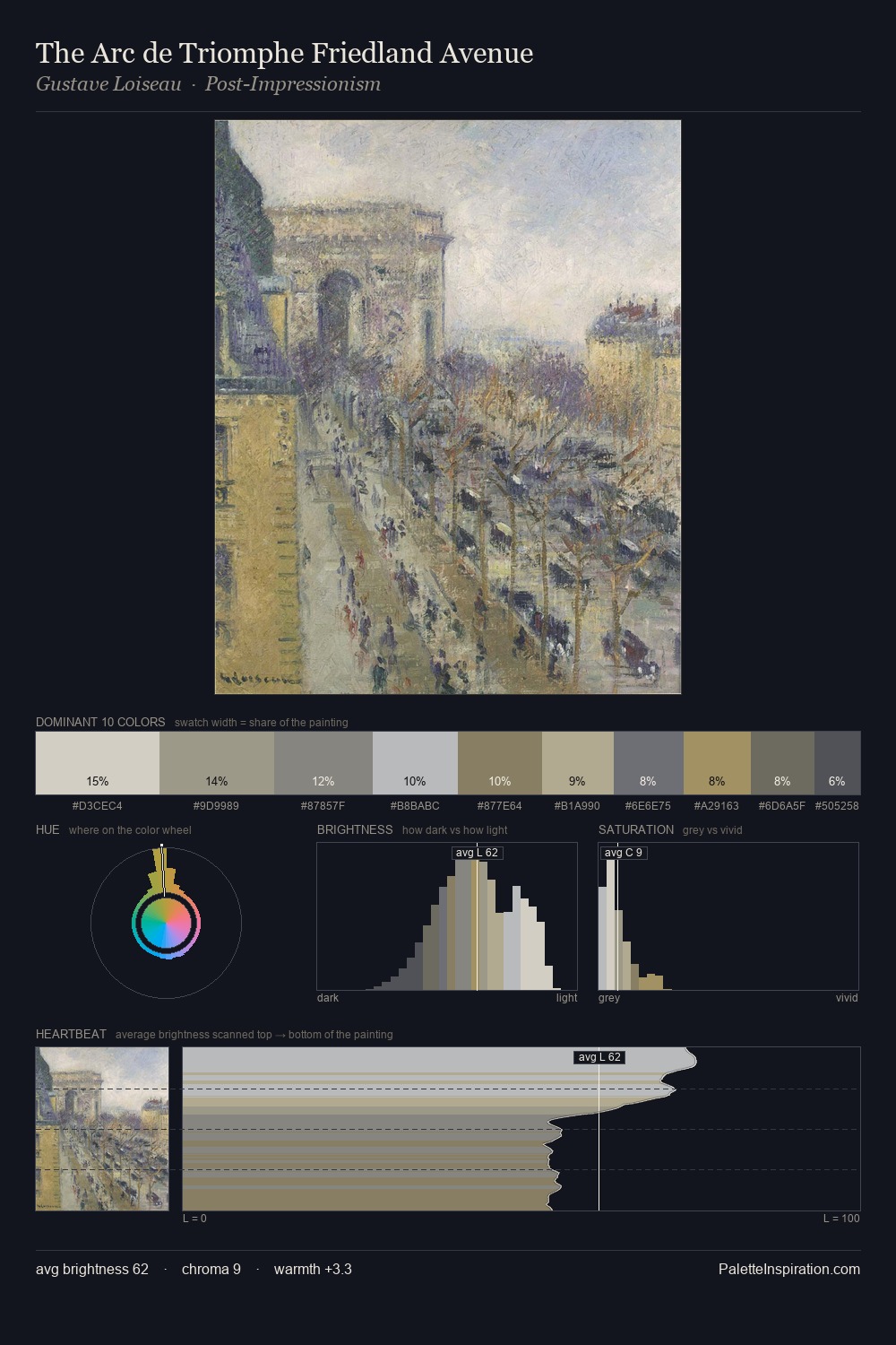
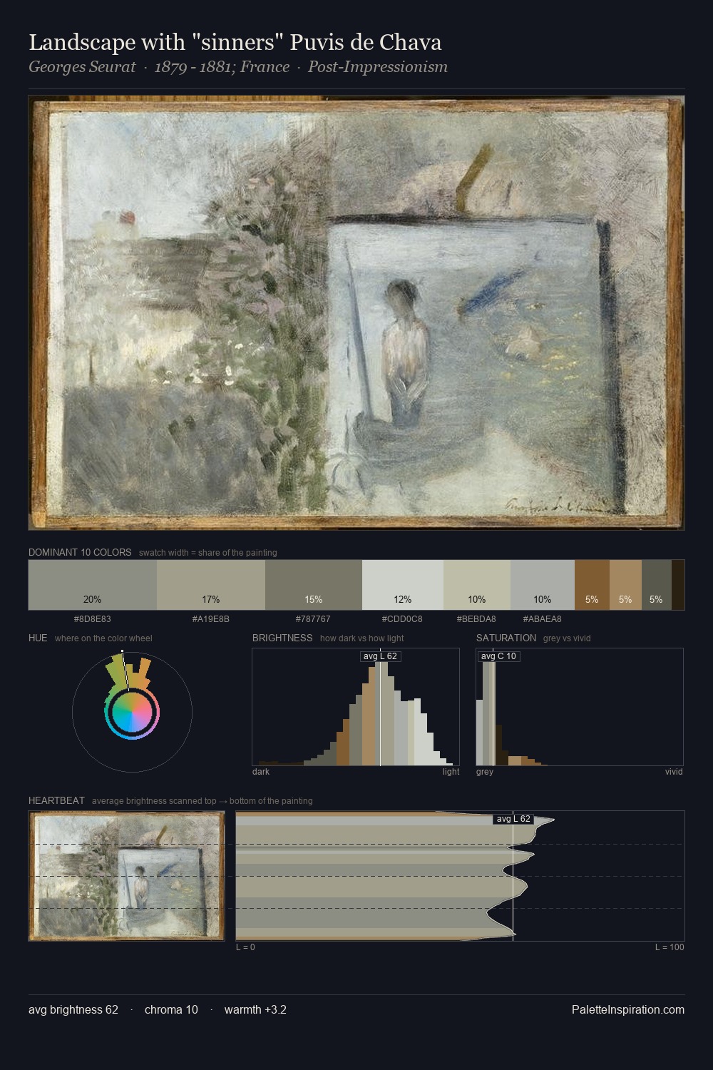
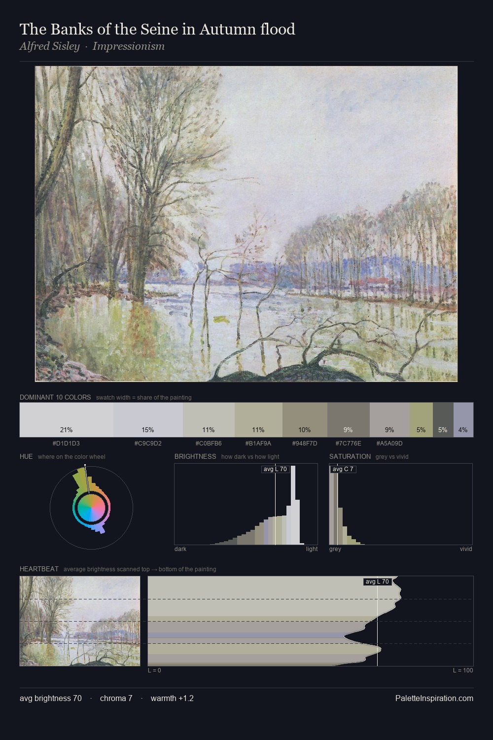
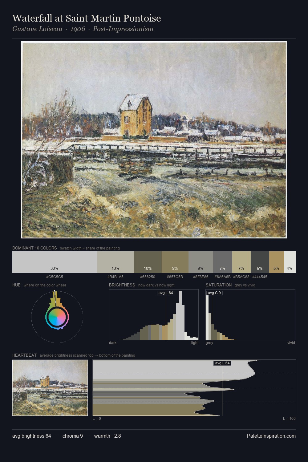
Pierre-Jacques Pelletier is high in key: pale, luminous, and filled with optical air. Pierre-Jacques Pelletier builds on cool foundations: the palette favours the blue-cyan-green arc. All colours lean toward grey, building depth through value rather than colour punch. #A49A68 delivers the chromatic peak at only 2.6% - a small shot of colour with outsized visual impact. The palette spans 43 value units: a measured range that delivers coherence over drama. High luminosity and cool temperature suggest the plein-air condition: unfiltered daylight and open sky. This is palette 1 of Pierre-Jacques Pelletier's sequence - a single chapter in a chromatic story told across many works.
Example use cases
- florist branding
- event design
- real estate
- jewelry retail
- hospitality branding
I Love This!
Use This Palette
Copy, export, or download for your project
Copy, export, or download for your project
Copy:
Download:
Share: