Peter Busch Palette 1

Palette Analysis
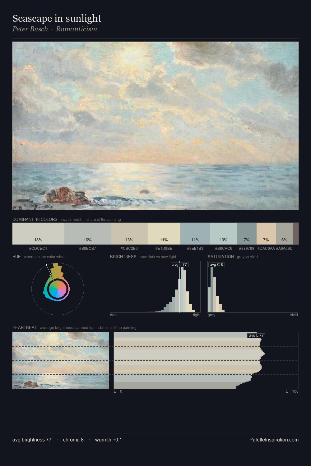
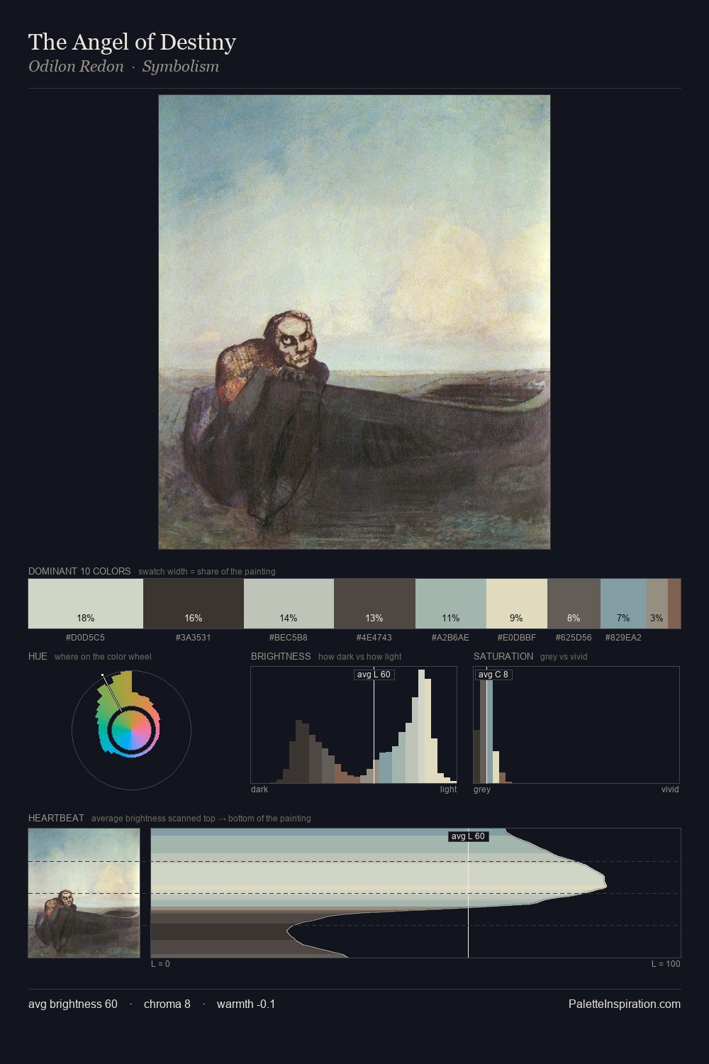
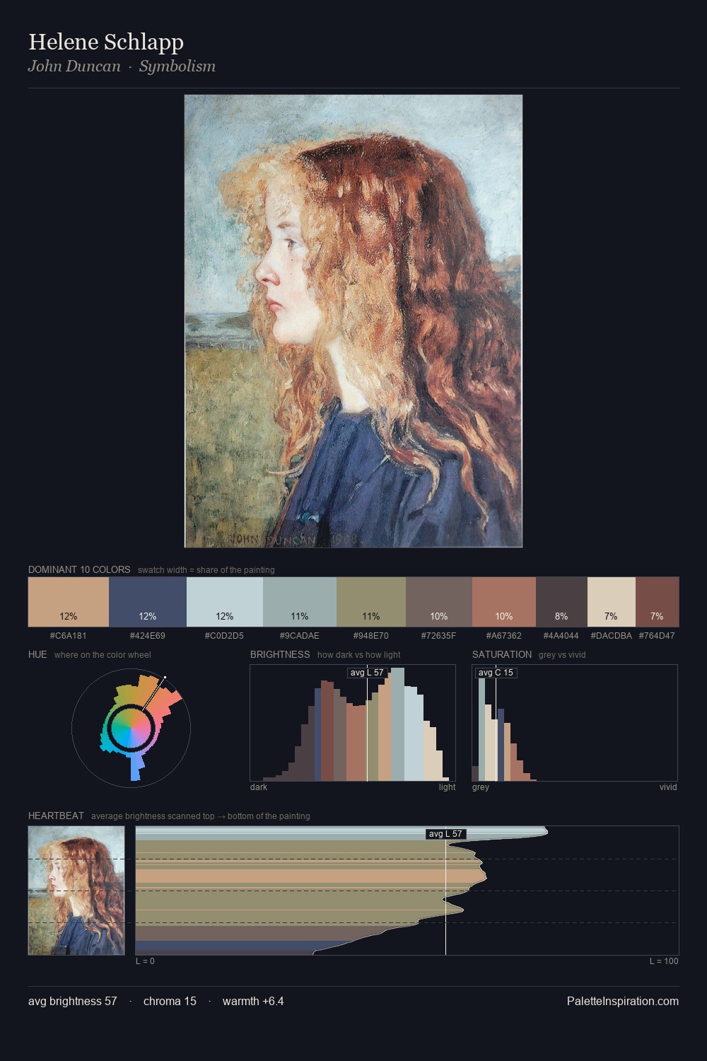
Peter Busch is high in key: pale, luminous, and filled with optical air. Temperature is cool-dominant, with blue and green families claiming the largest areas. Chroma hovers near zero; colour declares itself through subtle shifts in hue rather than outright saturation. At 10.8%, #D8C5AB carries the palette's sharpest chromatic charge: an accent that earns its place precisely because it is withheld. At 36 units across the value scale, the palette keeps contrast readable without letting it dominate. The mid-to-high key, cool bias, and moderate chroma point to outdoor observation - sky and diffused daylight as the dominant light source. In the context of Peter Busch's full range of palettes, group 1 represents one movement in an ongoing chromatic dialogue.
Example use cases
- florist branding
- event design
- real estate
- jewelry retail
- hospitality branding
I Love This!
Copy, export, or download for your project