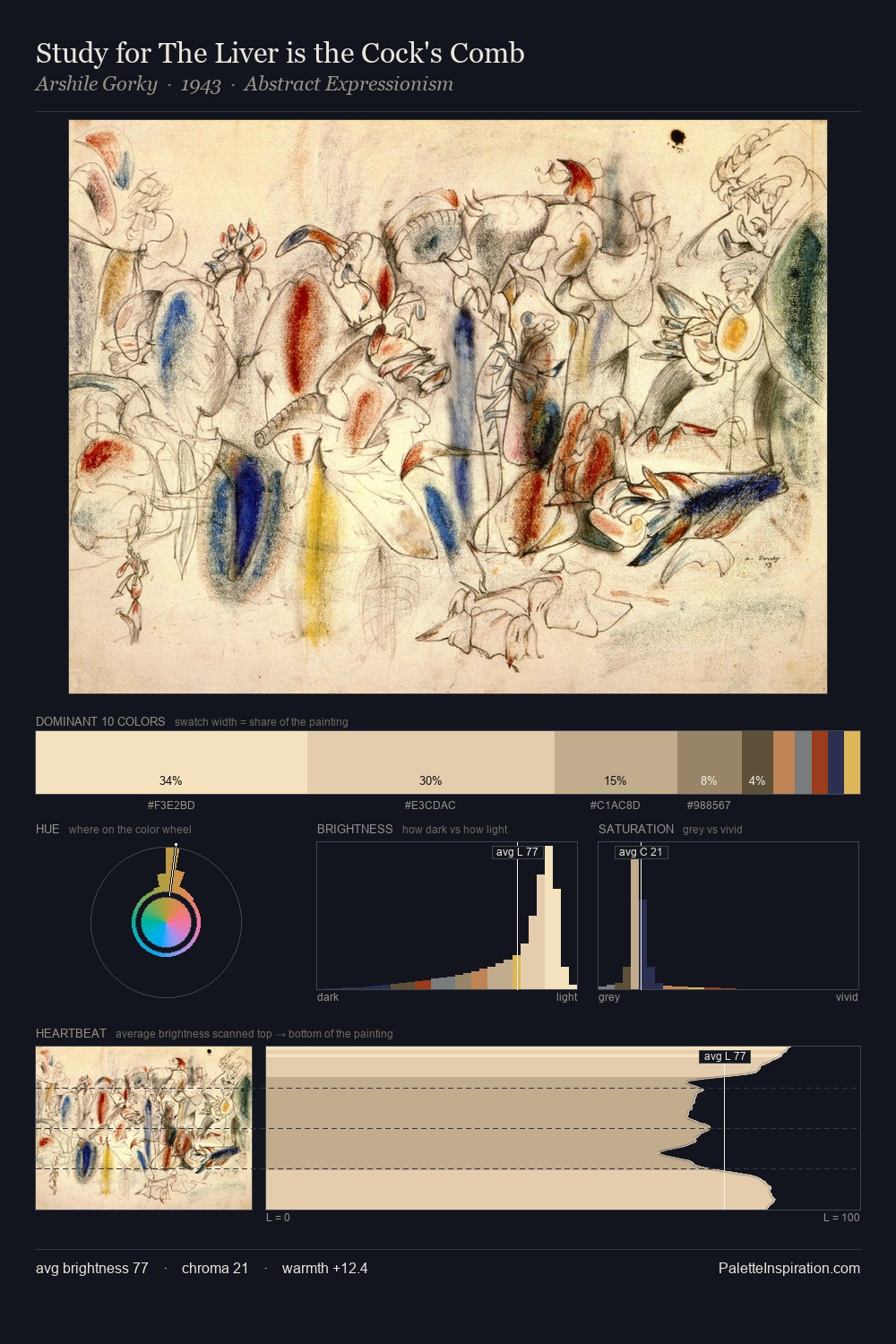
Toyota Hokkei Palette 1
Gleaming Ecru
Gleaming Bright and polished - high-key, often warm, suggesting reflective or luminous surfaces.
Ecru Unbleached linen - warm mid-neutral, slightly grayed, raw and natural.

Palette Analysis
The high-key values of Toyota Hokkei give it an effulgent, almost bleached quality. Toyota Hokkei builds on cool foundations: the palette favours the blue-cyan-green arc. The absence of saturated colour is itself an expressive choice: this is a palette of restraint and atmosphere. Only 1.6% is devoted to #213556, yet that small allocation delivers the palette's entire chromatic tension. From deepest dark to palest light, the palette traverses 62 units of the value scale - a span that creates natural depth. High luminosity and cool temperature suggest the plein-air condition: unfiltered daylight and open sky. Palette 1 sits within the larger chromatic argument that Toyota Hokkei's complete body of work advances.
Example use cases
- ceramics & pottery
- boutique hospitality
- menswear
- heritage food brands
- craft & artisan brands
I Love This!
Use This Palette
Copy, export, or download for your project
Copy, export, or download for your project
Copy:
Download:
Share: