Toyota Hokkei Palette 7

Palette Analysis
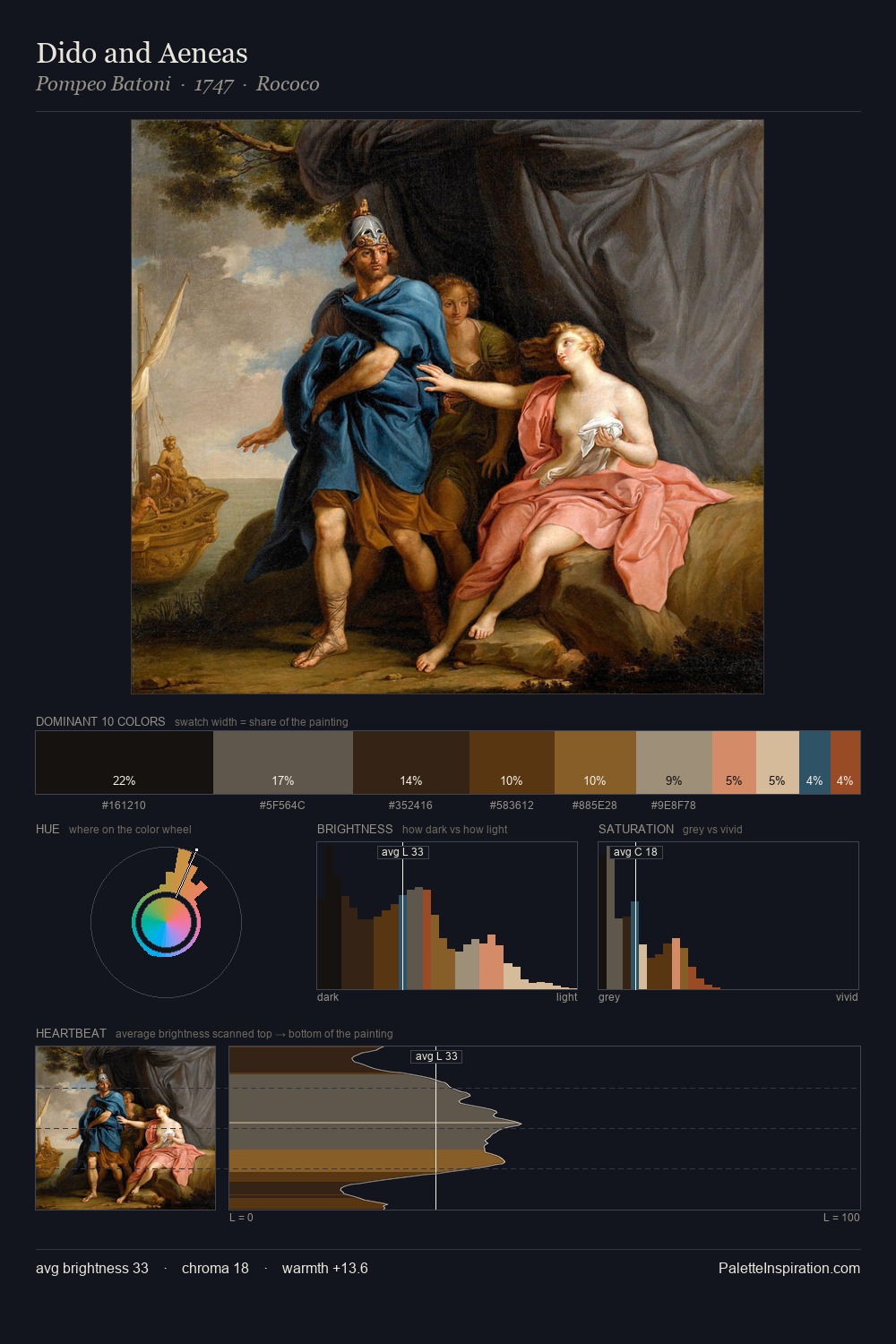
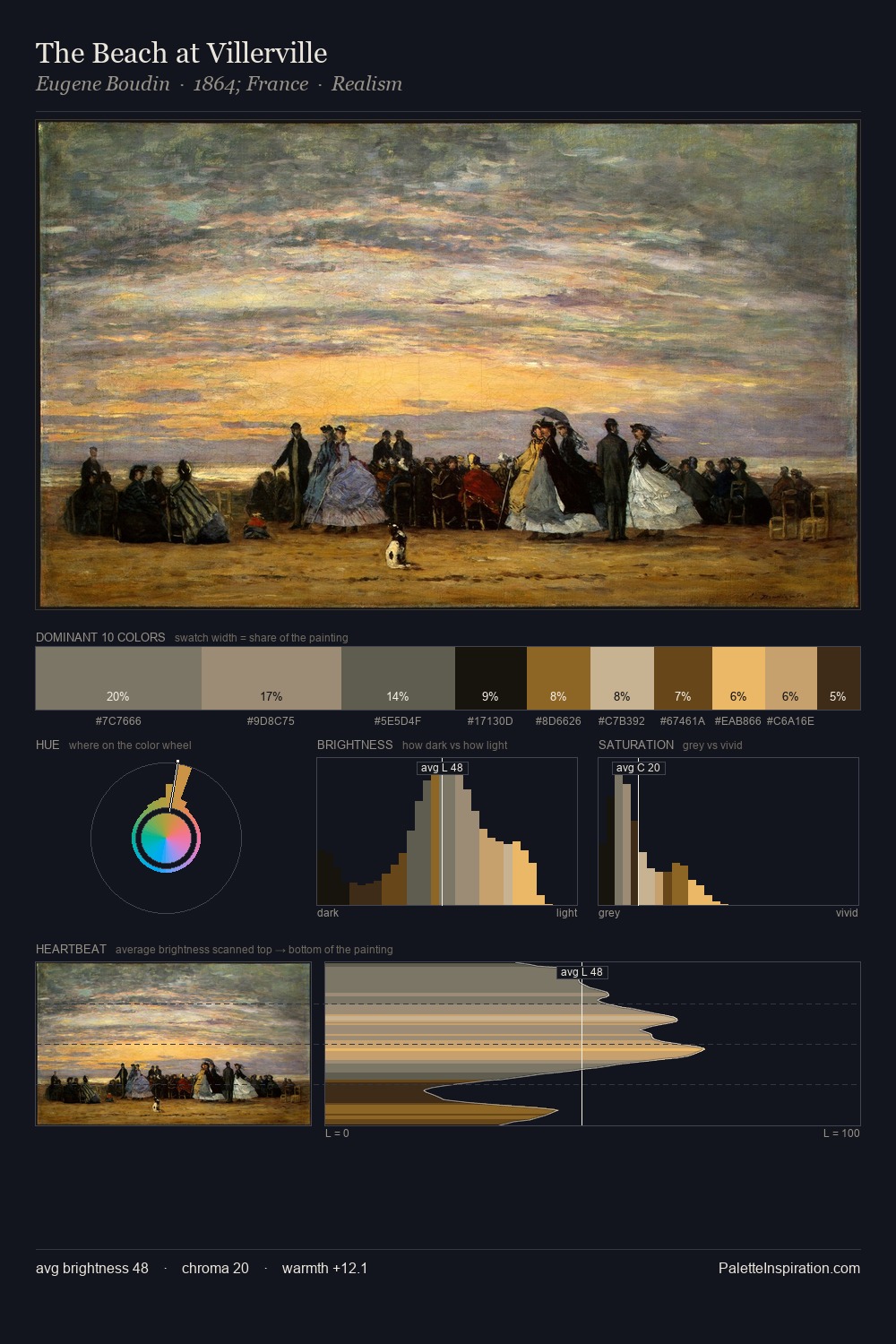
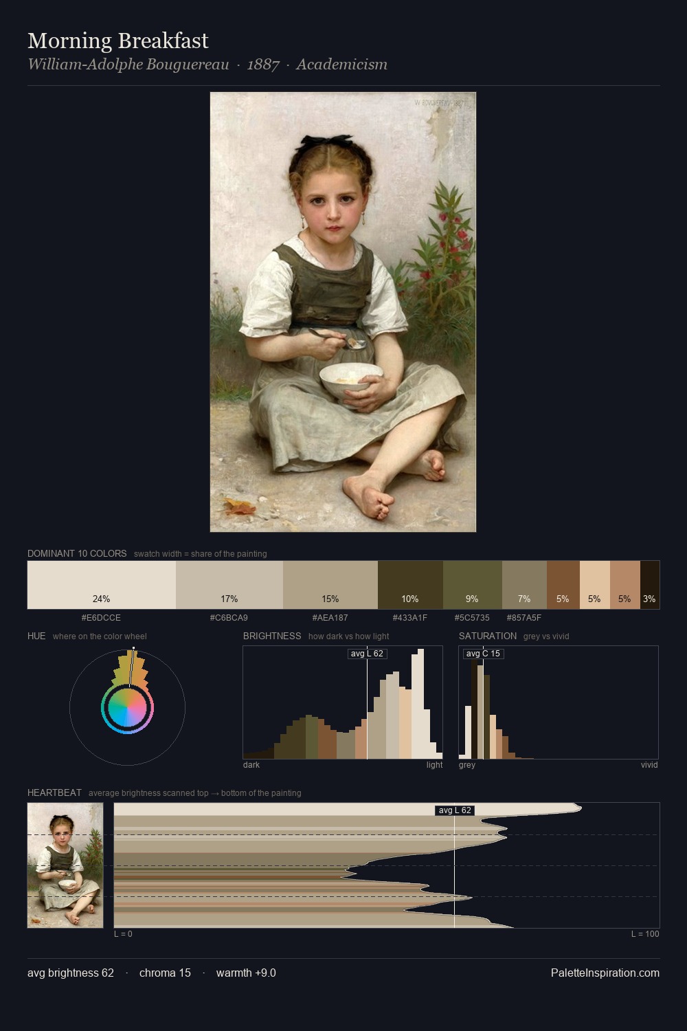
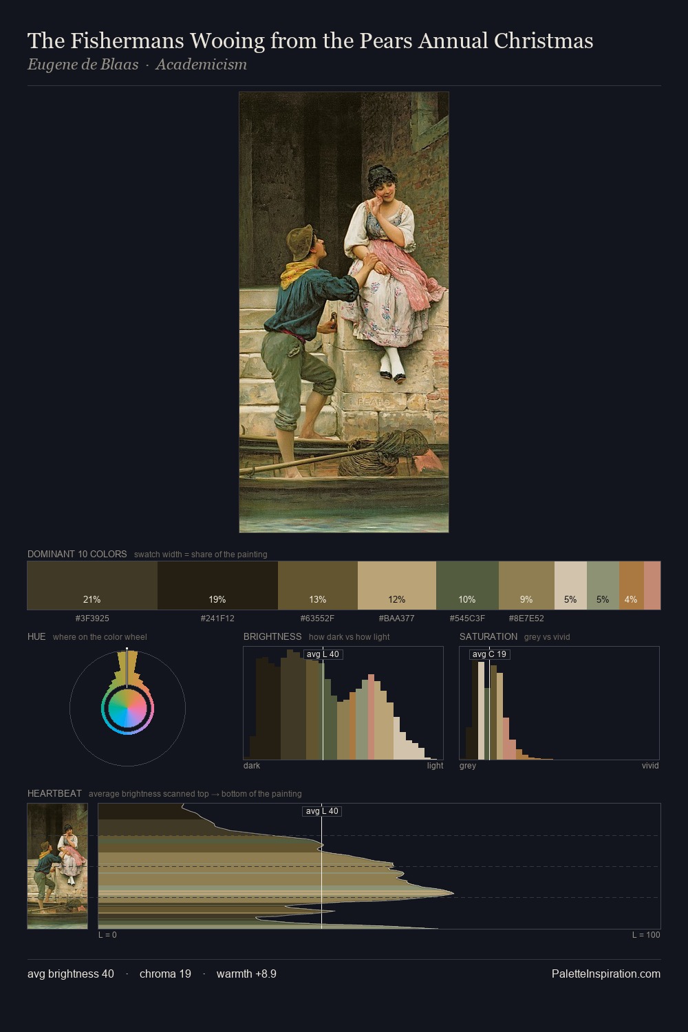
Light floods Toyota Hokkei; the palette keeps values pale and airy across its range. Warm and cool tones are held in careful balance - neither family dominates, creating tension and resolution simultaneously. The absence of saturated colour is itself an expressive choice: this is a palette of restraint and atmosphere. The dominant colour, #DEBDA4, takes 30.9% of the total area, establishing the overall mood before any other hue is introduced. The highest-chroma note - #D08B75 - appears at just 6.9%, deployed as a precision accent against the quieter ground. 65 units of value range underpin the palette's structural clarity: the eye always knows where light falls. Toyota Hokkei's palette 7 carries its own internal logic while remaining in conversation with the artist's broader colour intelligence.
Example use cases
- ceramics & pottery
- boutique hospitality
- menswear
- heritage food brands
- craft & artisan brands
I Love This!
Copy, export, or download for your project