Peter Busch Palette 2

Palette Analysis
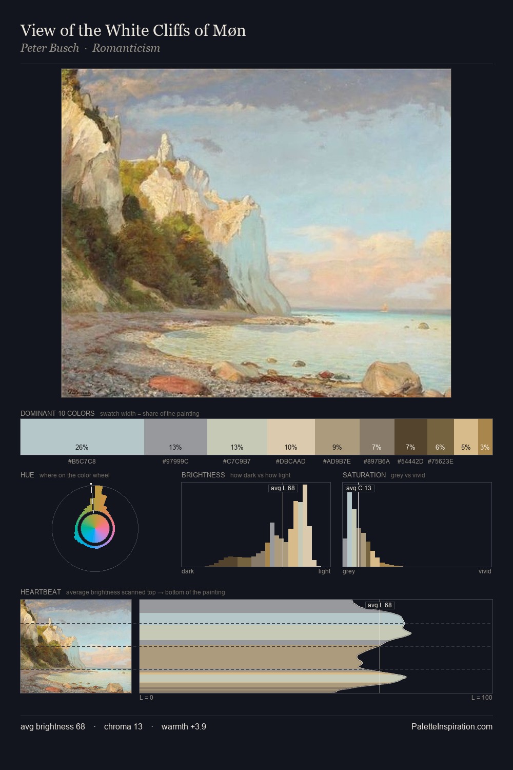
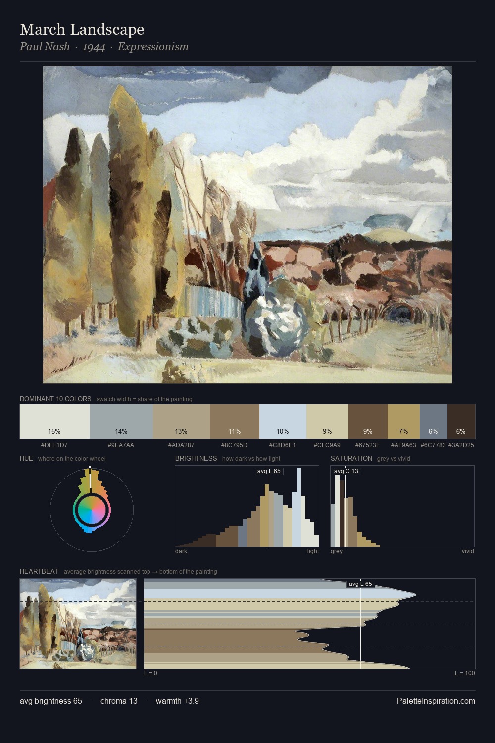
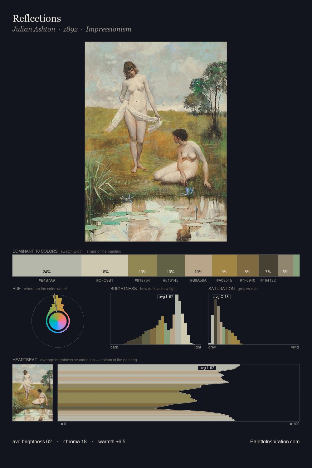
Values in Peter Busch tilt decisively toward white, giving the palette its luminous character. Peter Busch builds on cool foundations: the palette favours the blue-cyan-green arc. The absence of saturated colour is itself an expressive choice: this is a palette of restraint and atmosphere. Peter Busch gives 30.2% of the composition to a single #B5C8C9 - a decisive chromatic anchor. #A18741 functions as the palette's exclamation mark: highest chroma, lowest percentage (2.6%). Spanning 42 units on the value axis, the palette achieves the balance between tonal flatness and fragmentation. The mid-to-high key, cool bias, and moderate chroma point to outdoor observation - sky and diffused daylight as the dominant light source. In the context of Peter Busch's full range of palettes, group 2 represents one movement in an ongoing chromatic dialogue.
Example use cases
- florist branding
- event design
- real estate
- jewelry retail
- hospitality branding
I Love This!
Copy, export, or download for your project