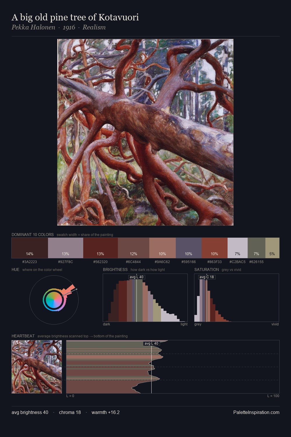
Pekka Halonen Palette 9
Shadowed Bister
Shadowed Low-key - values weighted toward shadow, the palette of dim interiors and overcast skies.
Bister Dark warm brown - a traditional ink and wash pigment made from wood soot.

Palette Analysis
The value structure of Pekka Halonen is mid-key: quiet, controlled, and cohesive. Pekka Halonen orchestrates warmth above all else - reds, ambers, and siennas take the lead. The absence of saturated colour is itself an expressive choice: this is a palette of restraint and atmosphere. The most saturated colour, #864D41, is reserved to 10.1% of the surface, where it acts as a focal punctuation. 53 units of value spread create a palette that is varied but unified - contrast in the service of harmony. In the context of Pekka Halonen's full range of palettes, group 9 represents one movement in an ongoing chromatic dialogue.
Example use cases
- theater design
- jewelry brands
- tobacco-adjacent retail
- event branding
- film & entertainment
I Love This!
Use This Palette
Copy, export, or download for your project
Copy, export, or download for your project
Copy:
Download:
Share: