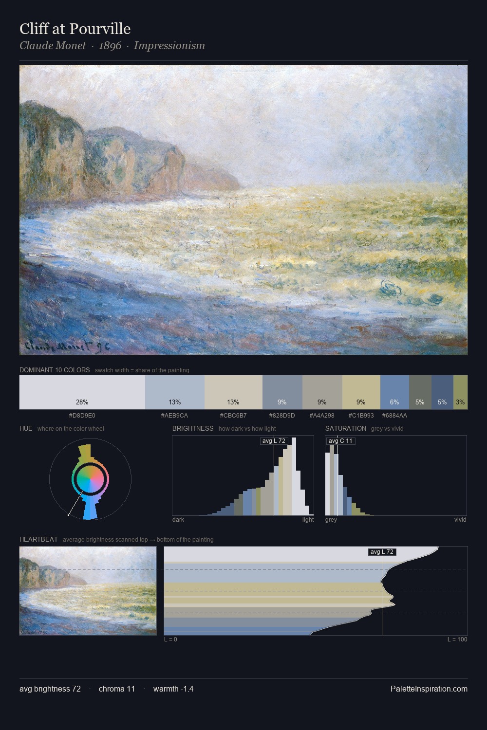
Pekka Halonen Palette 1
Gleaming Alabaster
Gleaming Bright and polished - high-key, often warm, suggesting reflective or luminous surfaces.
Alabaster Warm off-white - creamy stone white, luminous and slightly translucent.

Palette Analysis
Pekka Halonen works in the upper reaches of the value scale, creating an atmosphere of brightness and expansiveness. Cool tones set the register here - the blues and greens easily outweigh any warm accents. Muted throughout, the palette achieves its effects through value and temperature rather than chromatic force. #848C58 functions as the palette's exclamation mark: highest chroma, lowest percentage (6.9%). 44 units of value spread create a palette that is varied but unified - contrast in the service of harmony. High luminosity and cool temperature suggest the plein-air condition: unfiltered daylight and open sky. In the context of Pekka Halonen's full range of palettes, group 1 represents one movement in an ongoing chromatic dialogue.
Example use cases
- print magazines
- beauty brands
- real estate
- high-end packaging
- editorial design
I Love This!
Use This Palette
Copy, export, or download for your project
Copy, export, or download for your project
Copy:
Download:
Share: