Pekka Halonen Palette 3

Palette Analysis
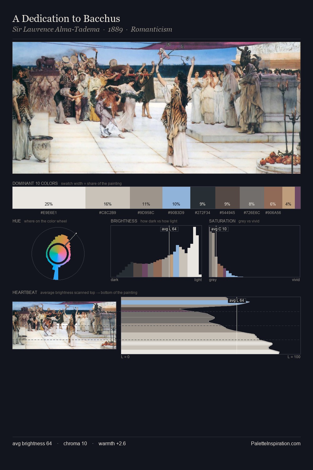
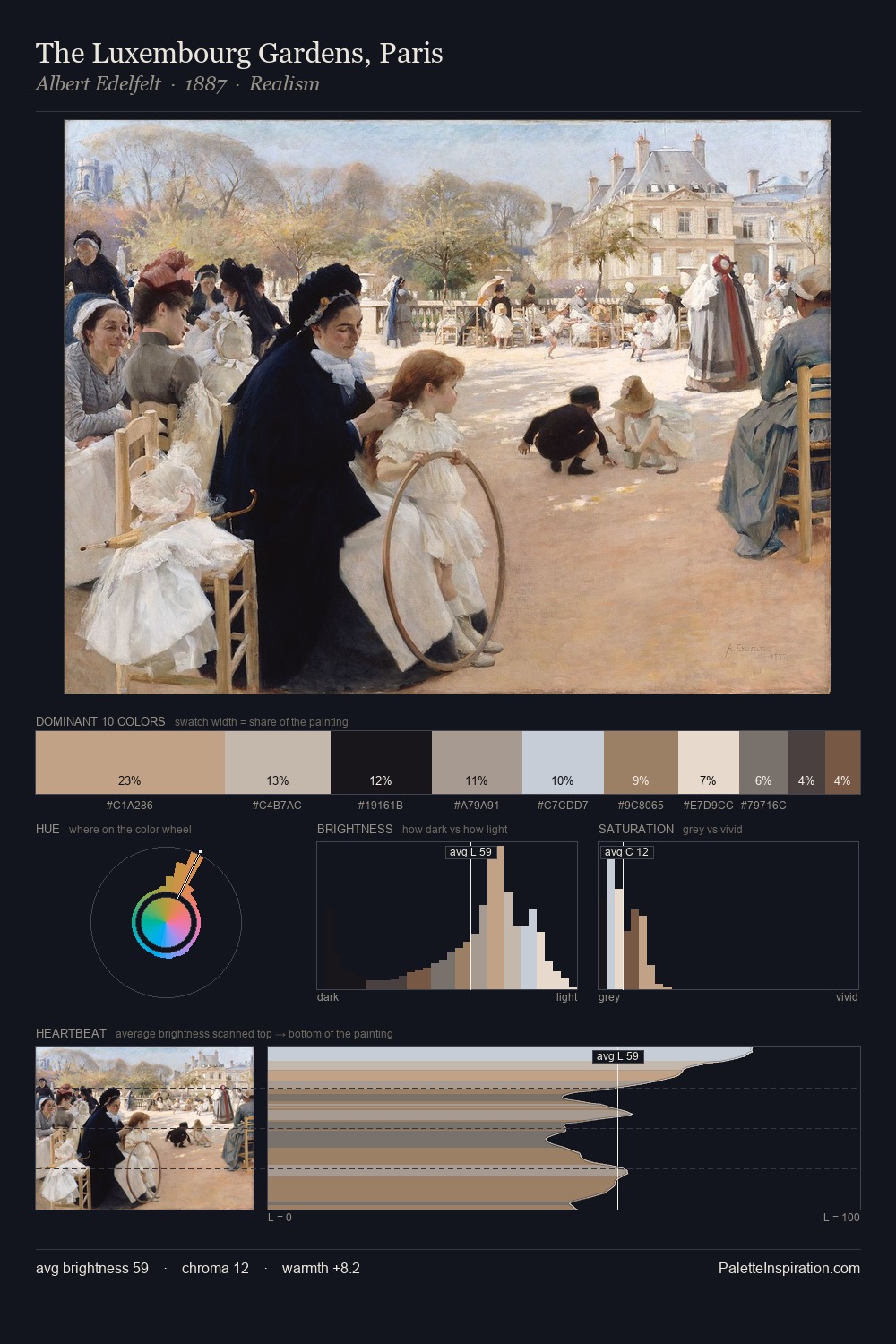
Pekka Halonen is high-key - luminous, open, and weighted toward light. Pekka Halonen tilts toward cool - blues and silver-greys carry the structural weight. Saturation is deliberately withheld - the beauty here lies in the near-monochromatic gradations rather than colour difference. Only 6.1% is devoted to #A78377, yet that small allocation delivers the palette's entire chromatic tension. At 60 units of value range, the palette has the tonal breadth to sustain complex spatial readings. The palette has the character of outdoor light: cool, mid-bright, with colour rendered faithfully rather than expressively. Pekka Halonen's palette 3 carries its own internal logic while remaining in conversation with the artist's broader colour intelligence.
Example use cases
- food & beverage
- wedding stationery
- lifestyle brands
- interior design
- fashion retail
I Love This!
Copy, export, or download for your project