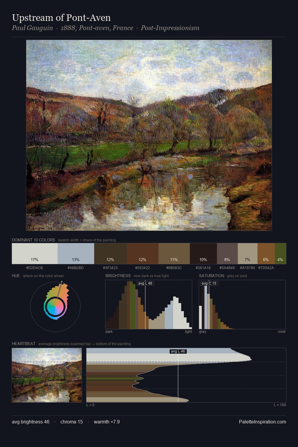
Peder Severin Kroyer Palette 3

Palette Analysis
Light floods Peder Severin Kroyer; the palette keeps values pale and airy across its range. Peder Severin Kroyer builds on cool foundations: the palette favours the blue-cyan-green arc. All colours lean toward grey, building depth through value rather than colour punch. The dominant colour, #BAAC8E, takes 28.2% of the total area, establishing the overall mood before any other hue is introduced. The saturated accent, #E9E3D7, registers at 7.2% - sparse enough to feel like a deliberate surprise. At 68 units of value range, the palette has the tonal breadth to sustain complex spatial readings. High luminosity and cool temperature suggest the plein-air condition: unfiltered daylight and open sky. Palette 3 sits within the larger chromatic argument that Peder Severin Kroyer's complete body of work advances.
Example use cases
- florist branding
- event design
- real estate
- jewelry retail
- hospitality branding
I Love This!
Copy, export, or download for your project