Peder Severin Kroyer Master Palette
Muted Parchment
Muted Deliberately desaturated - chroma pulled toward gray, the restraint of tonal painting.
Parchment Aged warm neutral - the color of old manuscript parchment, tan and slightly yellowed.

Palette Analysis
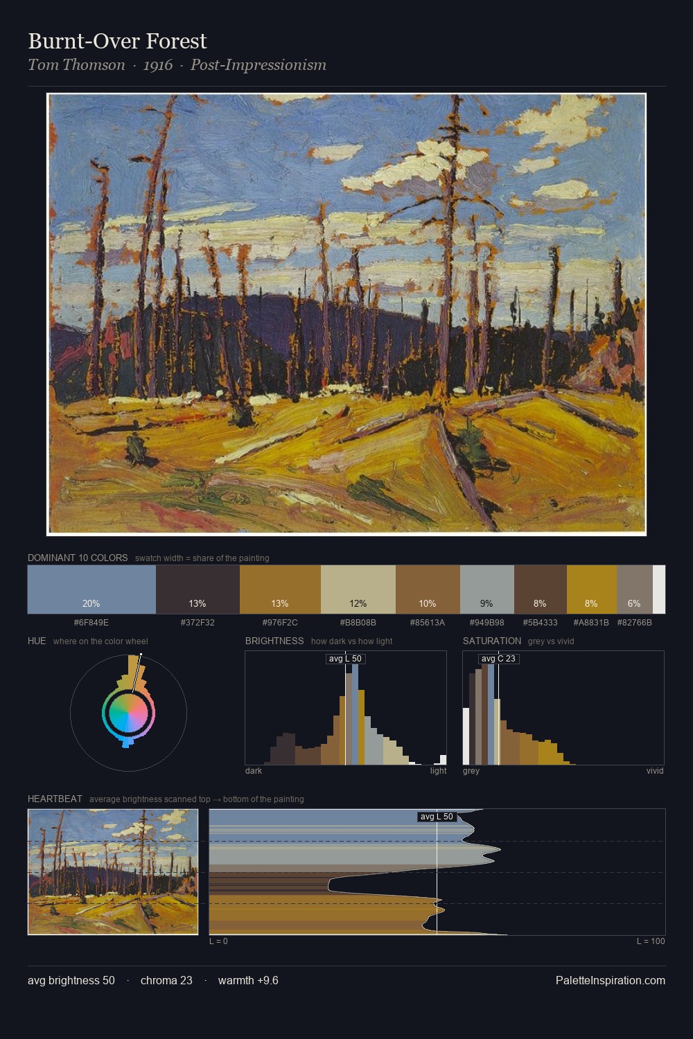
Values in Peder Severin Kroyer rest in the mid-range - neither dramatically lit nor steeped in shadow. Neither warm nor cool has the upper hand here; the equilibrium between the two generates the palette's visual energy. The absence of saturated colour is itself an expressive choice: this is a palette of restraint and atmosphere. The saturated accent, #664038, registers at 7.5% - sparse enough to feel like a deliberate surprise. The full value range is 58 units: broad enough to build convincing three-dimensional form. These proportions encode Peder Severin Kroyer's instinctive sense of how much of each quality the eye can hold.
Example use cases
- museums & galleries
- academic publishing
- heritage brands
- auction houses
- exhibition design
I Love This!
Use This Palette
Copy, export, or download for your project
Copy, export, or download for your project
Copy:
Download:
Share: