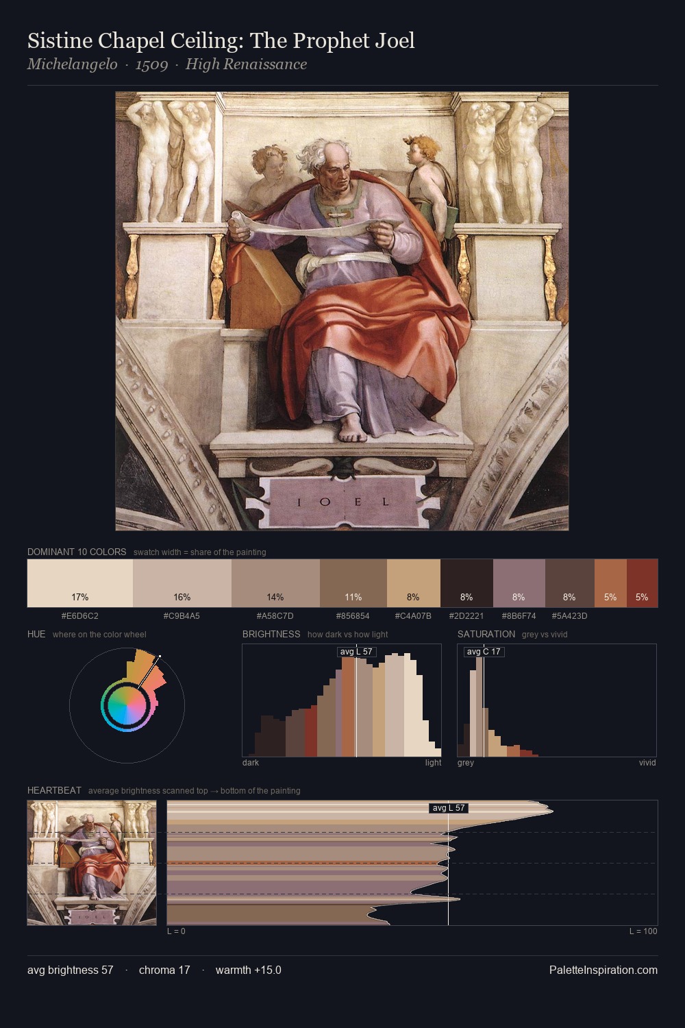
Peter Fendi Palette 1
Soft Ecru
Soft Low-contrast, gentle chroma - mid-key values and low saturation, approachable and calm.
Ecru Unbleached linen - warm mid-neutral, slightly grayed, raw and natural.

Palette Analysis
Peter Fendi is strongly light-biased - shadow is suggested rather than declared. Peter Fendi keeps warm and cool in parity, a balance that lends the work a perceptual shimmer. Chroma is kept low across all colours, producing the soft, enveloping quality that characterises tonal painting. The saturated accent, #9A513A, registers at 2.2% - sparse enough to feel like a deliberate surprise. 57 units of value range underpin the palette's structural clarity: the eye always knows where light falls. Peter Fendi's palette 1 carries its own internal logic while remaining in conversation with the artist's broader colour intelligence.
Example use cases
- craft & artisan brands
- specialty coffee
- home goods
- lifestyle retail
- ceramics & pottery
I Love This!
Use This Palette
Copy, export, or download for your project
Copy, export, or download for your project
Copy:
Download:
Share: