Paulus Potter Palette 1

Palette Analysis
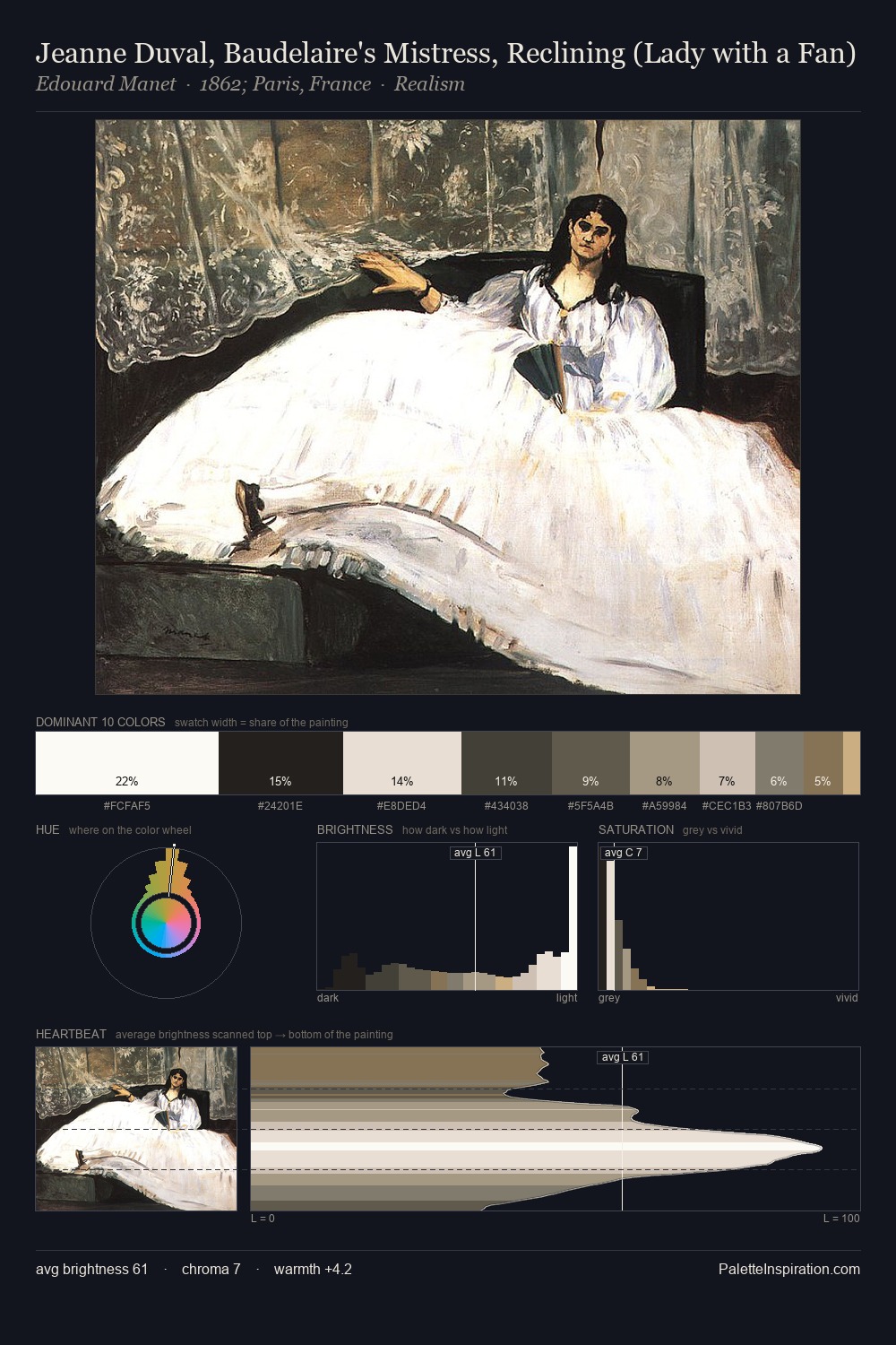
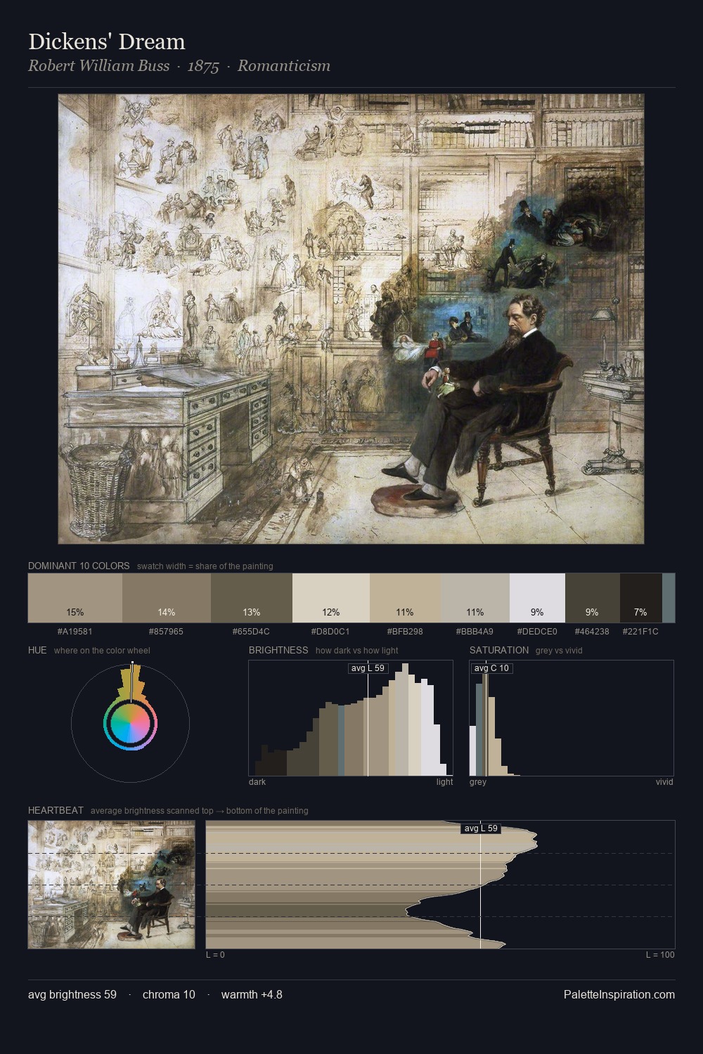
Paulus Potter works in the upper reaches of the value scale, creating an atmosphere of brightness and expansiveness. Cool hues prevail: blues, greens, and greys anchor the palette's emotional temperature. Chroma hovers near zero; colour declares itself through subtle shifts in hue rather than outright saturation. The saturated accent, #5C4B3B, registers at 6.2% - sparse enough to feel like a deliberate surprise. 70 units of value range underpin the palette's structural clarity: the eye always knows where light falls. The mid-to-high key, cool bias, and moderate chroma point to outdoor observation - sky and diffused daylight as the dominant light source. In the context of Paulus Potter's full range of palettes, group 1 represents one movement in an ongoing chromatic dialogue.
Example use cases
- nonprofit identity
- public libraries
- historical sites
- literary journals
- archival print
I Love This!
Copy, export, or download for your project