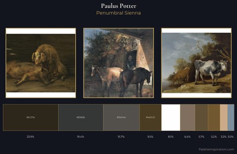
Paulus Potter Master Palette
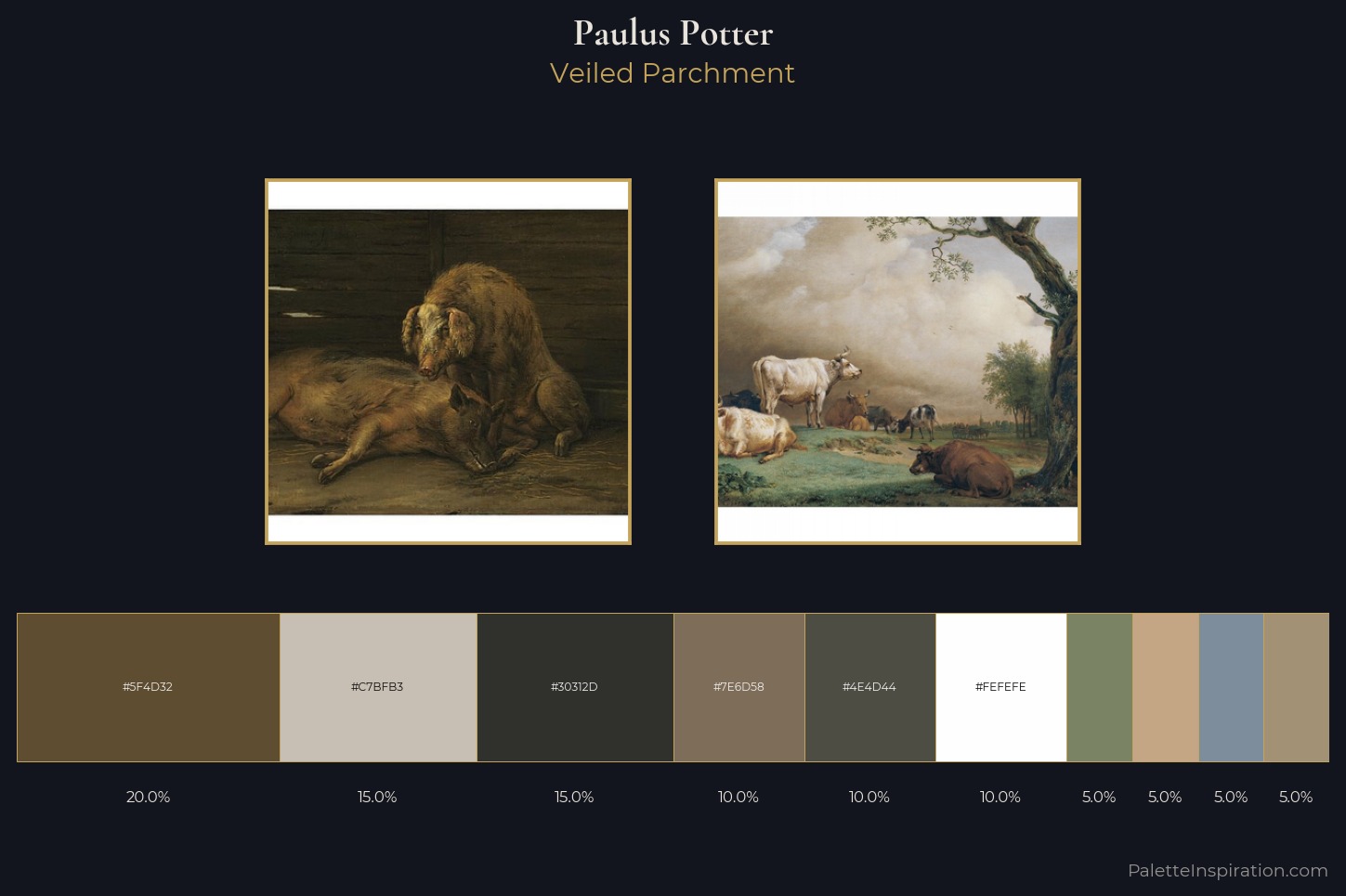
Palette Analysis
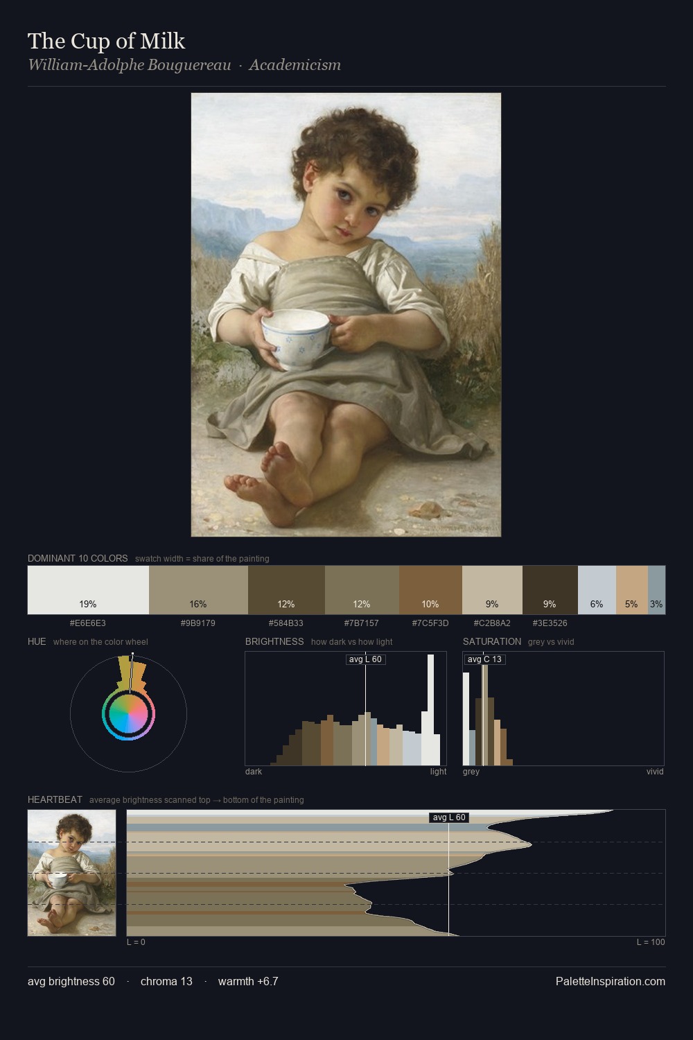
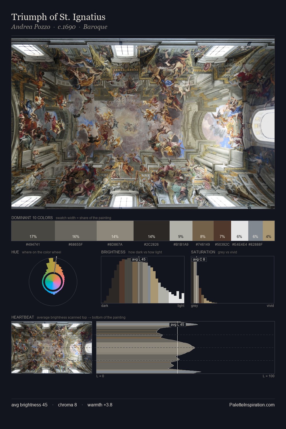
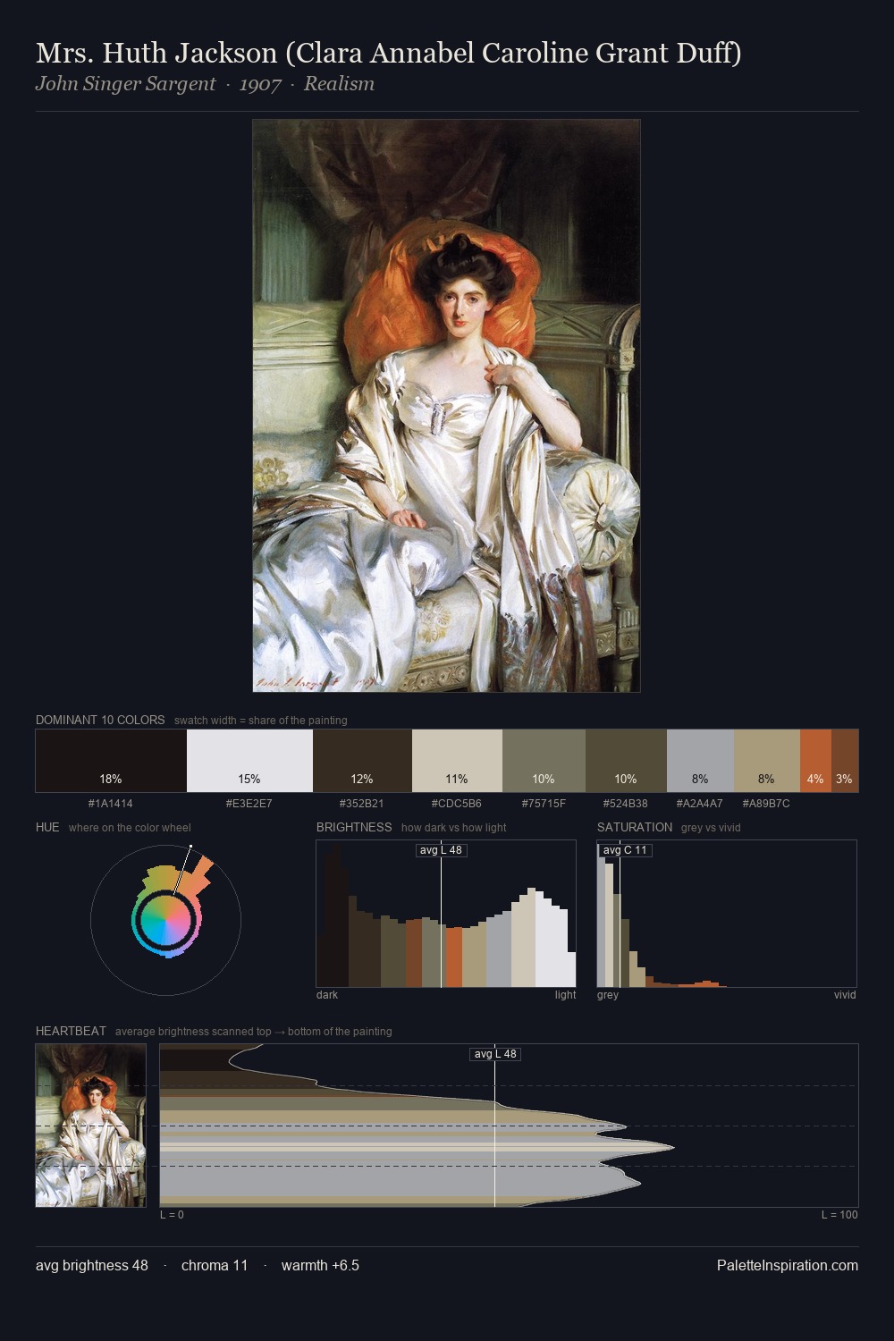
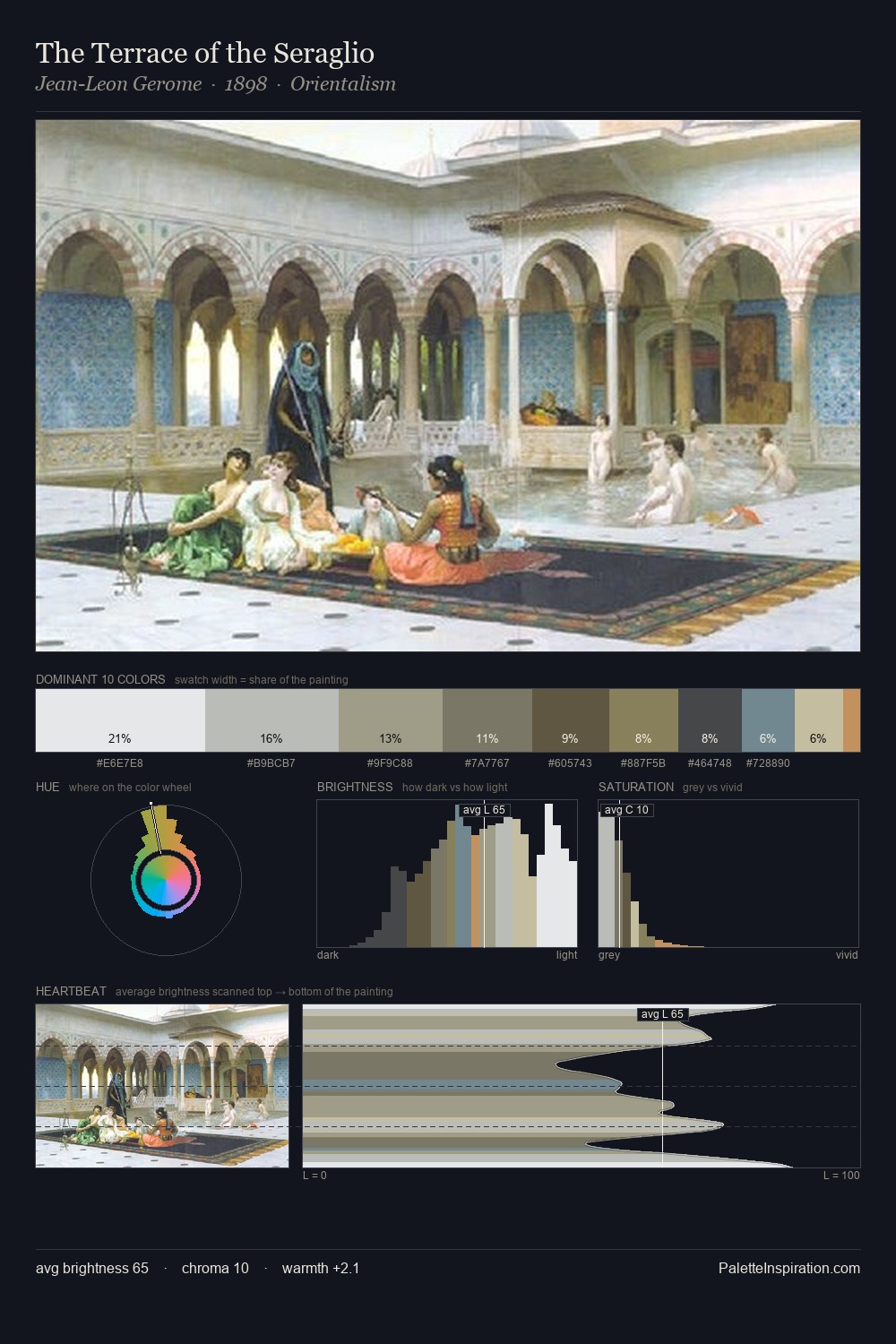
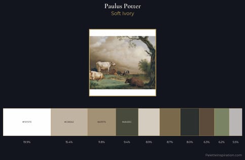
Paulus Potter occupies the comfortable middle of the value scale, avoiding both extremes to hold the eye in a sustained middle grey. Temperature is cool-dominant, with blue and green families claiming the largest areas. Saturation is deliberately withheld - the beauty here lies in the near-monochromatic gradations rather than colour difference. The saturated accent, #C4A685, registers at 5.0% - sparse enough to feel like a deliberate surprise. 69 units of value range underpin the palette's structural clarity: the eye always knows where light falls. High luminosity and cool temperature suggest the plein-air condition: unfiltered daylight and open sky. Taken together, these qualities constitute Paulus Potter's chromatic voice - distinctive enough to be read across an entire body of work.
Example use cases
- exhibition design
- foundation branding
- estate management
- art education
- museums & galleries
I Love This!
Copy, export, or download for your project