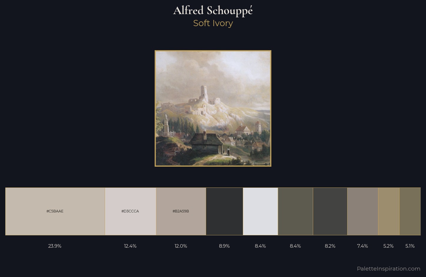
Alfred Schouppé Palette 1
Soft Ivory
Soft Low-contrast, gentle chroma - mid-key values and low saturation, approachable and calm.
Ivory Warm creamy white - the color of natural ivory, warmer than pure white.
Palette Analysis
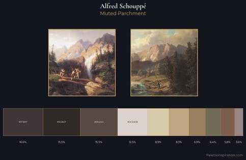
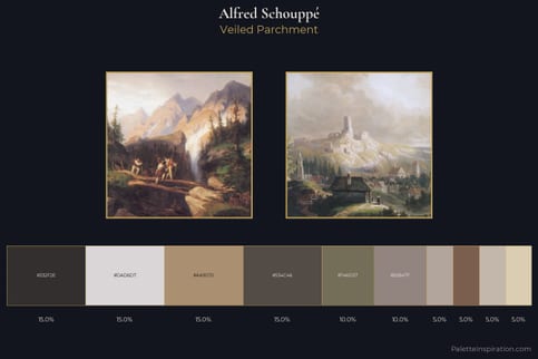
Alfred Schouppé is high-key - luminous, open, and weighted toward light. Warm and cool are kept in productive tension, creating the kind of chromatic harmony that sustains the eye. The absence of saturated colour is itself an expressive choice: this is a palette of restraint and atmosphere. The most saturated colour, #9D8D6F, is reserved to 5.2% of the surface, where it acts as a focal punctuation. A value spread of 59 units gives the palette both depth and air - shadows are genuinely dark, lights genuinely light. Palette 1 sits within the larger chromatic argument that Alfred Schouppé's complete body of work advances.
Example use cases
- museums & galleries
- academic publishing
- heritage brands
- auction houses
- exhibition design
I Love This!
Use This Palette
Copy, export, or download for your project
Copy, export, or download for your project
Copy:
Download:
Share: