Paul Henry Master Palette

Palette Analysis
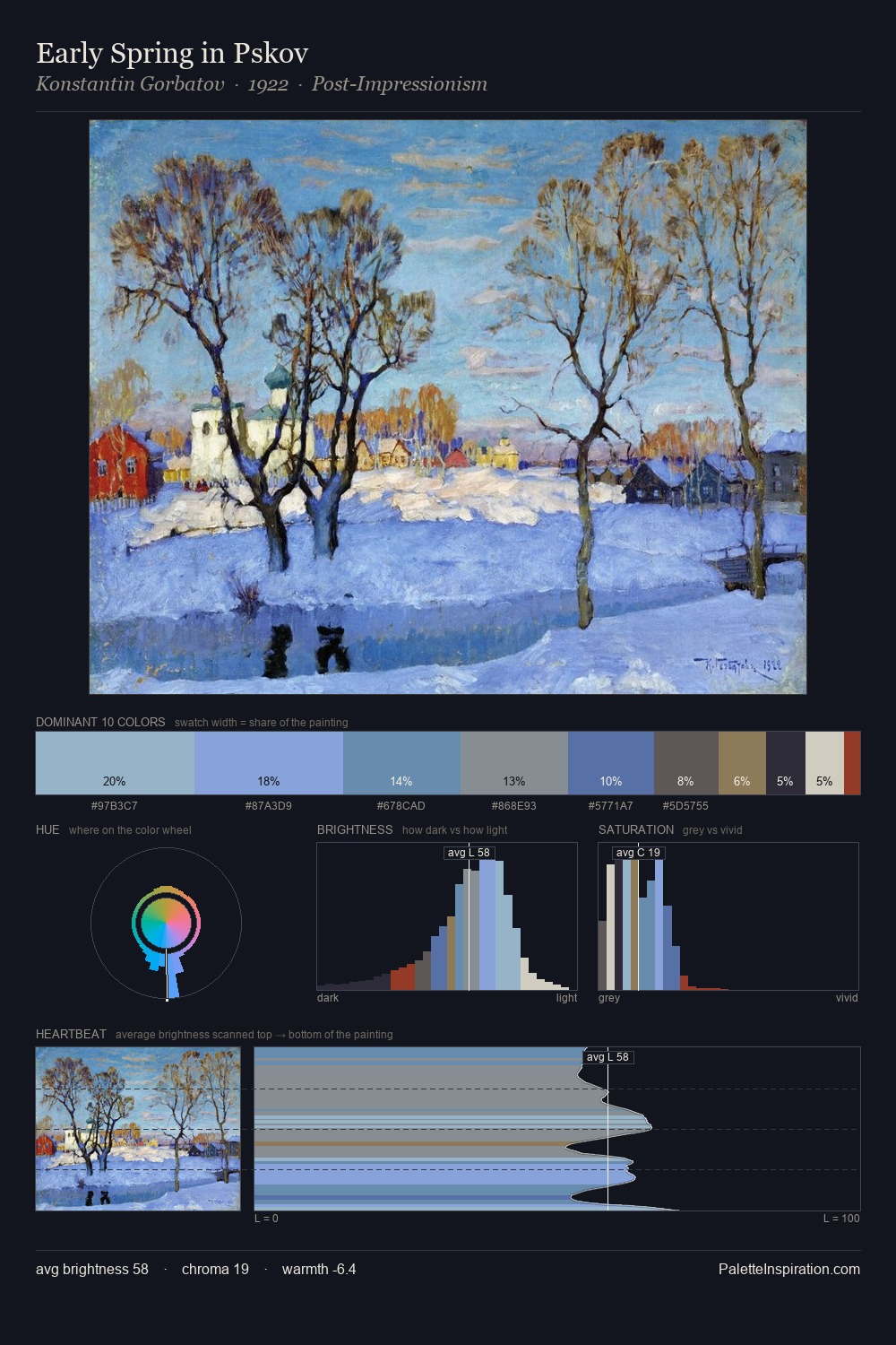
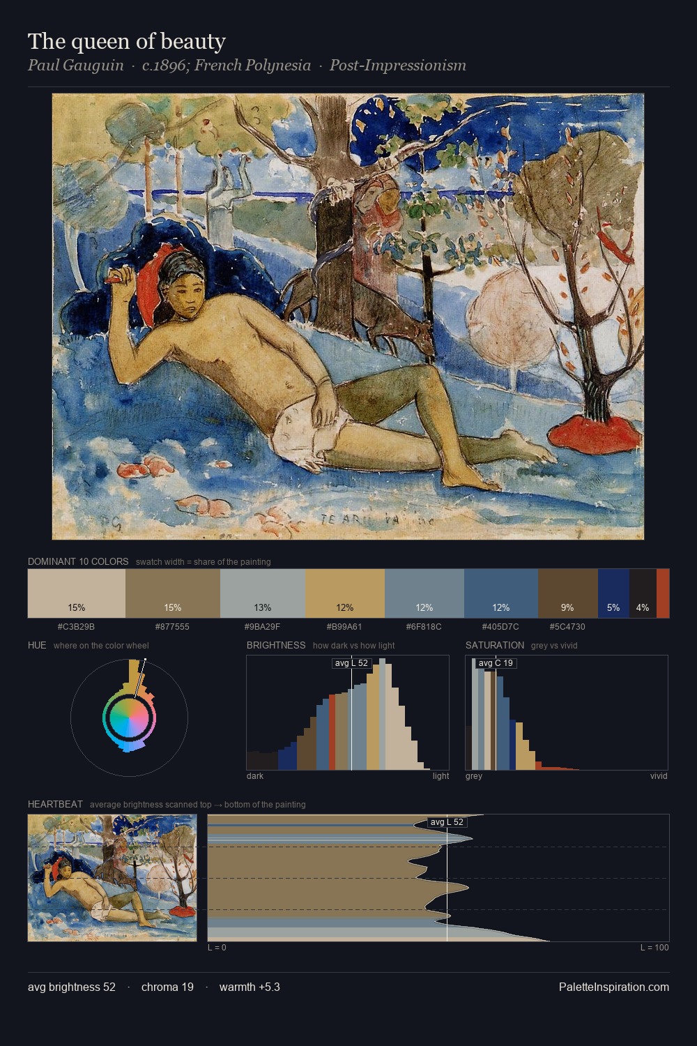
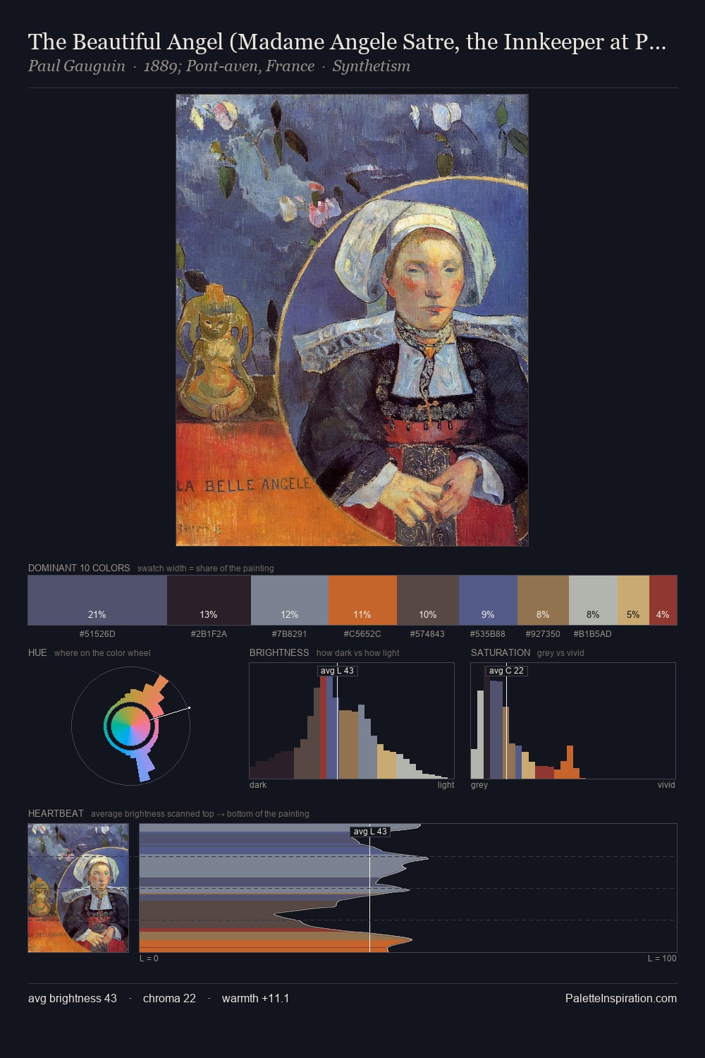
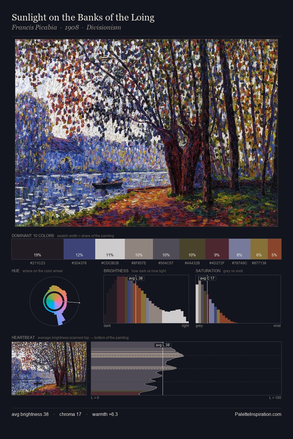
Values in Paul Henry rest in the mid-range - neither dramatically lit nor steeped in shadow. Blues and teal-greys govern the palette, lending it an aquatic or atmospheric quality. Saturation is deliberately withheld - the beauty here lies in the near-monochromatic gradations rather than colour difference. The saturated accent, #121422, registers at 2.0% - sparse enough to feel like a deliberate surprise. A value spread of 62 units gives the palette both depth and air - shadows are genuinely dark, lights genuinely light. The palette has the character of outdoor light: cool, mid-bright, with colour rendered faithfully rather than expressively. Taken together, these qualities constitute Paul Henry's chromatic voice - distinctive enough to be read across an entire body of work.
Example use cases
- theater design
- jewelry brands
- tobacco-adjacent retail
- event branding
- film & entertainment
I Love This!
Copy, export, or download for your project