Paul Henry Palette 2

Palette Analysis
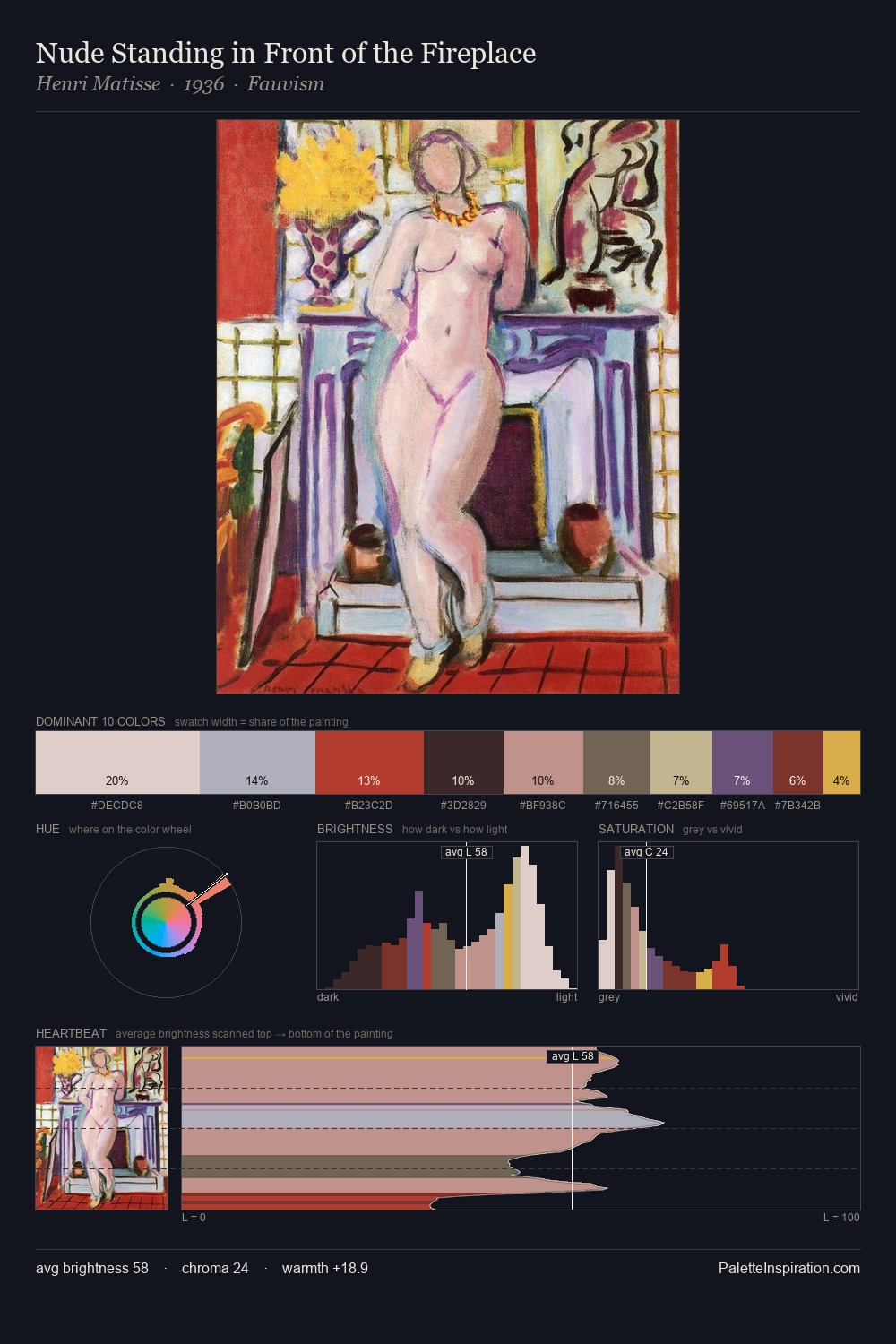
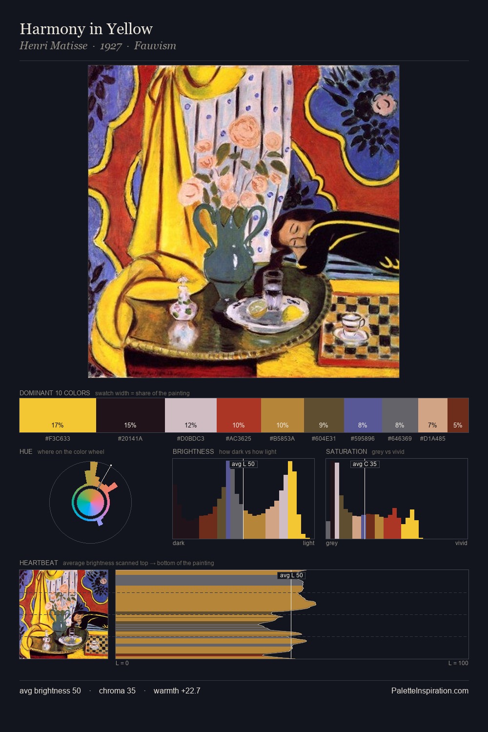
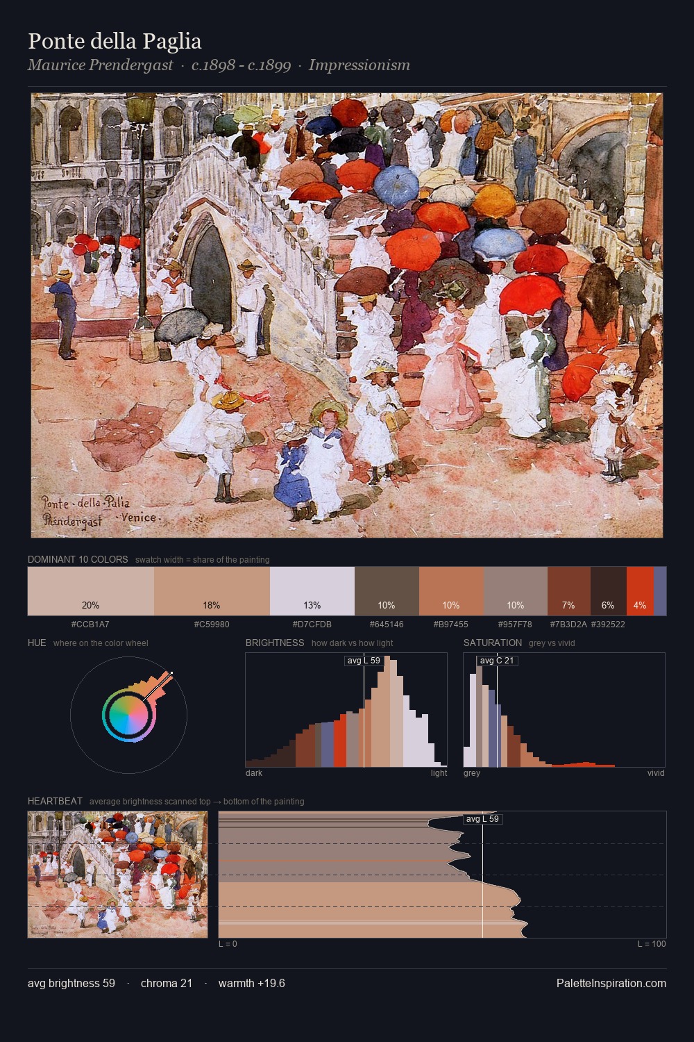
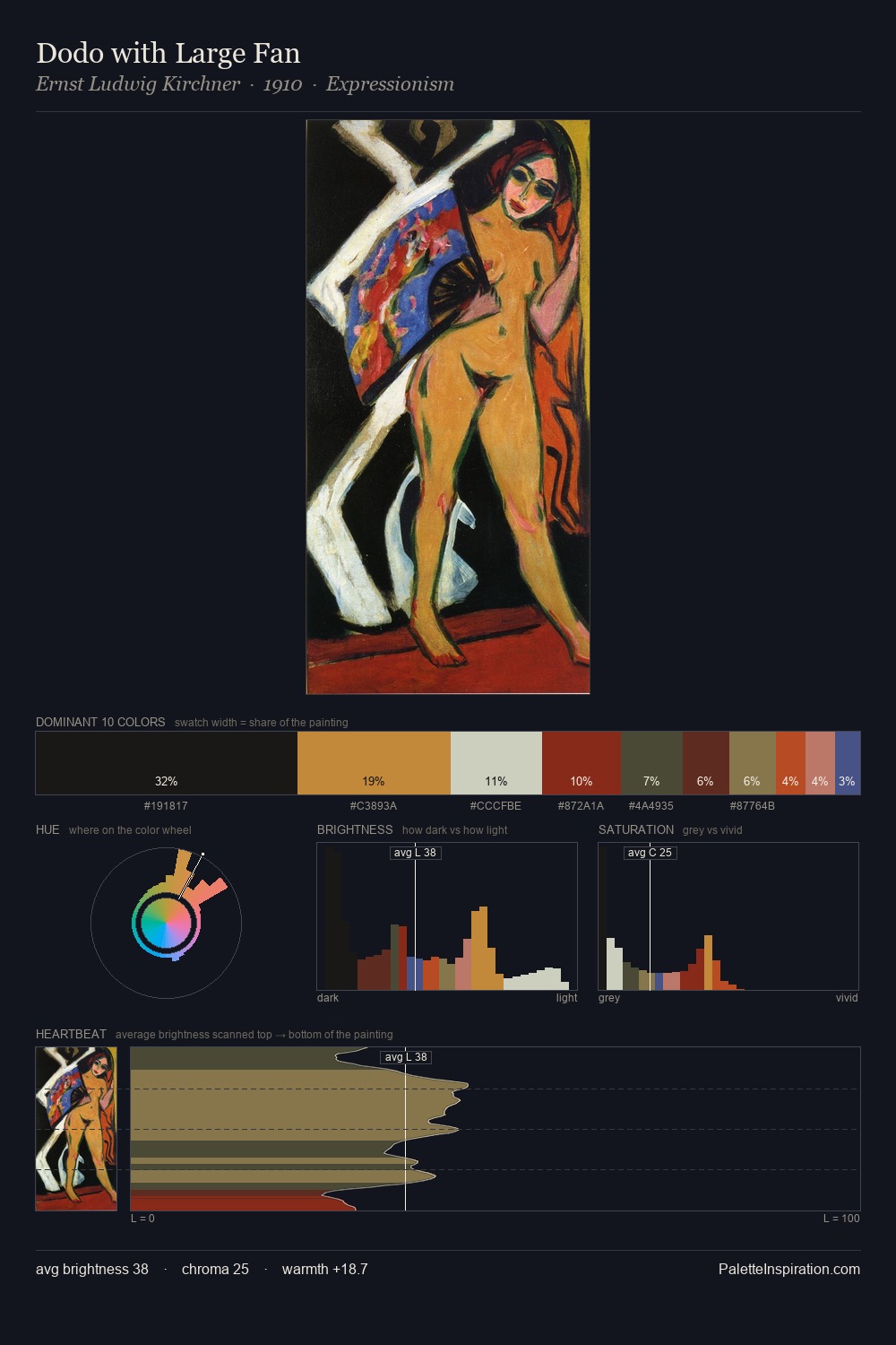
The high-key values of Paul Henry give it an effulgent, almost bleached quality. Cool hues prevail: blues, greens, and greys anchor the palette's emotional temperature. Muted throughout, the palette achieves its effects through value and temperature rather than chromatic force. The dominant colour, #EFF0EA, takes 29.0% of the total area, establishing the overall mood before any other hue is introduced. Only 3.4% is devoted to #5E2719, yet that small allocation delivers the palette's entire chromatic tension. 73 units of value range underpin the palette's structural clarity: the eye always knows where light falls. High luminosity and cool temperature suggest the plein-air condition: unfiltered daylight and open sky. Paul Henry's palette 2 carries its own internal logic while remaining in conversation with the artist's broader colour intelligence.
Example use cases
- boutique hospitality
- film production
- menswear
- art prints & posters
- heritage brands
I Love This!
Copy, export, or download for your project