Pastorale Palette 4
Pearlescent Whisper
Pearlescent Iridescent light quality - high-key with subtle hue variation, like mother-of-pearl.
Whisper Barely-there pale neutral - so light it barely registers, the quietest color.

Palette Analysis
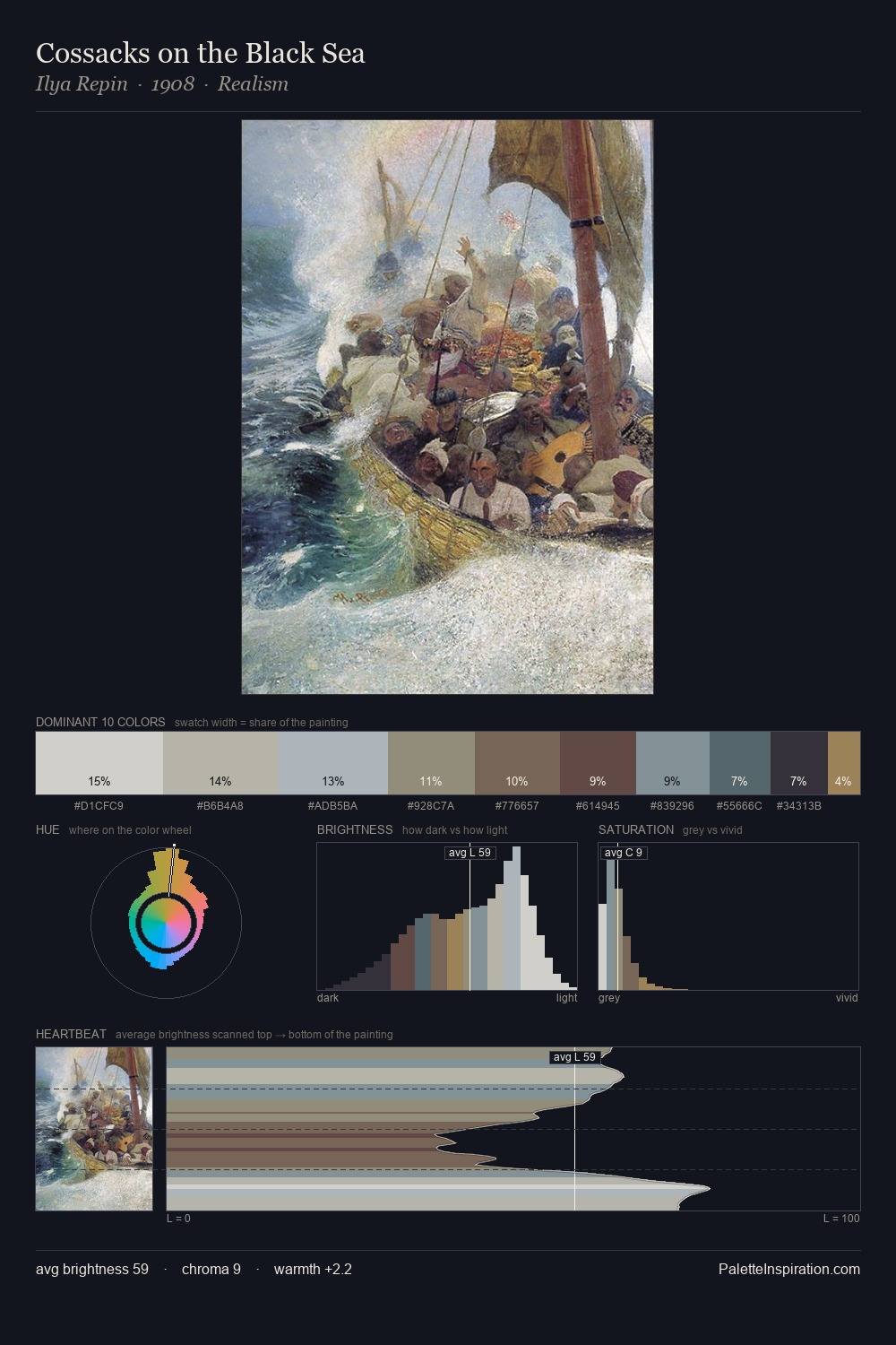
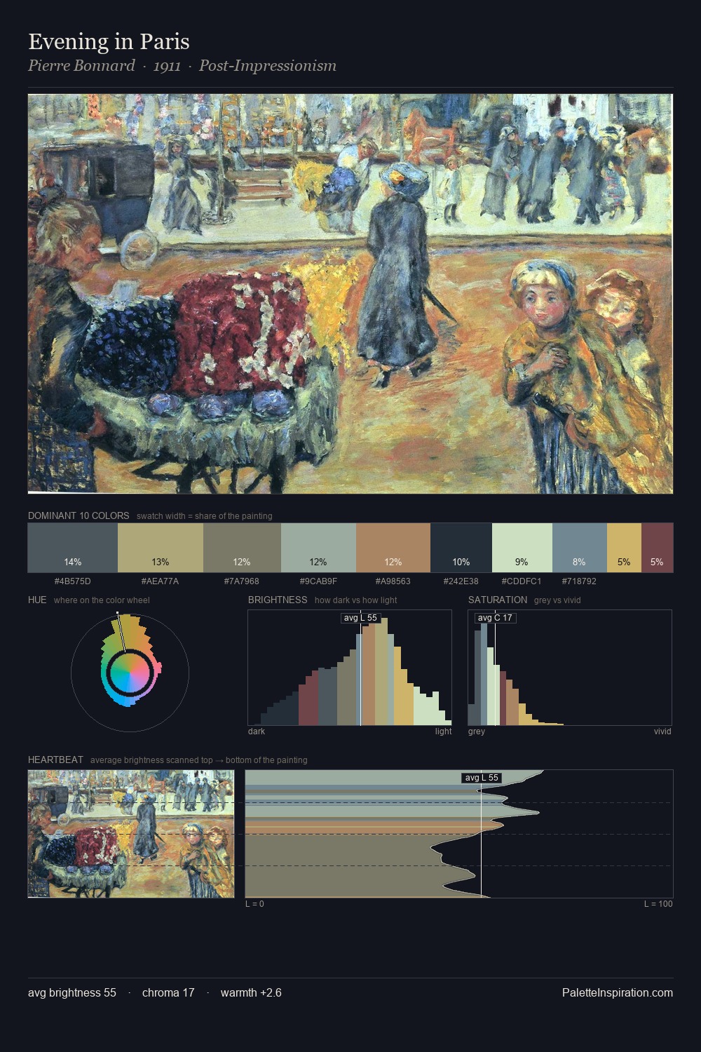
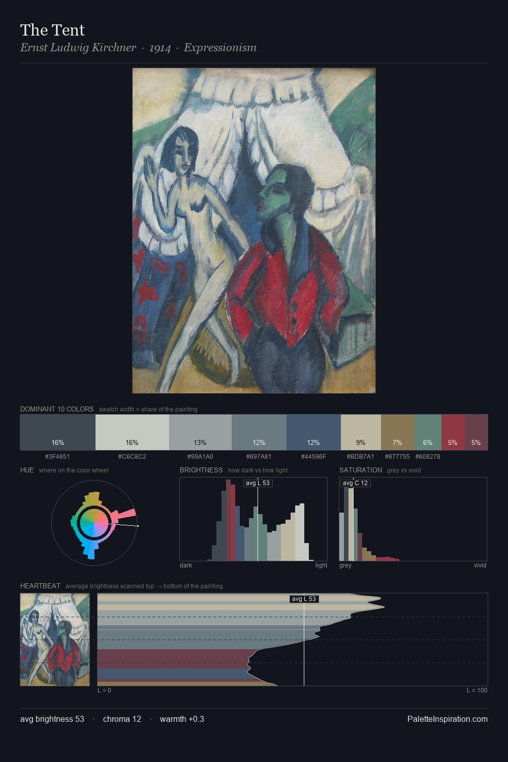
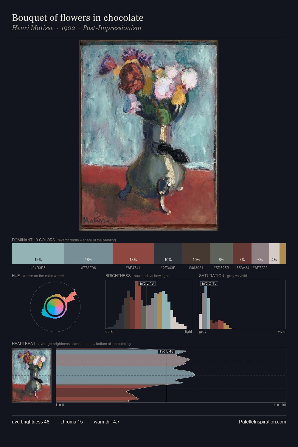
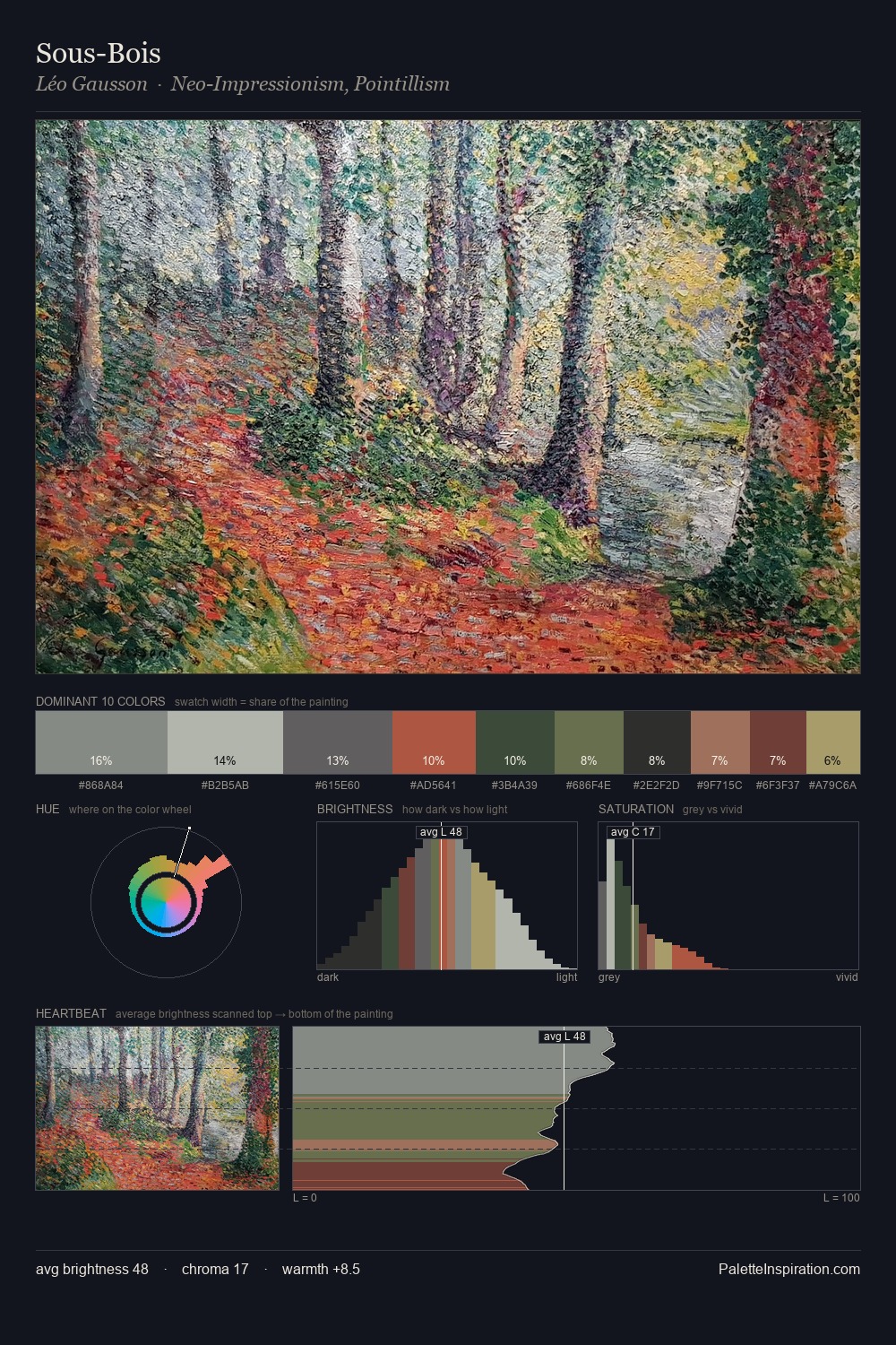
pastorale is high-key - luminous, open, and weighted toward light. Temperature is cool-dominant, with blue and green families claiming the largest areas. Chroma is kept low across all colours, producing the soft, enveloping quality that characterises tonal painting. #5B3036 functions as the palette's exclamation mark: highest chroma, lowest percentage (3.2%). At 49 units across the value scale, the palette keeps contrast readable without letting it dominate. High luminosity and cool temperature suggest the plein-air condition: unfiltered daylight and open sky.
Example use cases
- exhibition design
- foundation branding
- estate management
- art education
- museums & galleries
I Love This!
Use This Palette
Copy, export, or download for your project
Copy, export, or download for your project
Copy:
Download:
Share: