Pastorale Palette 2
Soft Apricot
Soft Low-contrast, gentle chroma - mid-key values and low saturation, approachable and calm.
Apricot Soft warm orange - peach-adjacent, the color of ripe stone fruit.

Palette Analysis
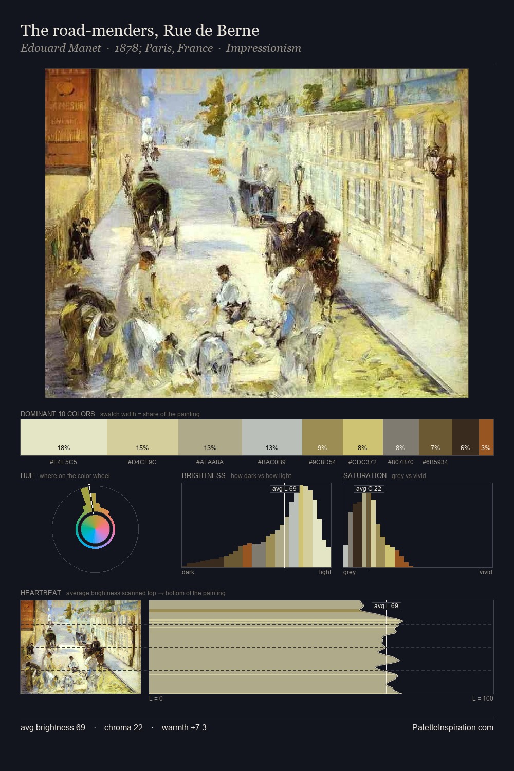
pastorale is high in key: pale, luminous, and filled with optical air. Blues and teal-greys govern the palette, lending it an aquatic or atmospheric quality. Chroma is held at a comfortable level - distinct colours, but no single hue is allowed to overwhelm. At 8.4%, #C6CD5C carries the palette's sharpest chromatic charge: an accent that earns its place precisely because it is withheld. 59 units of value range underpin the palette's structural clarity: the eye always knows where light falls. The mid-to-high key, cool bias, and moderate chroma point to outdoor observation - sky and diffused daylight as the dominant light source.
Example use cases
- food packaging
- leather accessories
- travel & outdoor
- natural cosmetics
- interior design
I Love This!
Use This Palette
Copy, export, or download for your project
Copy, export, or download for your project
Copy:
Download:
Share: