Pastorale Palette 1
Soft Ecru
Soft Low-contrast, gentle chroma - mid-key values and low saturation, approachable and calm.
Ecru Unbleached linen - warm mid-neutral, slightly grayed, raw and natural.

Palette Analysis
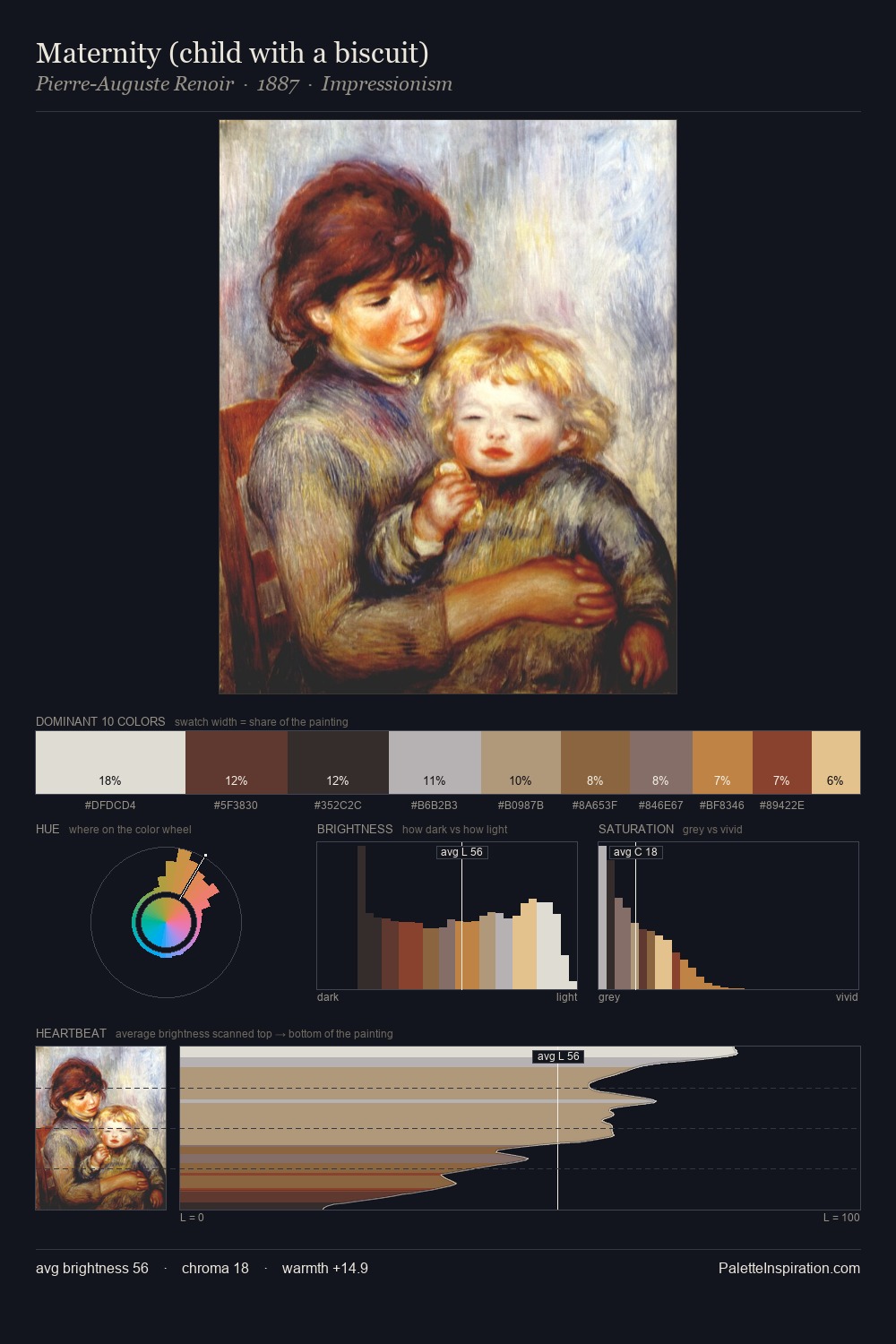
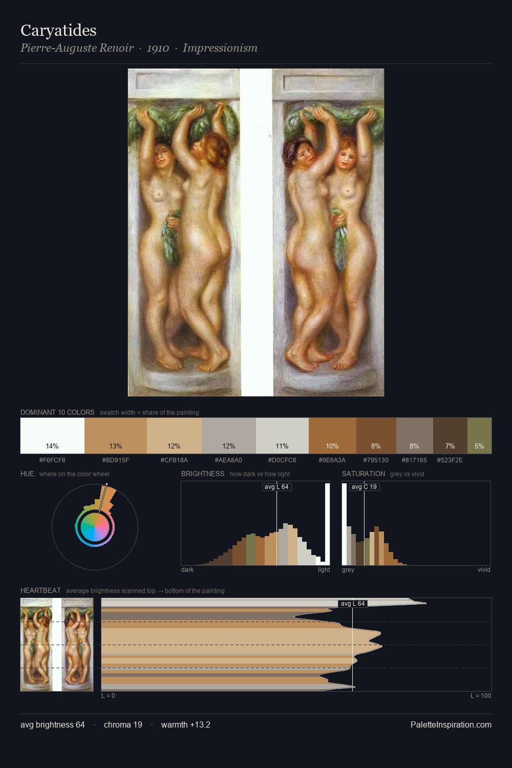
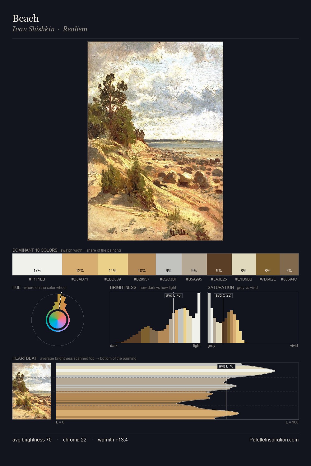
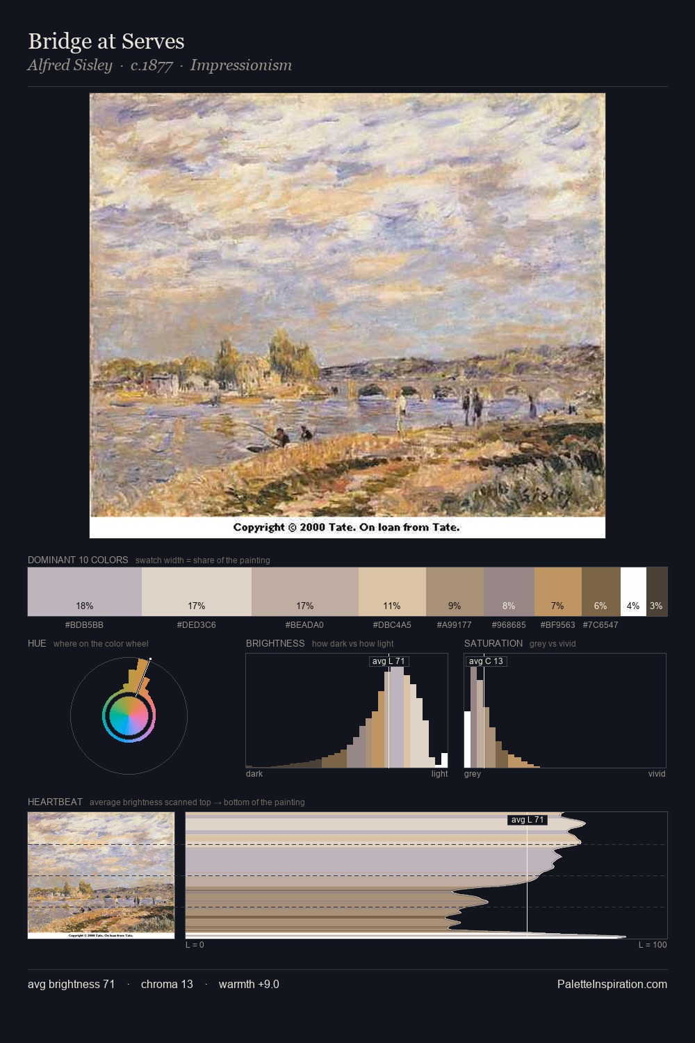
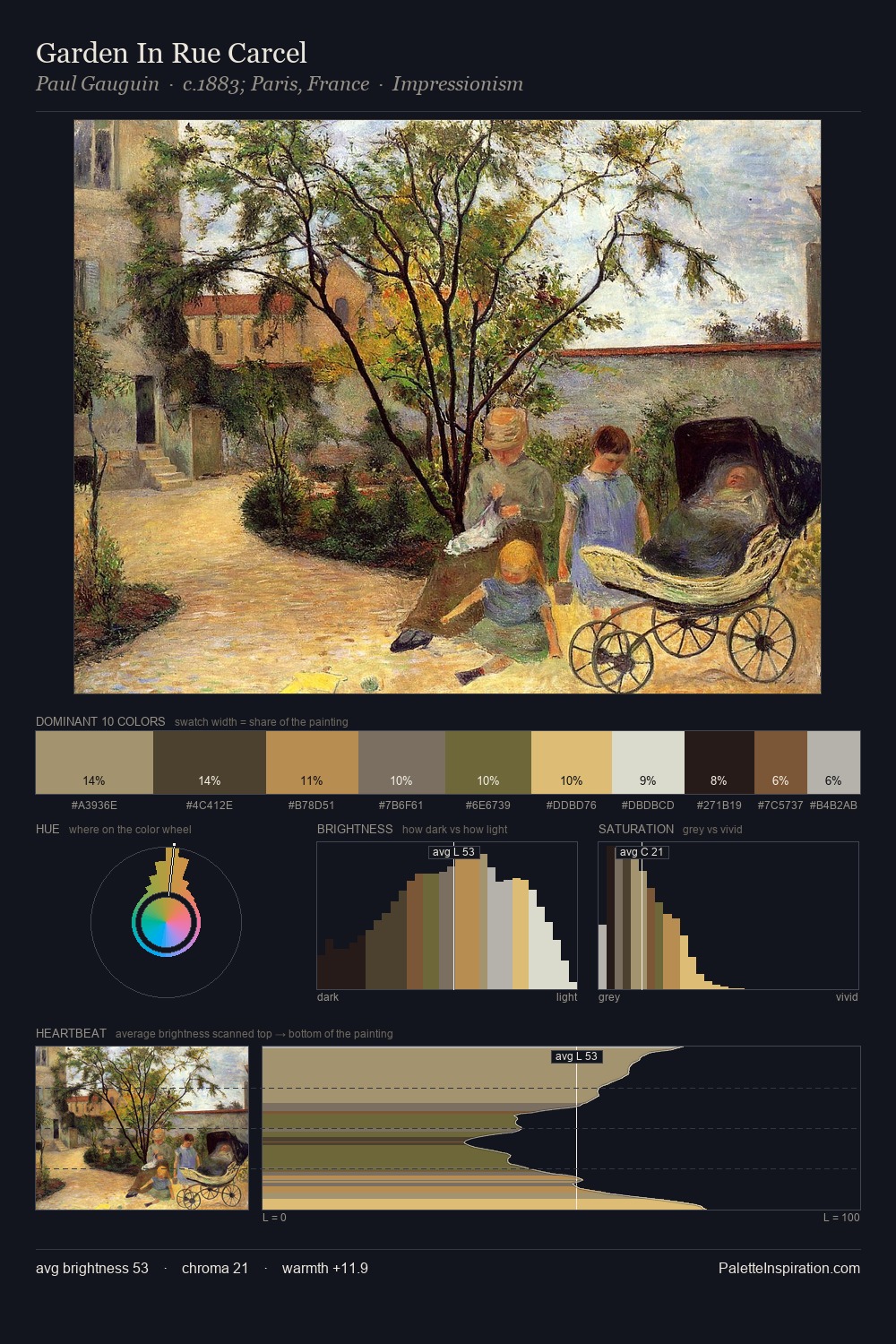
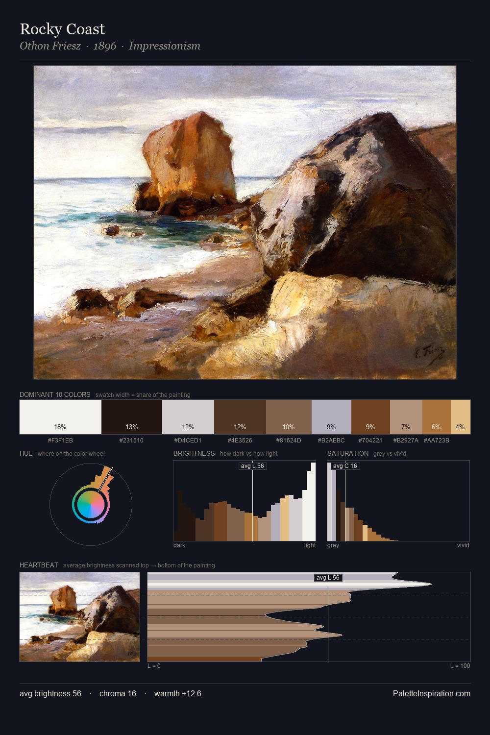
The high-key values of pastorale give it an effulgent, almost bleached quality. Neither warm nor cool has the upper hand here; the equilibrium between the two generates the palette's visual energy. All colours lean toward grey, building depth through value rather than colour punch. 25.4% of the palette belongs to #CFC8BC, a concentration that makes it the unmistakable visual centre. At 7.3%, #9F7258 carries the palette's sharpest chromatic charge: an accent that earns its place precisely because it is withheld. The full value range is 61 units: broad enough to build convincing three-dimensional form.
Example use cases
- exhibition design
- foundation branding
- estate management
- art education
- museums & galleries
I Love This!
Use This Palette
Copy, export, or download for your project
Copy, export, or download for your project
Copy:
Download:
Share: