Pablo Picasso Master Palette
Muted Tawny
Muted Deliberately desaturated - chroma pulled toward gray, the restraint of tonal painting.
Tawny Warm orange-brown - a traditional term for the color of tanned leather or lion fur.
Palette Analysis
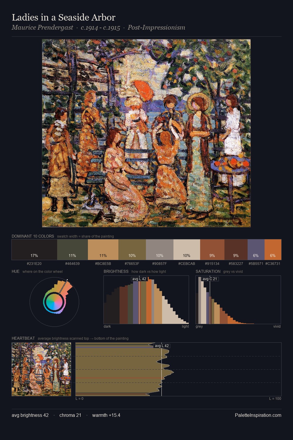
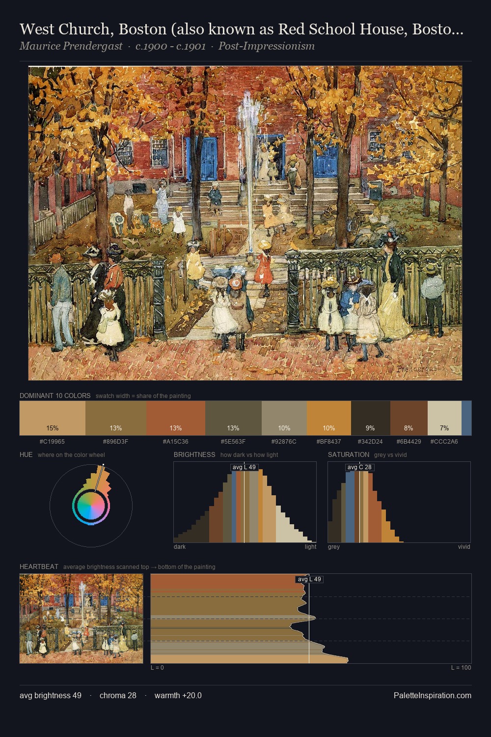
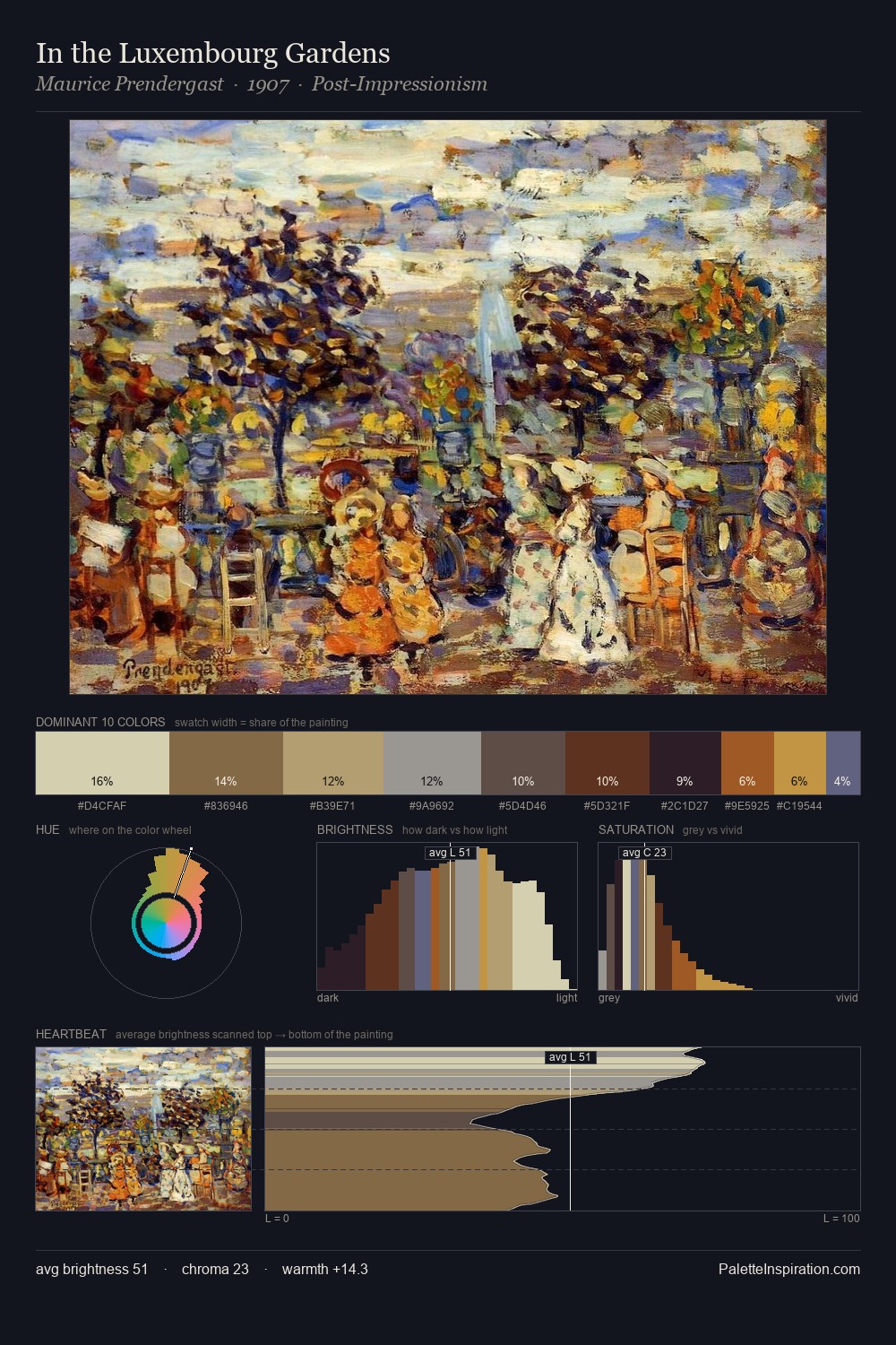
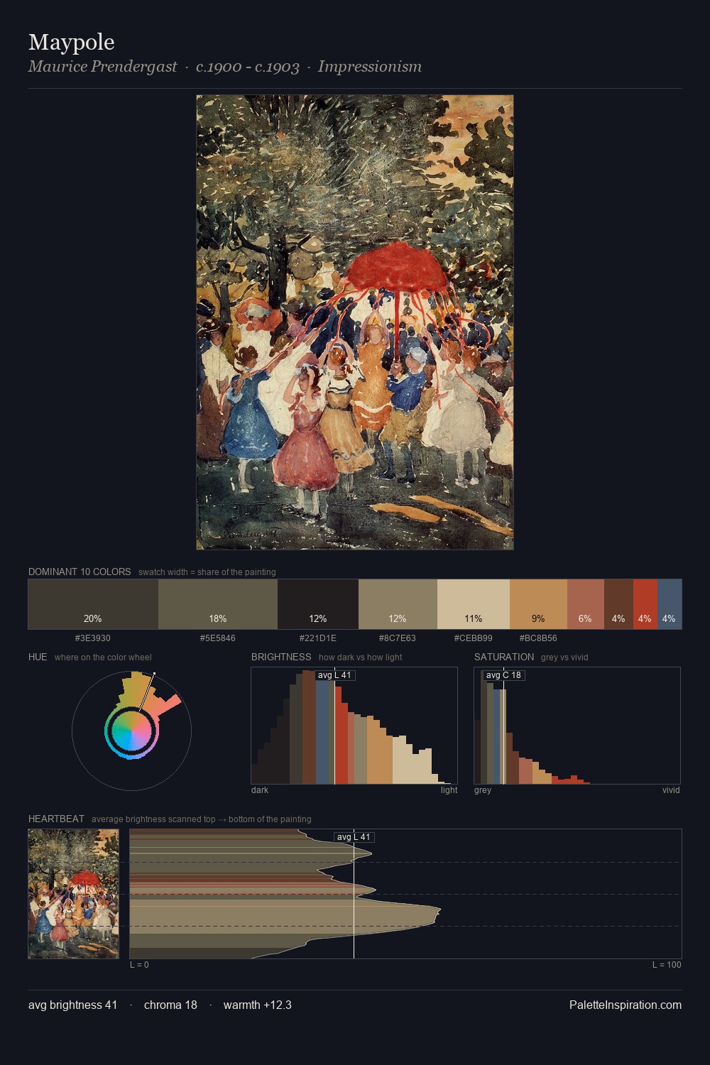
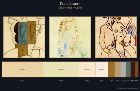
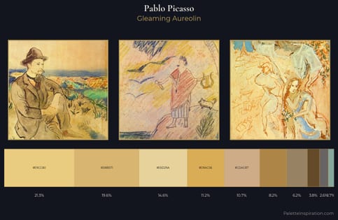
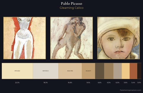
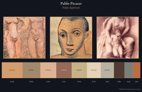
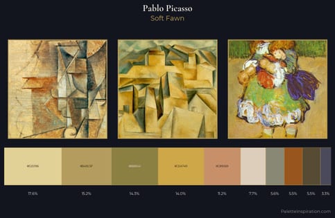
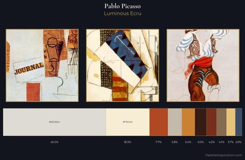
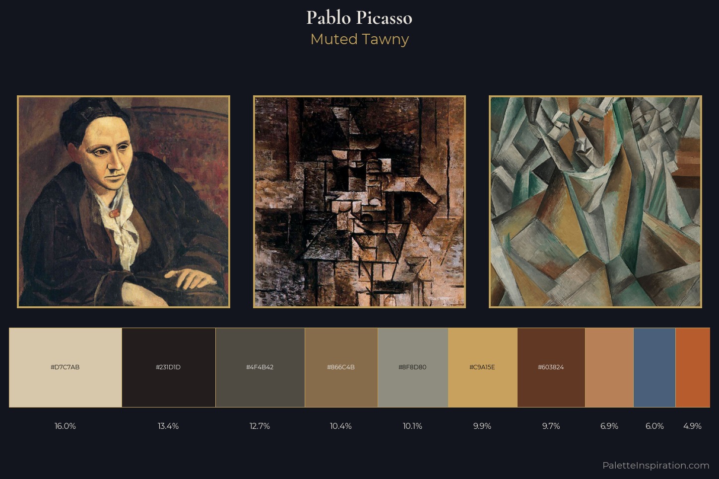
Pablo Picasso sits in the centre of the value range, lending the palette a sense of even, sustained light. Warm and cool tones are held in careful balance - neither family dominates, creating tension and resolution simultaneously. All colours lean toward grey, building depth through value rather than colour punch. #B75C2C delivers the chromatic peak at only 4.9% - a small shot of colour with outsized visual impact. A value spread of 60 units gives the palette both depth and air - shadows are genuinely dark, lights genuinely light. Taken together, these qualities constitute Pablo Picasso's chromatic voice - distinctive enough to be read across an entire body of work.
Example use cases
- ceramics & pottery
- boutique hospitality
- menswear
- heritage food brands
- craft & artisan brands
I Love This!
Use This Palette
Copy, export, or download for your project
Copy, export, or download for your project
Copy:
Download:
Share: