Pablo Picasso Palette 10

Palette Analysis
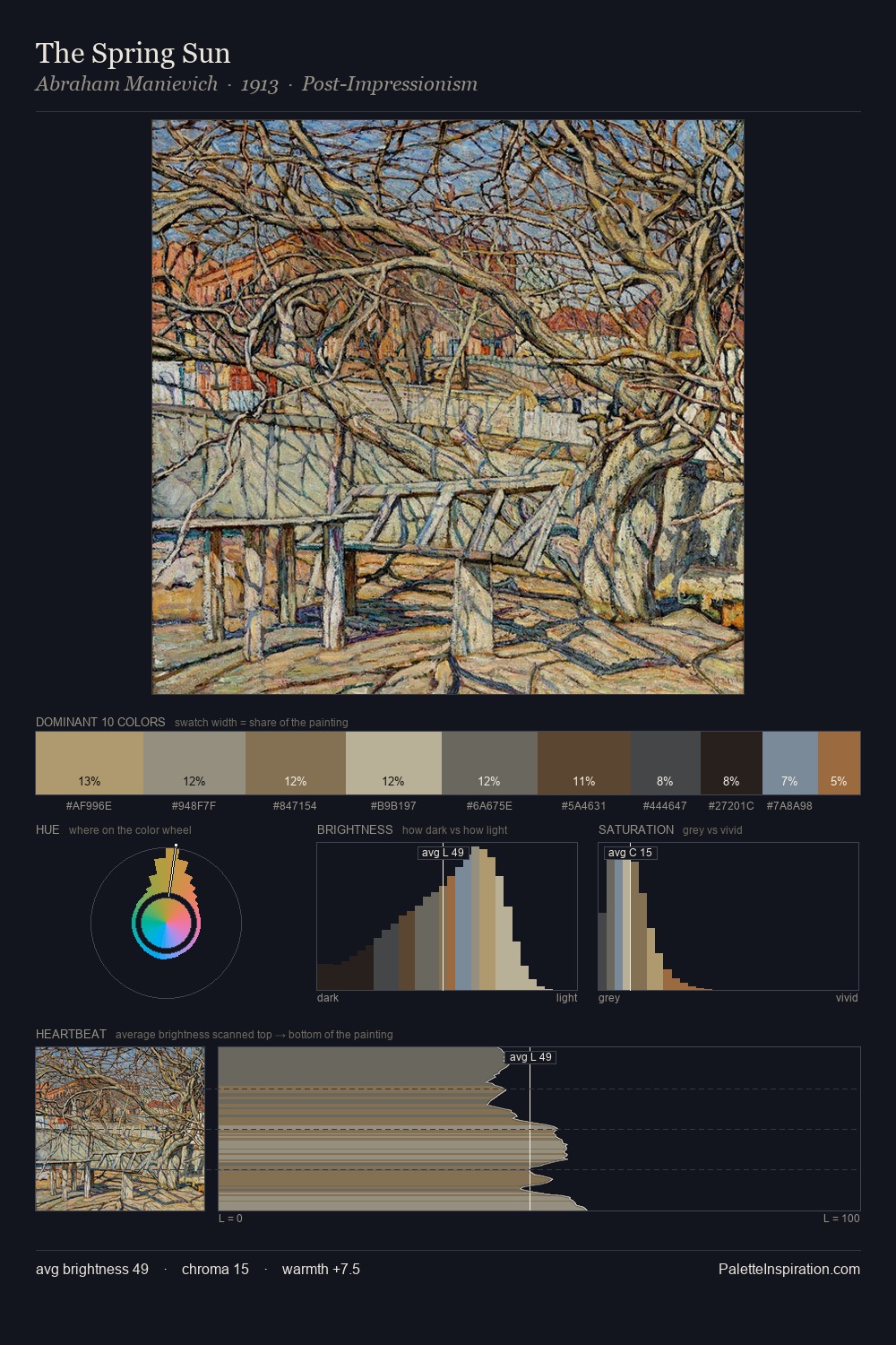
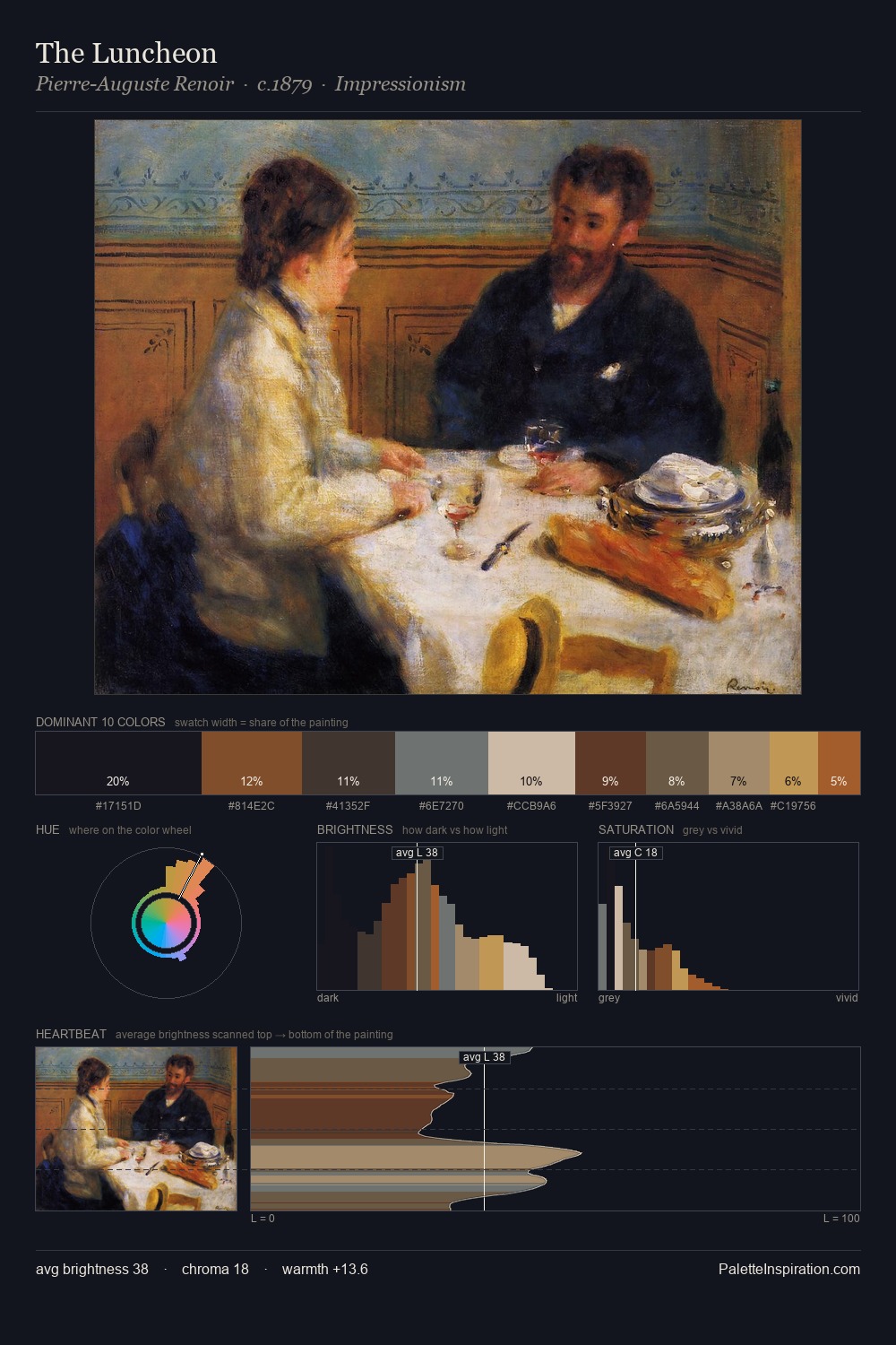
Pablo Picasso occupies the comfortable middle of the value scale, avoiding both extremes to hold the eye in a sustained middle grey. Cool tones set the register here - the blues and greens easily outweigh any warm accents. Muted throughout, the palette achieves its effects through value and temperature rather than chromatic force. The most saturated colour, #6A4633, is reserved to 6.1% of the surface, where it acts as a focal punctuation. 59 units of value range underpin the palette's structural clarity: the eye always knows where light falls. High luminosity and cool temperature suggest the plein-air condition: unfiltered daylight and open sky. Palette 10 sits within the larger chromatic argument that Pablo Picasso's complete body of work advances.
Example use cases
- museums & galleries
- academic publishing
- heritage brands
- auction houses
- exhibition design
I Love This!
Copy, export, or download for your project