Pablo Picasso Palette 11
Muted Vermillion
Muted Deliberately desaturated - chroma pulled toward gray, the restraint of tonal painting.
Vermillion Brilliant red-orange - the classic mercury sulfide pigment, vivid and warm.

Palette Analysis
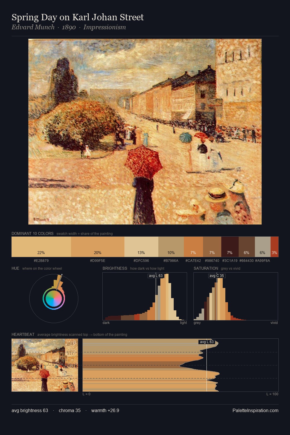
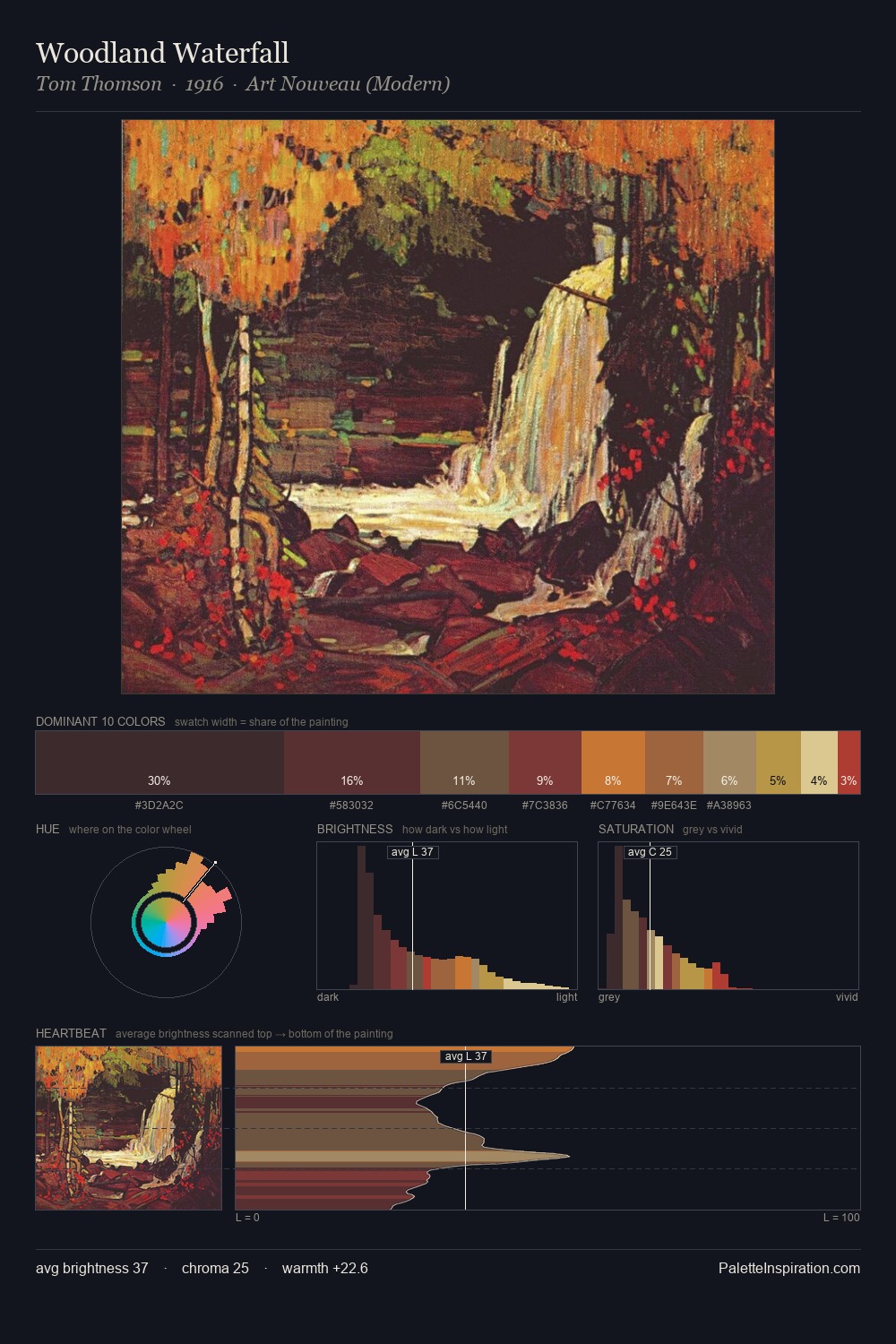
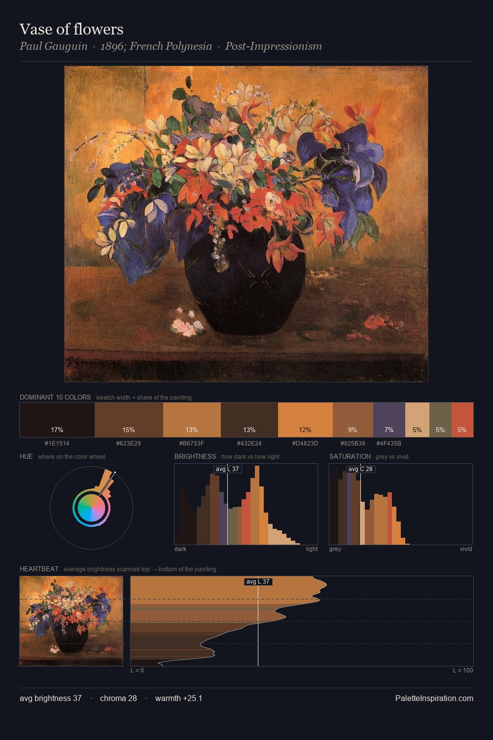
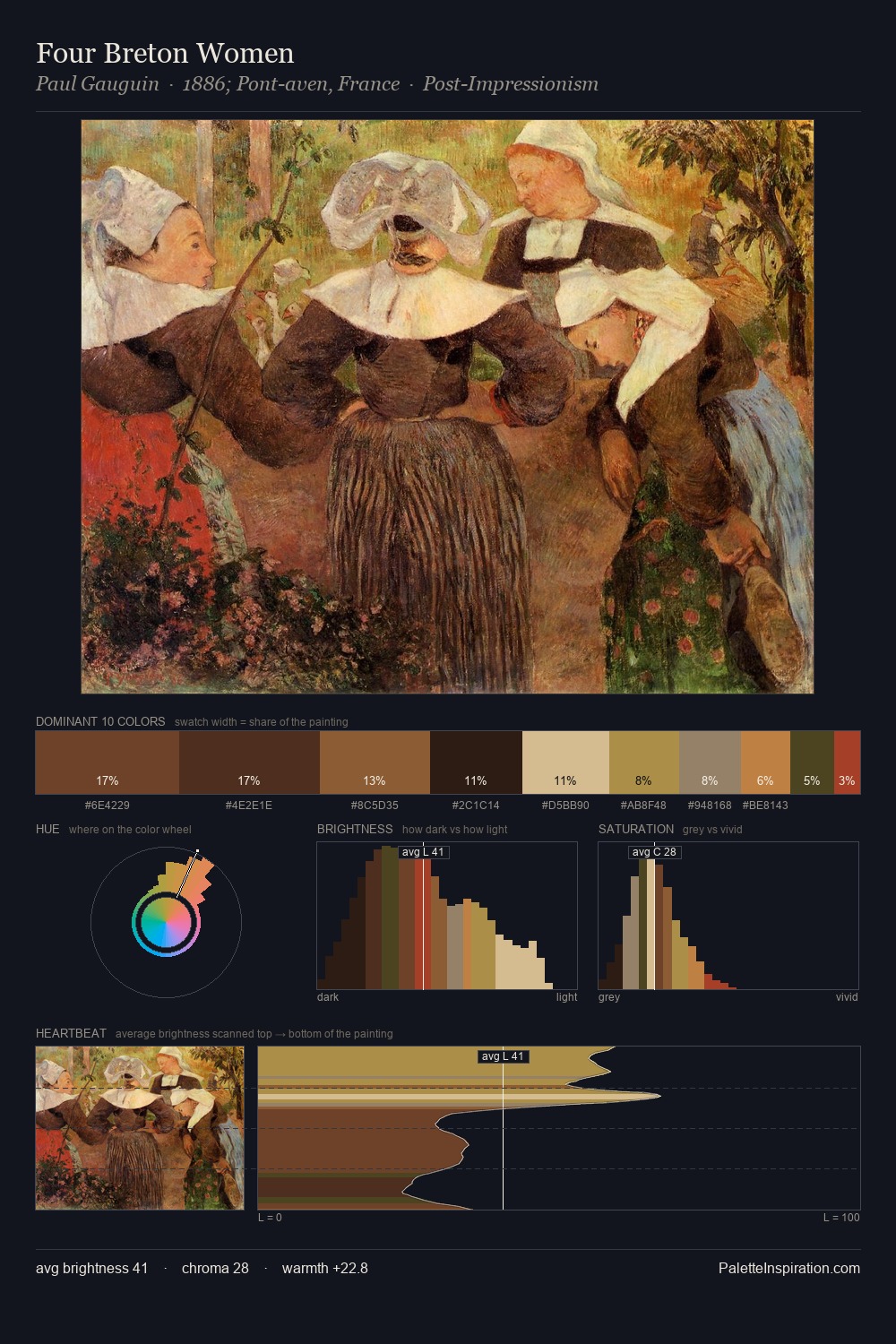
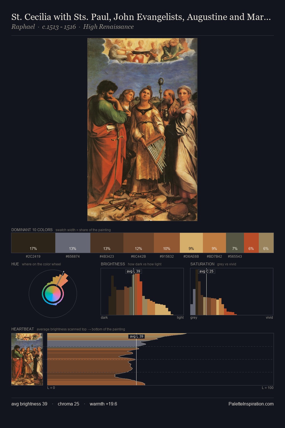
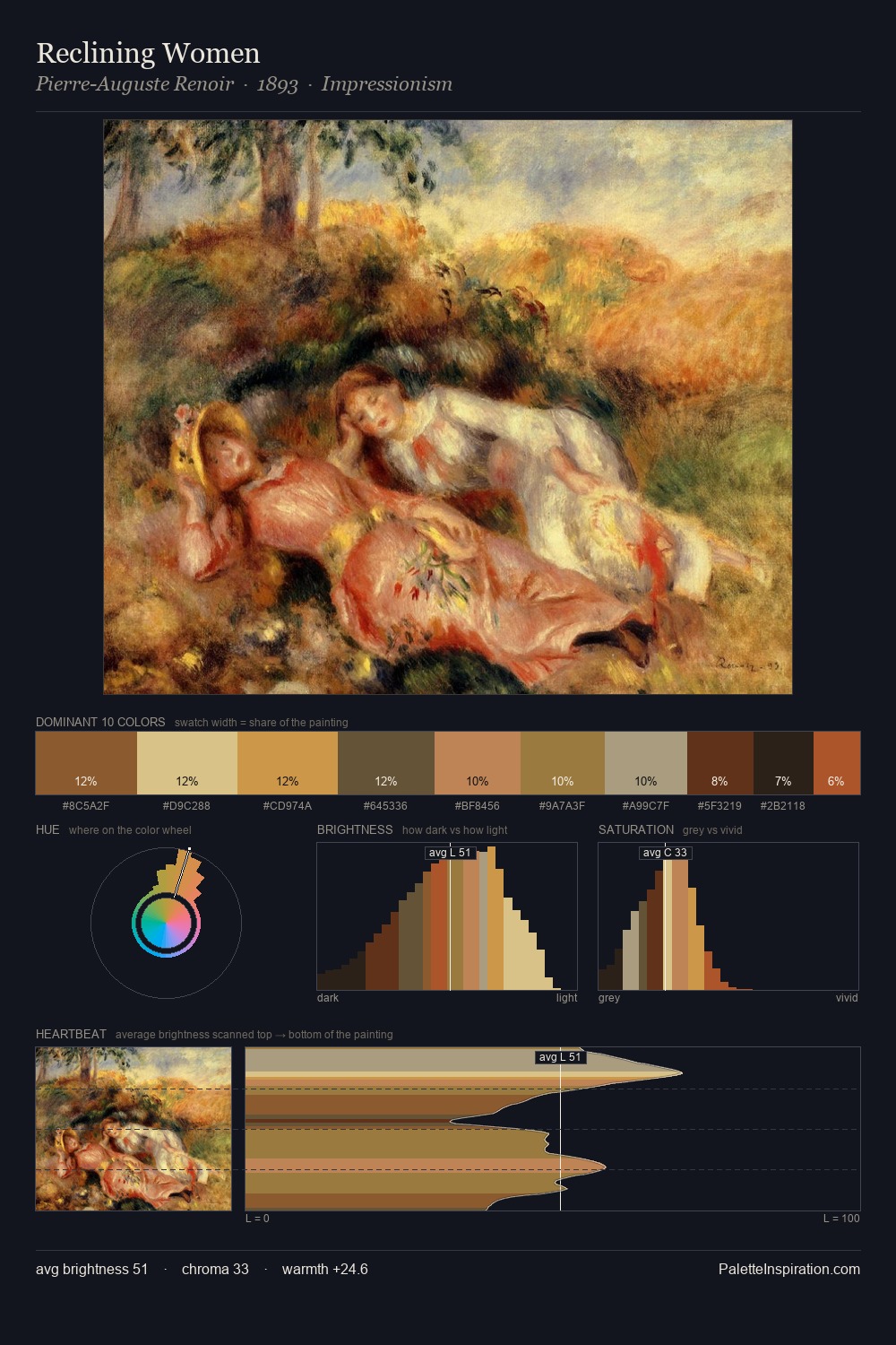
Pablo Picasso distributes its values across the middle register, creating harmony without high contrast. Pablo Picasso orchestrates warmth above all else - reds, ambers, and siennas take the lead. Mid-saturation across the board: the palette has colour character without chromatic excess. Only 10.0% is devoted to #E0B483, yet that small allocation delivers the palette's entire chromatic tension. Value range is moderate at 53 units - enough contrast for legibility, not so much as to fragment the tonal unity. Pablo Picasso's palette 11 carries its own internal logic while remaining in conversation with the artist's broader colour intelligence.
Example use cases
- publishing
- corporate identity
- consumer apps
- hospitality
- design agencies
I Love This!
Use This Palette
Copy, export, or download for your project
Copy, export, or download for your project
Copy:
Download:
Share: