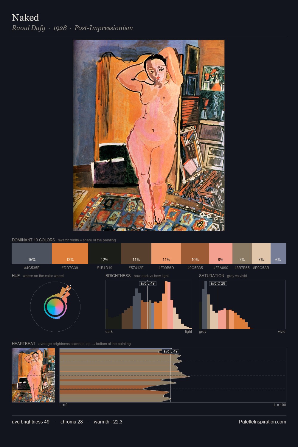
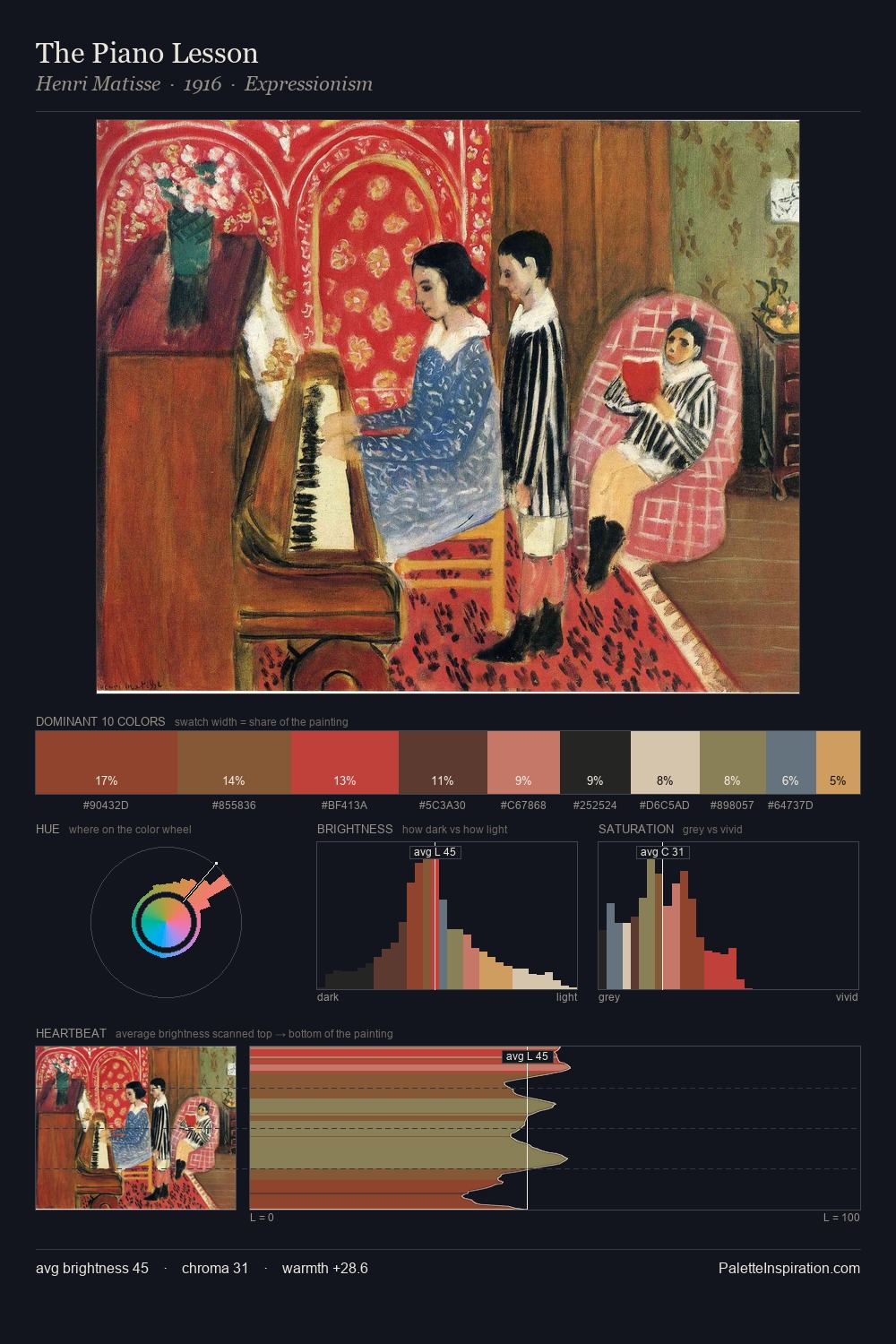
Pablo Picasso Palette 7

Palette Analysis
The high-key values of Pablo Picasso give it an effulgent, almost bleached quality. Warm hues command this palette; Pablo Picasso favours the reds, oranges, and yellows of firelight and earth. Chroma hovers near zero; colour declares itself through subtle shifts in hue rather than outright saturation. 28.3% of the palette belongs to #E7DBC7, a concentration that makes it the unmistakable visual centre. #CD7079 delivers the chromatic peak at only 1.1% - a small shot of colour with outsized visual impact. 64 units of value range underpin the palette's structural clarity: the eye always knows where light falls. Pablo Picasso's palette 7 carries its own internal logic while remaining in conversation with the artist's broader colour intelligence.
Example use cases
- ceramics & pottery
- boutique hospitality
- menswear
- heritage food brands
- craft & artisan brands
I Love This!
Copy, export, or download for your project