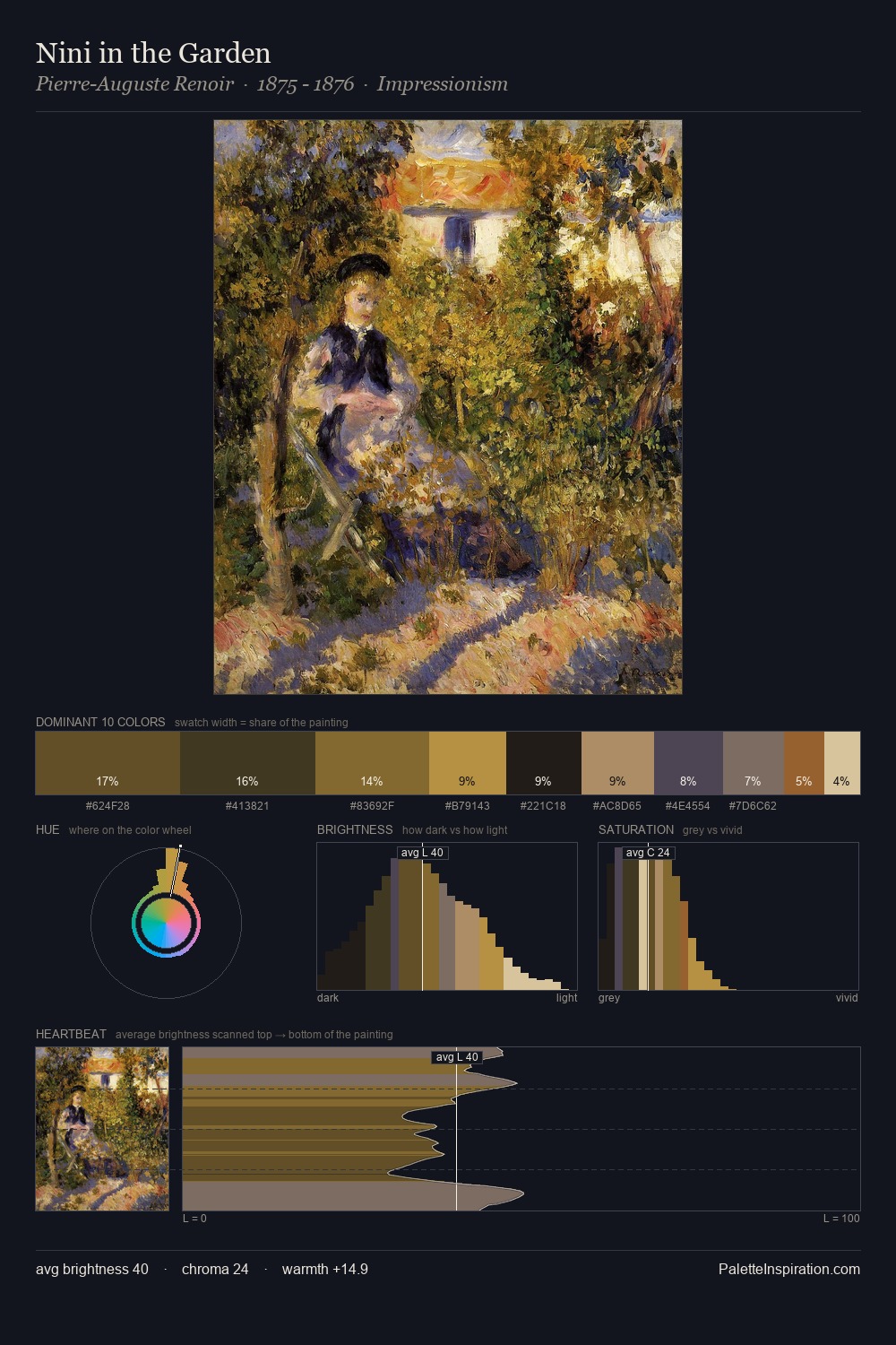
Pablo Picasso Palette 5

Palette Analysis
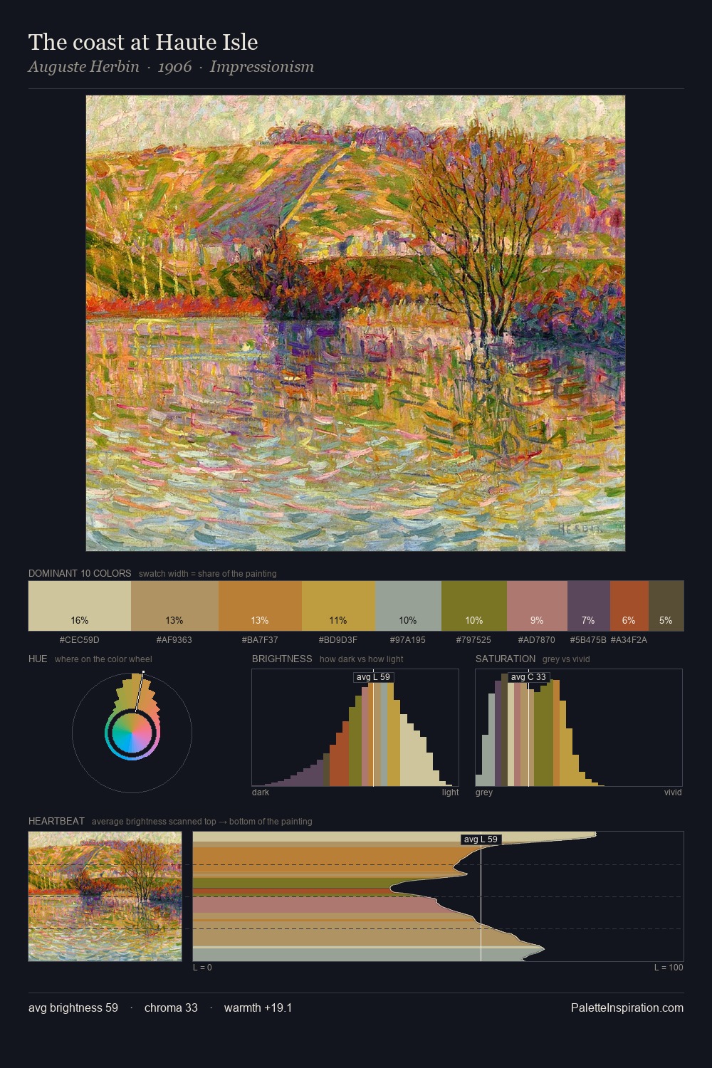
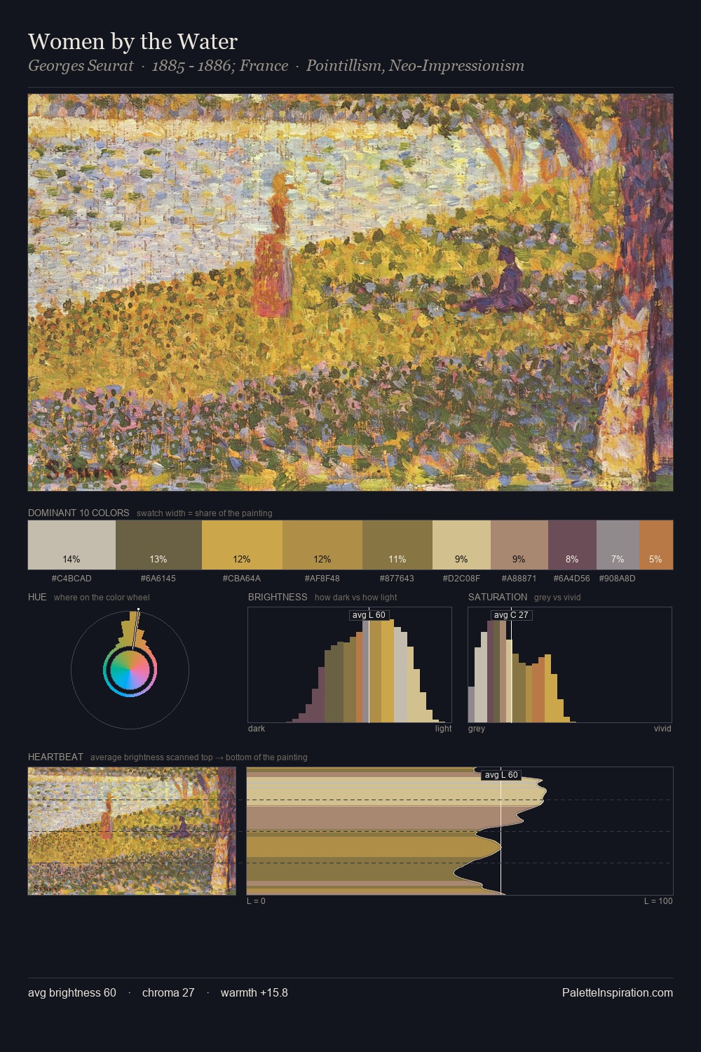
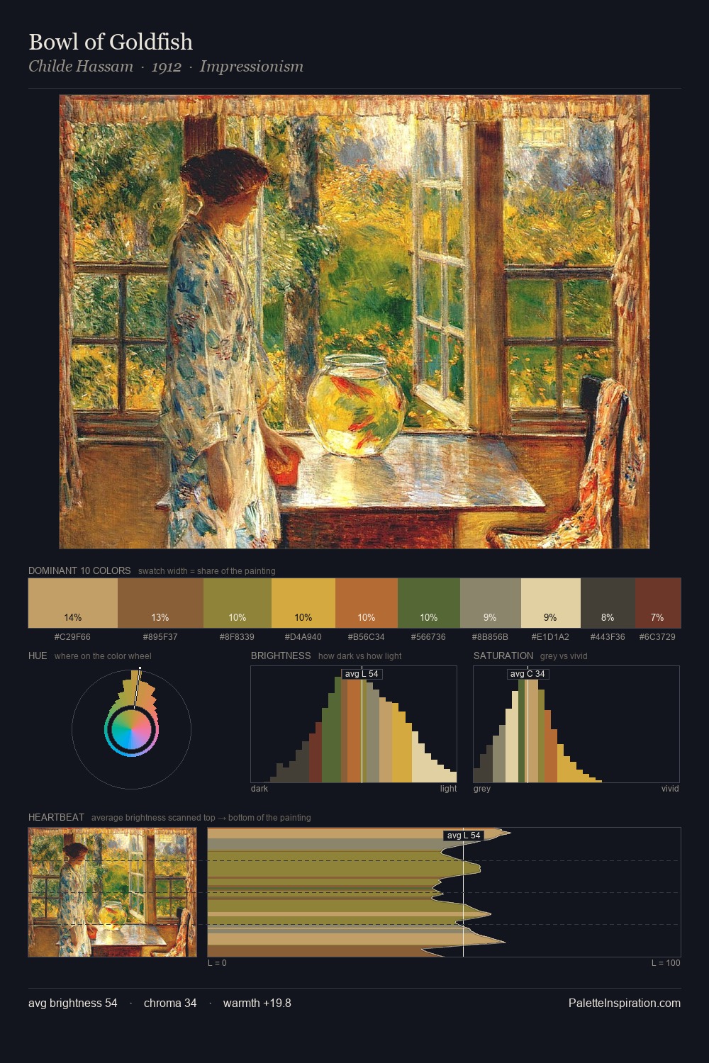
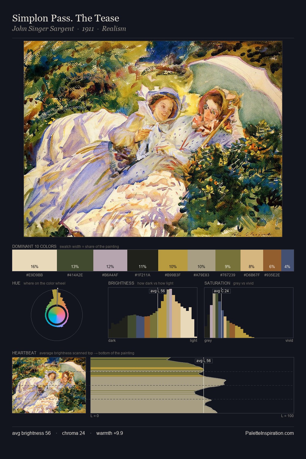
Light floods Pablo Picasso; the palette keeps values pale and airy across its range. Blues and teal-greys govern the palette, lending it an aquatic or atmospheric quality. Colours are neither washed out nor blazing; they occupy the productive middle ground of the chroma scale. The most saturated colour, #CEA749, is reserved to 14.0% of the surface, where it acts as a focal punctuation. The value range of 44 units sits in the comfortable middle: enough depth, enough light, neither extreme. The mid-to-high key, cool bias, and moderate chroma point to outdoor observation - sky and diffused daylight as the dominant light source. In the context of Pablo Picasso's full range of palettes, group 5 represents one movement in an ongoing chromatic dialogue.
Example use cases
- ceramics & pottery
- boutique hospitality
- menswear
- heritage food brands
- craft & artisan brands
I Love This!
Copy, export, or download for your project