Pablo Picasso Palette 19
Weathered Pewter
Weathered Worn and desaturated - the palette of aged surfaces, faded pigment, and patina.
Pewter Mid-tone warm gray - the color of pewter alloy, between silver and lead.

Palette Analysis
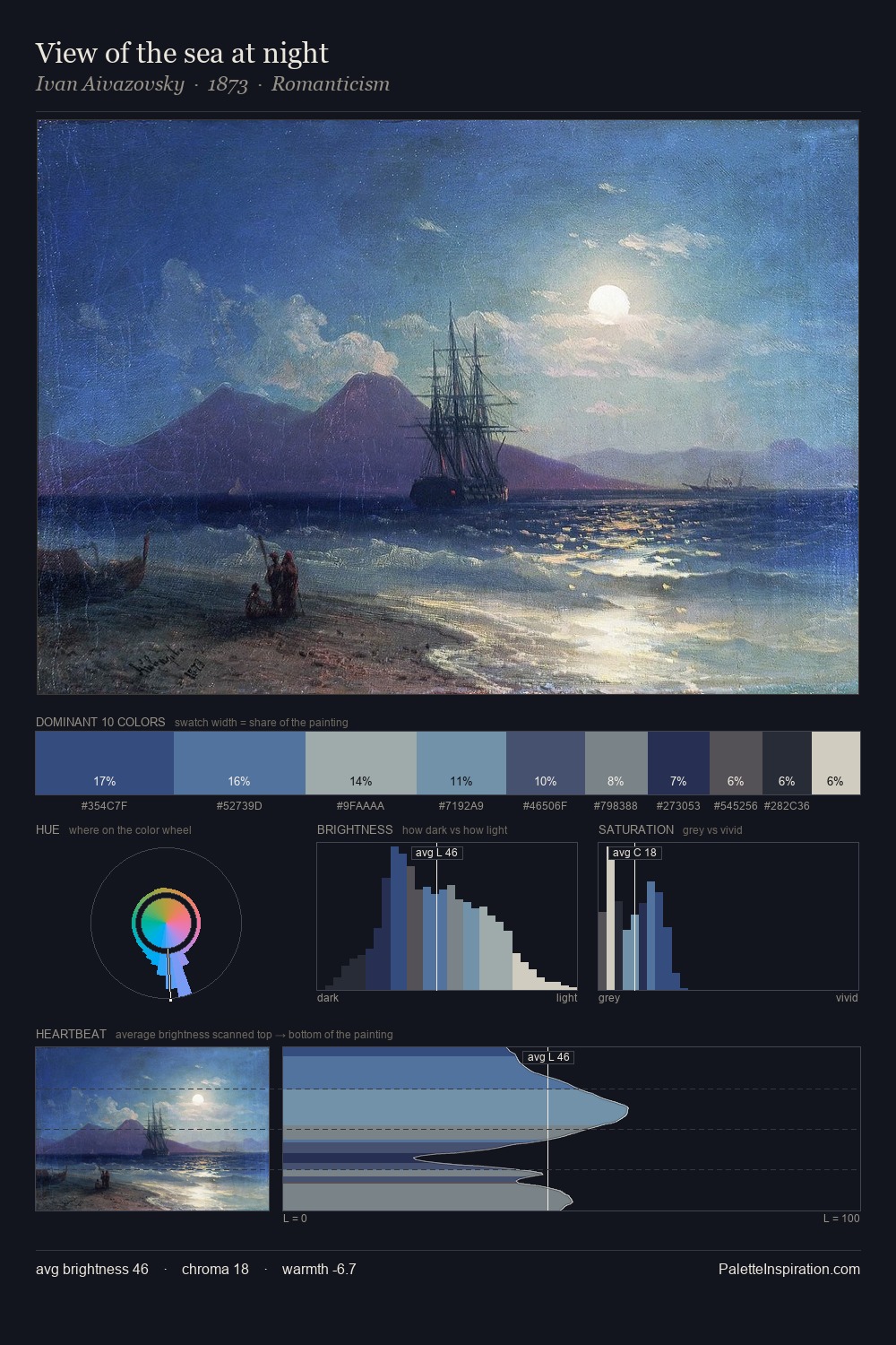
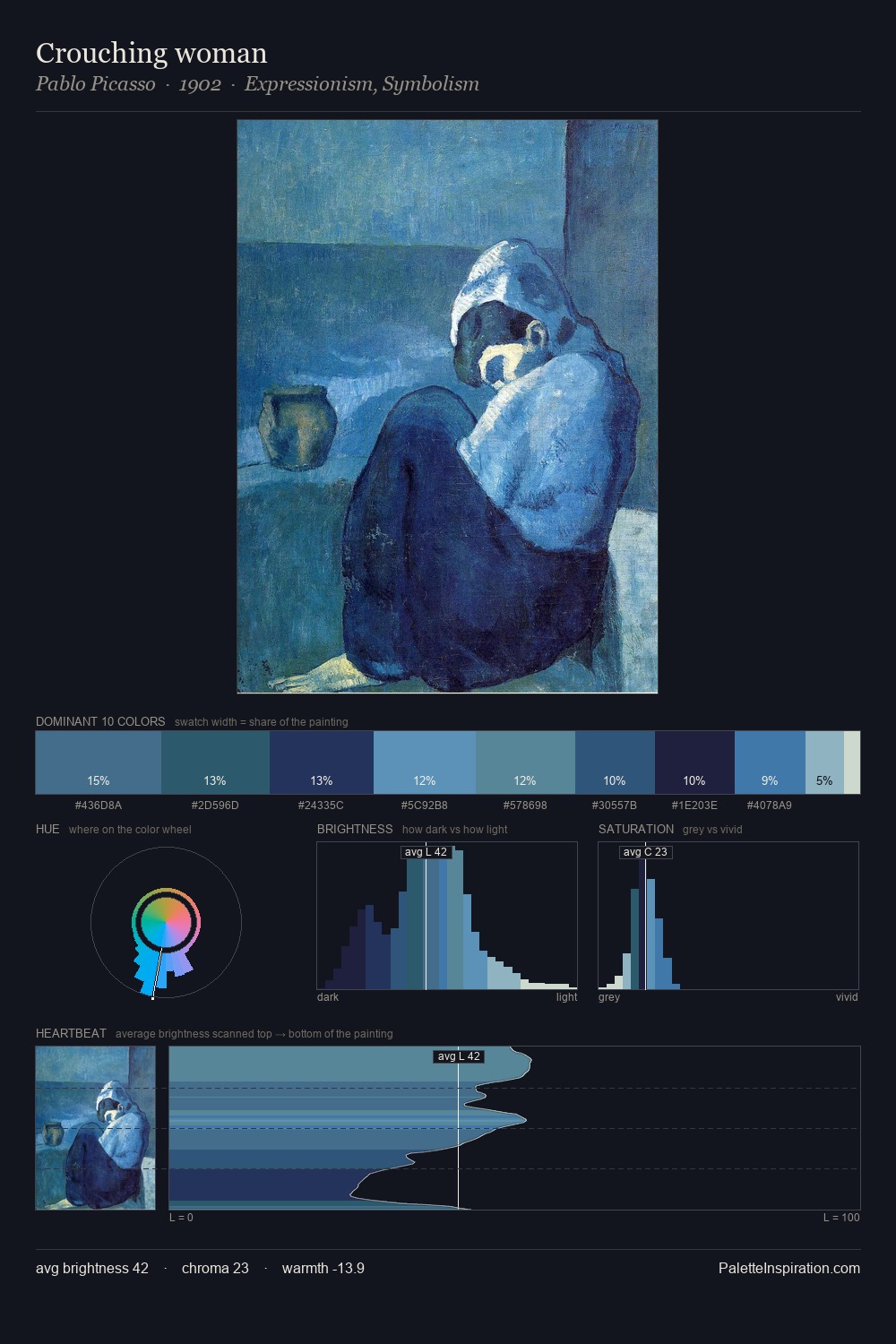
Pablo Picasso distributes its values across the middle register, creating harmony without high contrast. Pablo Picasso tilts toward cool - blues and silver-greys carry the structural weight. All colours lean toward grey, building depth through value rather than colour punch. #3C5586 delivers the chromatic peak at only 8.9% - a small shot of colour with outsized visual impact. At 56 units of value range, the palette has the tonal breadth to sustain complex spatial readings. The mid-to-high key, cool bias, and moderate chroma point to outdoor observation - sky and diffused daylight as the dominant light source. Palette 19 sits within the larger chromatic argument that Pablo Picasso's complete body of work advances.
Example use cases
- publishing
- corporate identity
- consumer apps
- hospitality
- design agencies
I Love This!
Use This Palette
Copy, export, or download for your project
Copy, export, or download for your project
Copy:
Download:
Share: