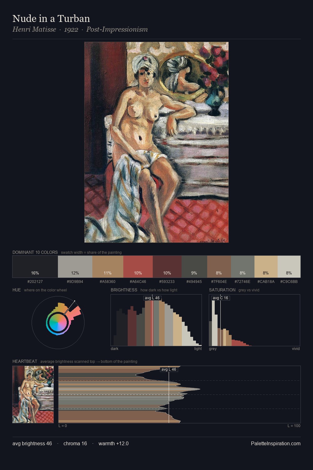
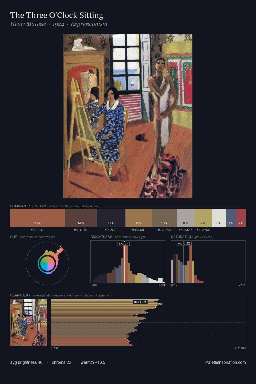
Pablo Picasso Palette 17

Palette Analysis
Values in Pablo Picasso rest in the mid-range - neither dramatically lit nor steeped in shadow. Pablo Picasso tilts toward cool - blues and silver-greys carry the structural weight. Chroma hovers near zero; colour declares itself through subtle shifts in hue rather than outright saturation. 30.2% of the palette belongs to #21252E, a concentration that makes it the unmistakable visual centre. The most saturated colour, #B05646, is reserved to 1.8% of the surface, where it acts as a focal punctuation. The value range spans 55 units across the palette, providing the full gamut from deep shadow to near-white and ensuring clear tonal hierarchy. The palette has the character of outdoor light: cool, mid-bright, with colour rendered faithfully rather than expressively. Pablo Picasso's palette 17 carries its own internal logic while remaining in conversation with the artist's broader colour intelligence.
Example use cases
- publishing
- corporate identity
- consumer apps
- hospitality
- design agencies
I Love This!
Copy, export, or download for your project