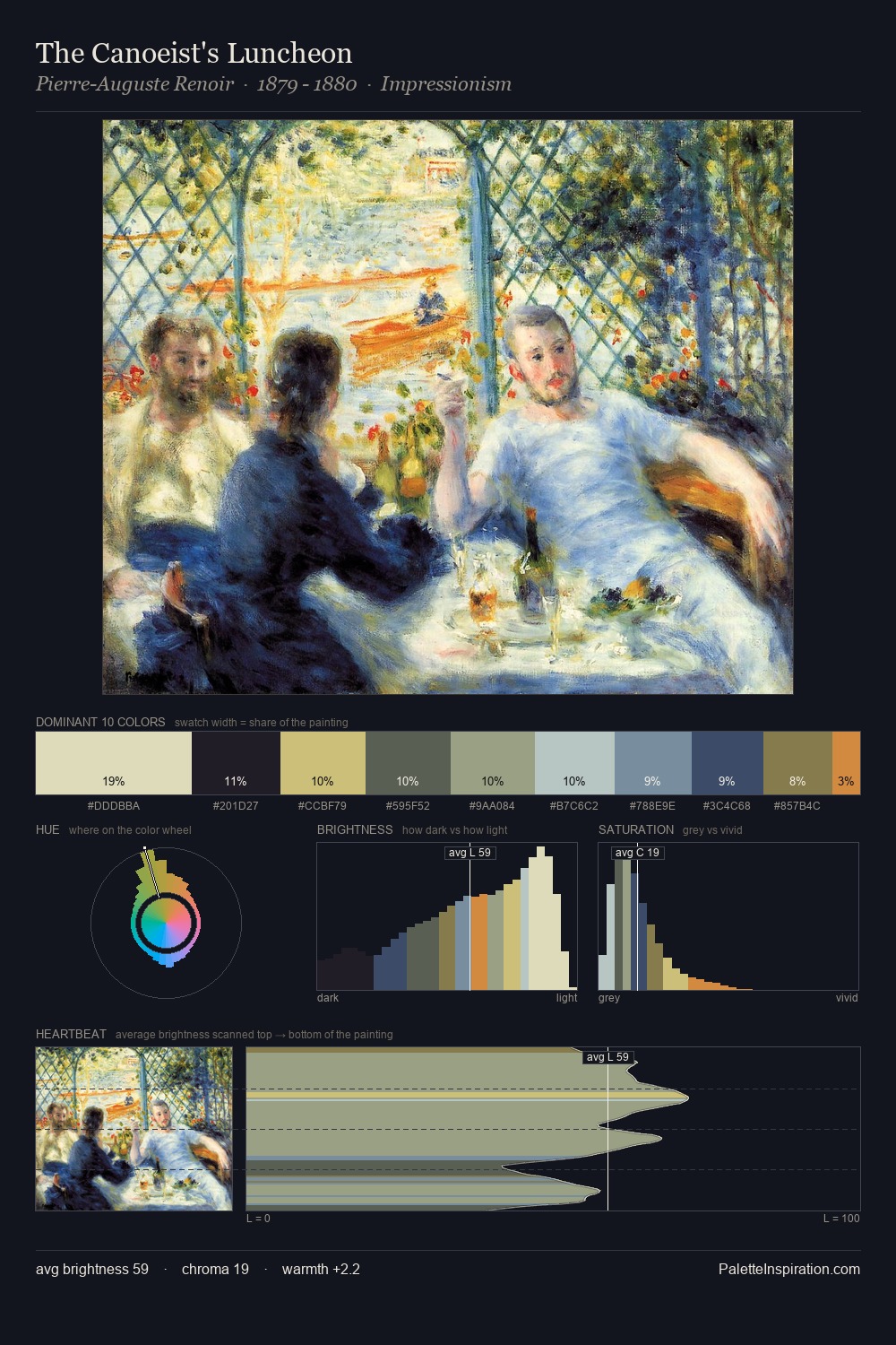
Pablo Picasso Palette 16
Subdued Ash
Subdued Held back from full expression - moderate values, restrained chroma, controlled.
Ash Mid cool-gray - the neutral residue of fire, between white and charcoal.

Palette Analysis
Pablo Picasso sits in the centre of the value range, lending the palette a sense of even, sustained light. Blues and teal-greys govern the palette, lending it an aquatic or atmospheric quality. Saturation is deliberately withheld - the beauty here lies in the near-monochromatic gradations rather than colour difference. The most saturated colour, #354160, is reserved to 7.4% of the surface, where it acts as a focal punctuation. 54 units of value spread create a palette that is varied but unified - contrast in the service of harmony. High luminosity and cool temperature suggest the plein-air condition: unfiltered daylight and open sky. Palette 16 sits within the larger chromatic argument that Pablo Picasso's complete body of work advances.
Example use cases
- exhibition design
- foundation branding
- estate management
- art education
- museums & galleries
I Love This!
Use This Palette
Copy, export, or download for your project
Copy, export, or download for your project
Copy:
Download:
Share: