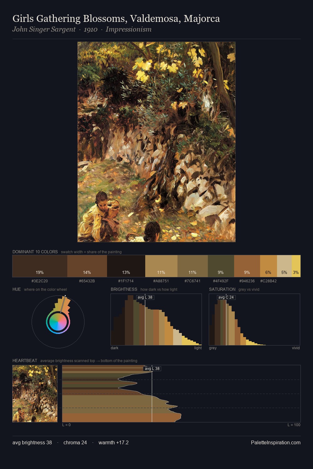
Otto Gustav Carlsund Palette 7
Veiled Fawn
Veiled Partially obscured light - mid-dark with a hazy, scrim-filtered quality.
Fawn Light warm tan - the color of a young deer, soft and golden-brown.

Palette Analysis
Otto Gustav Carlsund distributes its values across the middle register, creating harmony without high contrast. Otto Gustav Carlsund orchestrates warmth above all else - reds, ambers, and siennas take the lead. Mid-saturation across the board: the palette has colour character without chromatic excess. Only 6.8% is devoted to #E2BD37, yet that small allocation delivers the palette's entire chromatic tension. From deepest dark to palest light, the palette traverses 68 units of the value scale - a span that creates natural depth. This is palette 7 of Otto Gustav Carlsund's sequence - a single chapter in a chromatic story told across many works.
Example use cases
- publishing
- corporate identity
- consumer apps
- hospitality
- design agencies
I Love This!
Use This Palette
Copy, export, or download for your project
Copy, export, or download for your project
Copy:
Download:
Share: