Otto Gustav Carlsund Palette 2

Palette Analysis
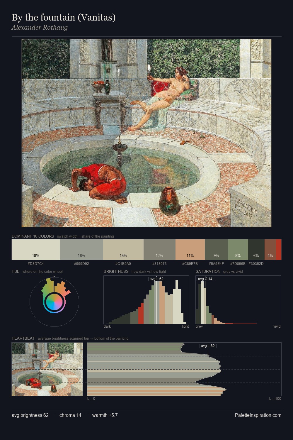
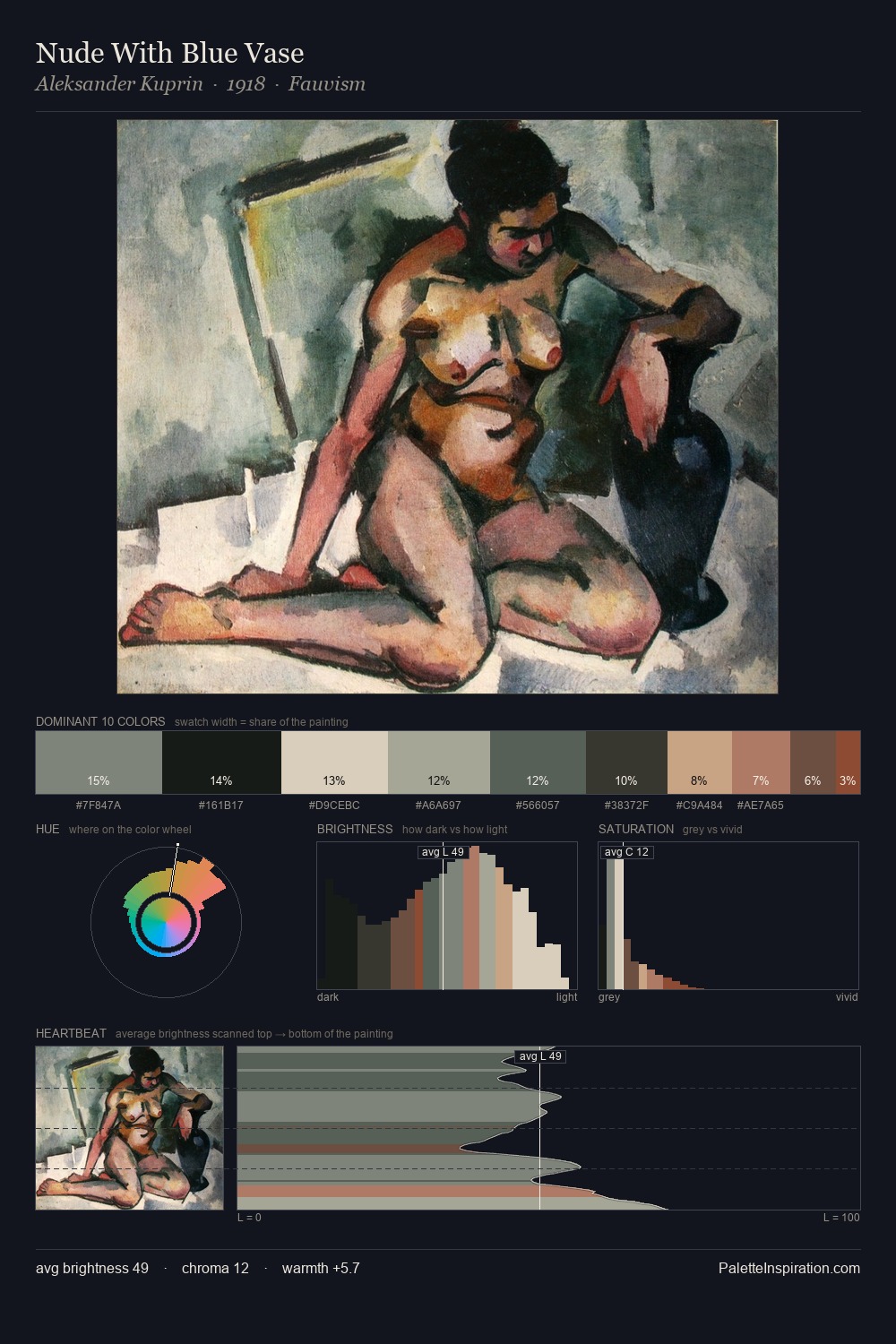
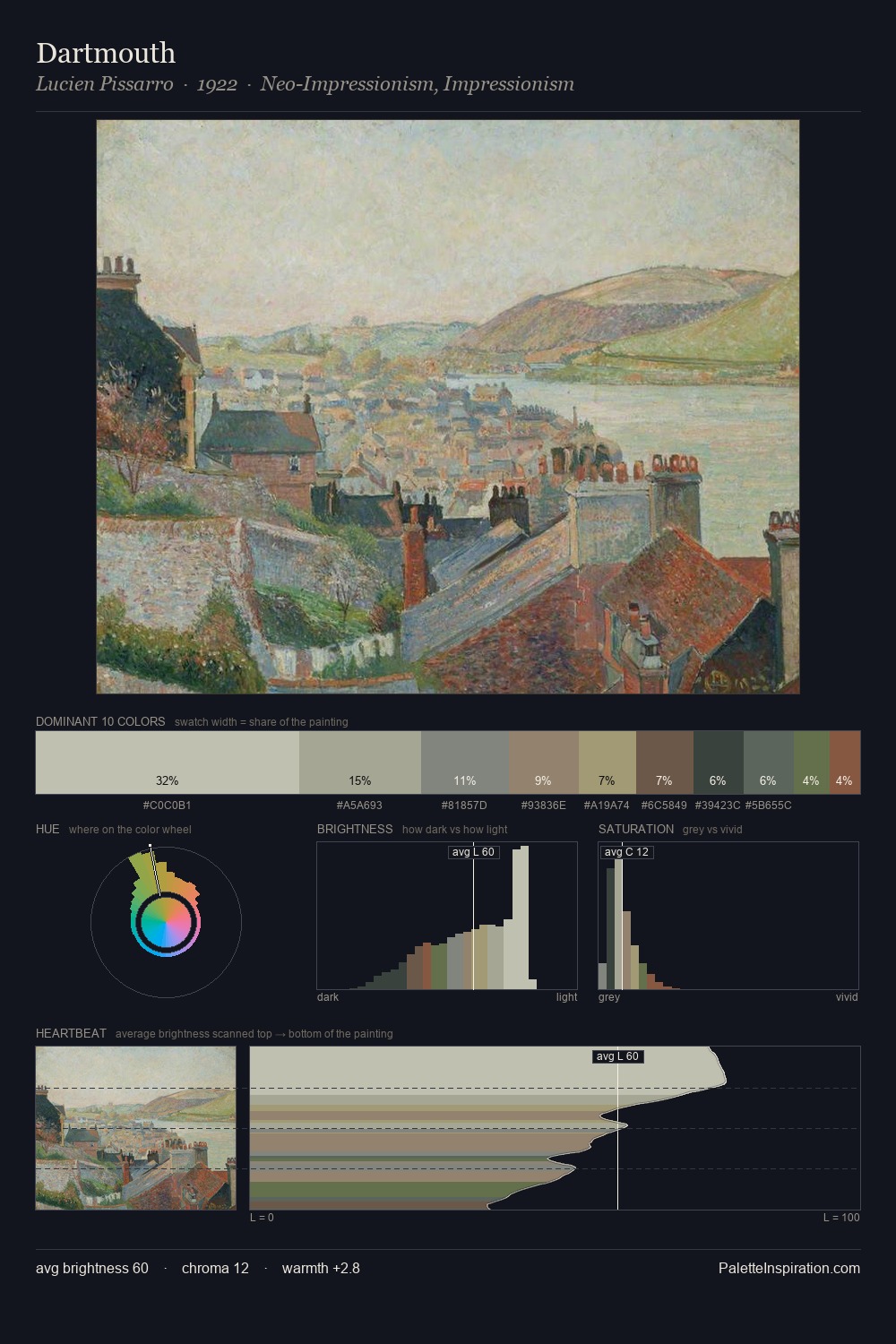
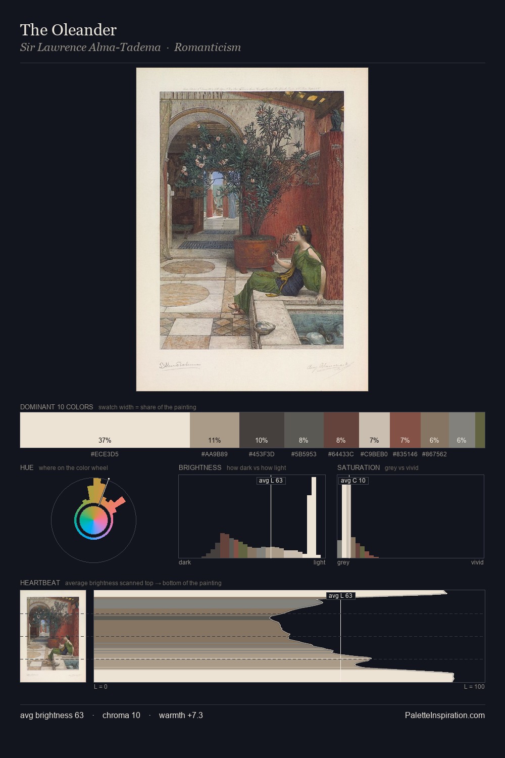
Otto Gustav Carlsund is strongly light-biased - shadow is suggested rather than declared. Cool hues prevail: blues, greens, and greys anchor the palette's emotional temperature. Chroma hovers near zero; colour declares itself through subtle shifts in hue rather than outright saturation. #D4D4C7 at 48.9% of the palette: an overwhelming presence that pulls all other colours into its gravitational field. The most saturated colour, #805A47, is reserved to 0.9% of the surface, where it acts as a focal punctuation. The value range of 51 units sits in the comfortable middle: enough depth, enough light, neither extreme. The palette has the character of outdoor light: cool, mid-bright, with colour rendered faithfully rather than expressively. In the context of Otto Gustav Carlsund's full range of palettes, group 2 represents one movement in an ongoing chromatic dialogue.
Example use cases
- florist branding
- event design
- real estate
- jewelry retail
- hospitality branding
I Love This!
Copy, export, or download for your project