Otto Gustav Carlsund Palette 4

Palette Analysis
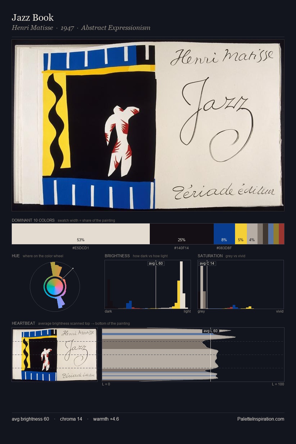
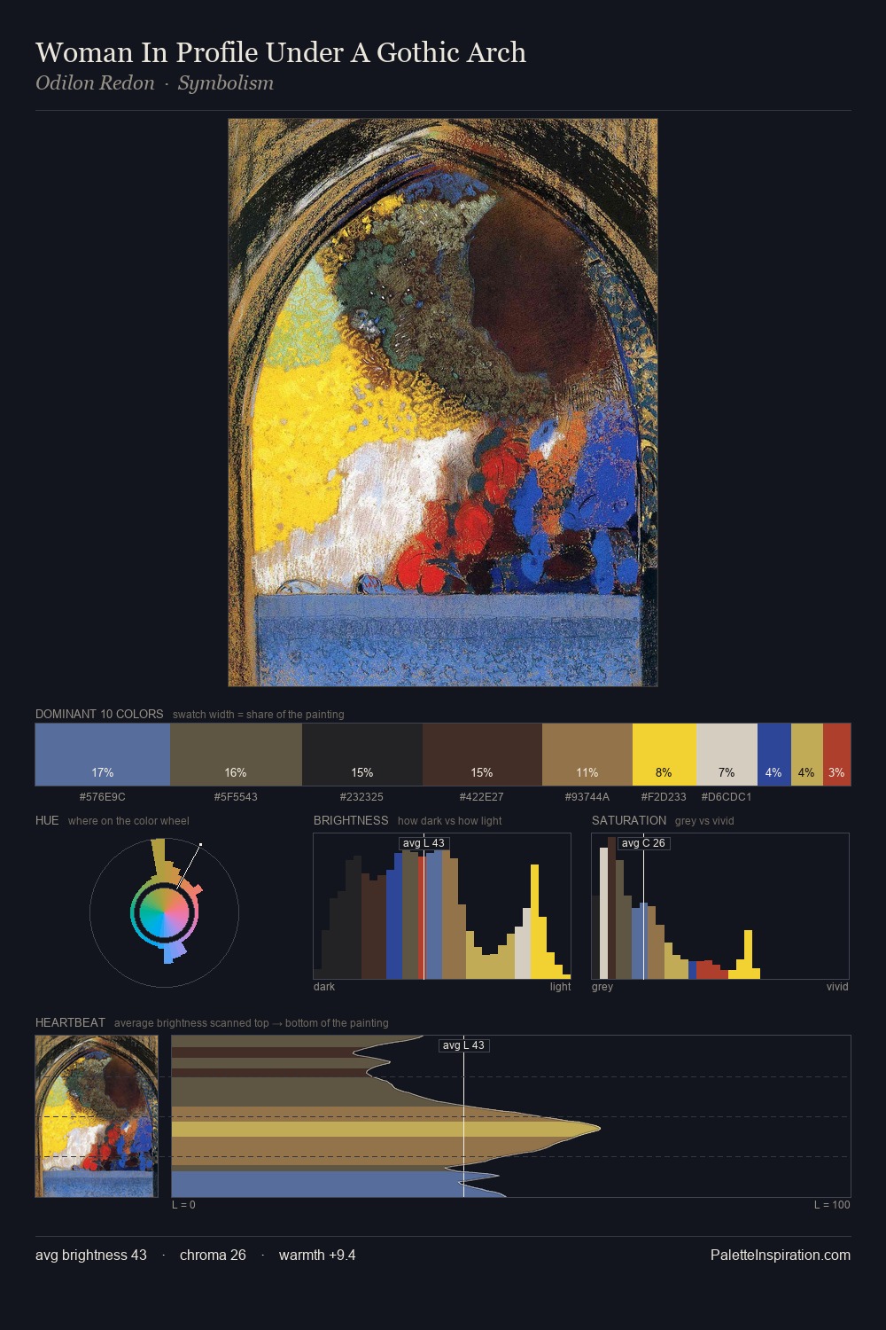
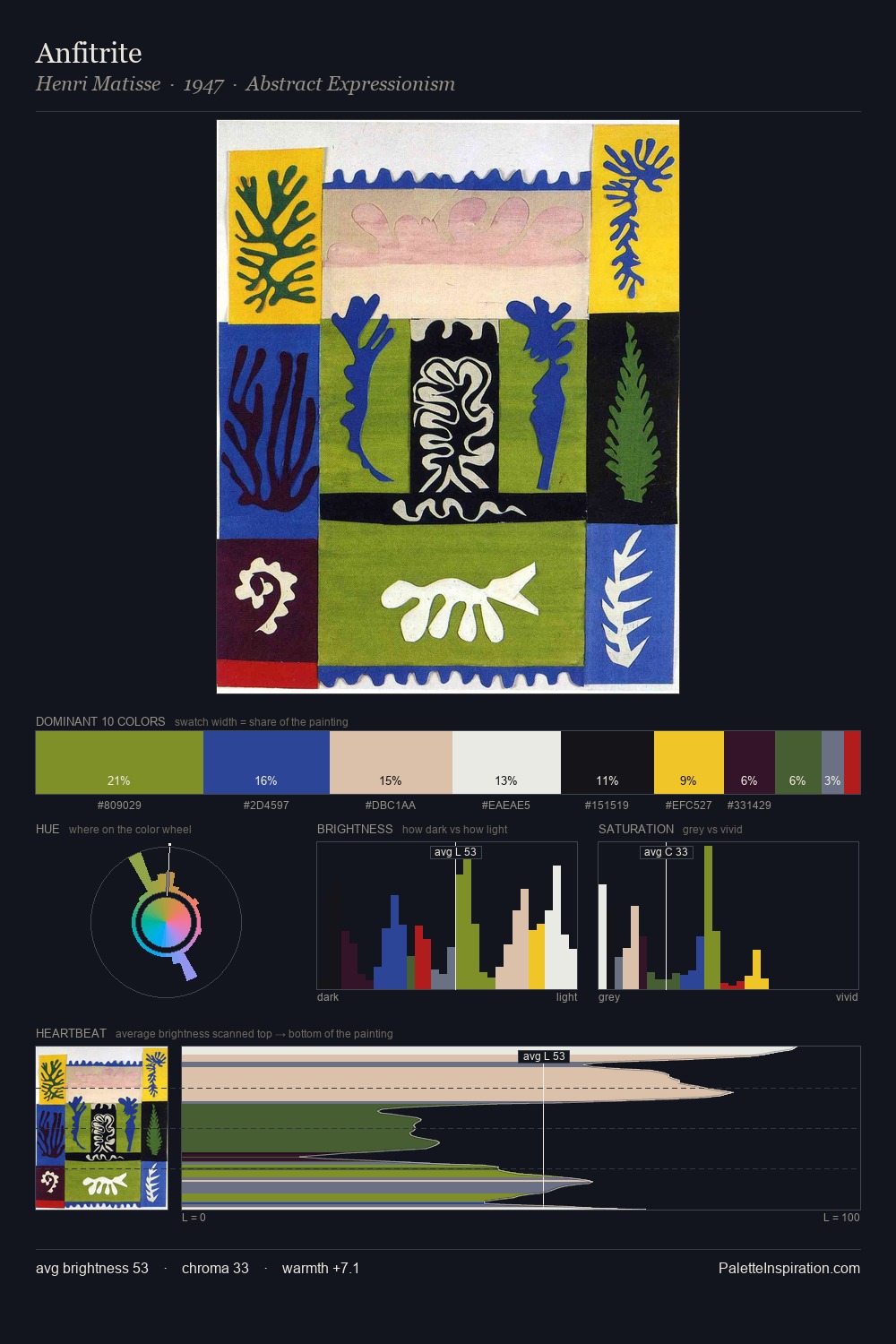
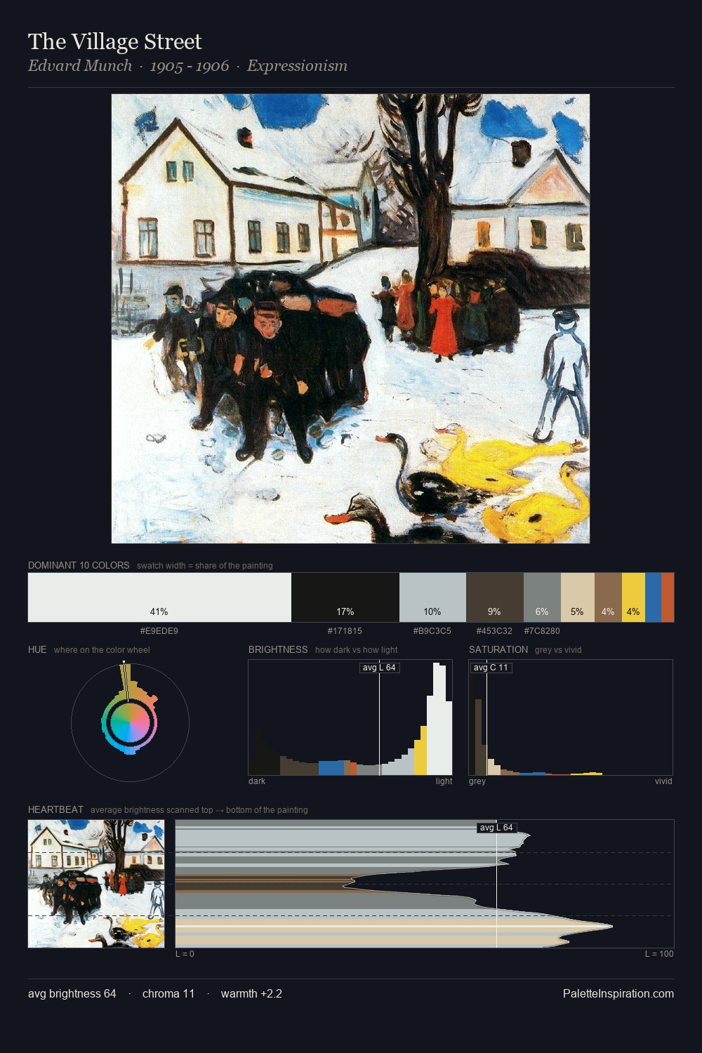
Otto Gustav Carlsund is high in key: pale, luminous, and filled with optical air. A distinctly cool atmosphere runs through this palette: sky, water, and mist given colour form. Chroma is kept low across all colours, producing the soft, enveloping quality that characterises tonal painting. A single dominant - #FCFCFA at 26.6% - sets the character of the whole composition. The most saturated colour, #134E97, is reserved to 2.2% of the surface, where it acts as a focal punctuation. The value range spans 81 units across the palette, providing the full gamut from deep shadow to near-white and ensuring clear tonal hierarchy. The palette has the character of outdoor light: cool, mid-bright, with colour rendered faithfully rather than expressively. Otto Gustav Carlsund's palette 4 carries its own internal logic while remaining in conversation with the artist's broader colour intelligence.
Example use cases
- boutique hospitality
- film production
- menswear
- art prints & posters
- heritage brands
I Love This!
Copy, export, or download for your project