Otto Gustav Carlsund Palette 6

Palette Analysis
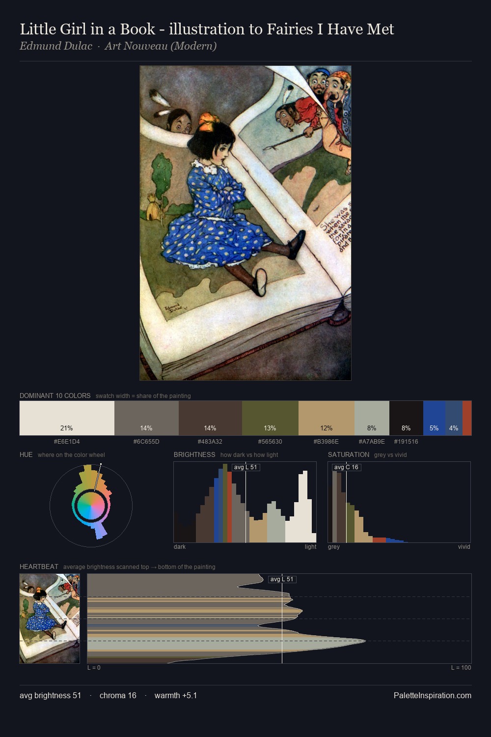
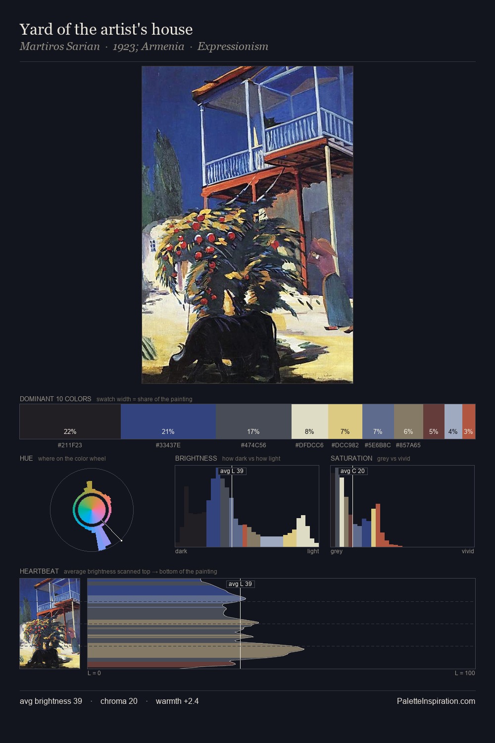
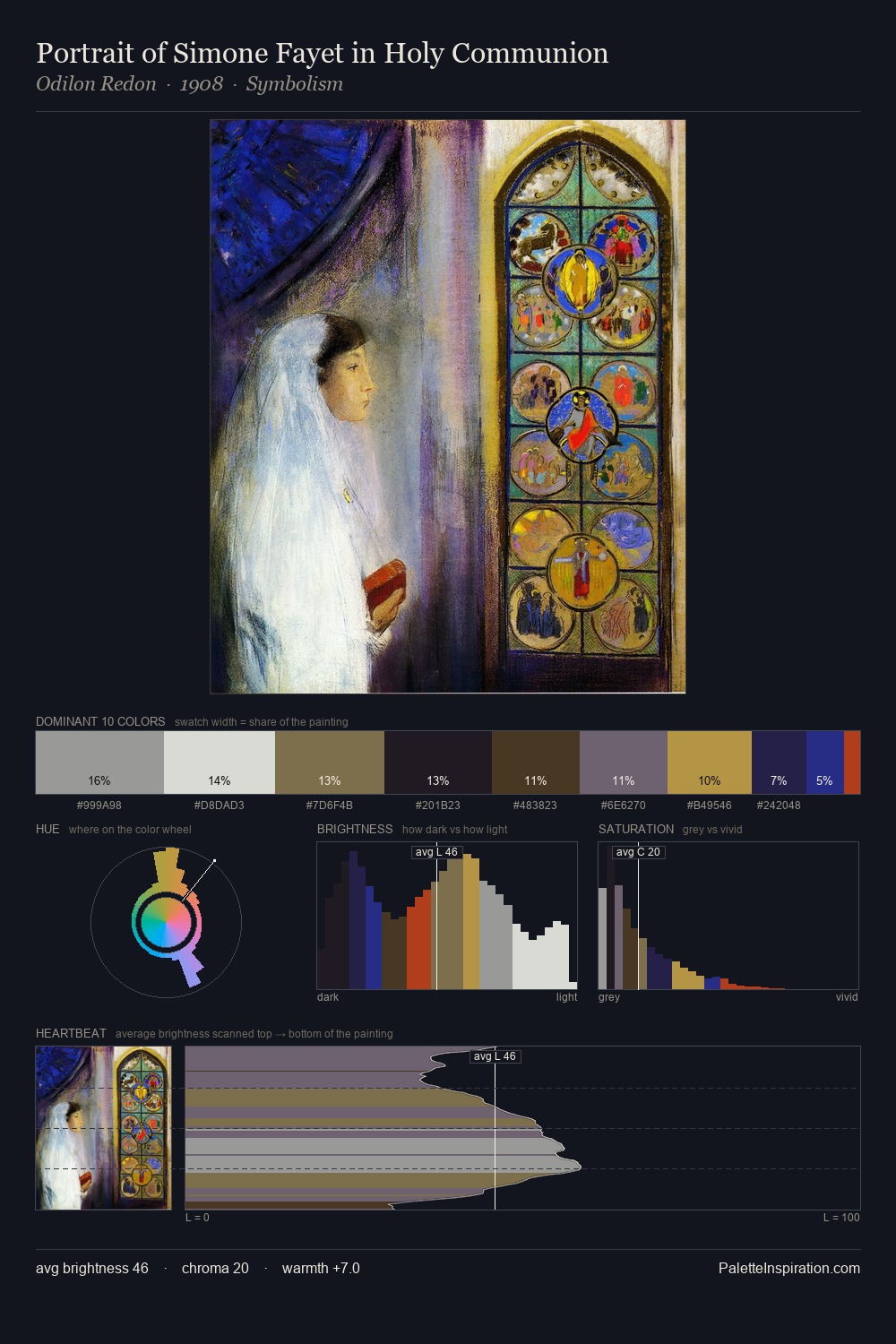
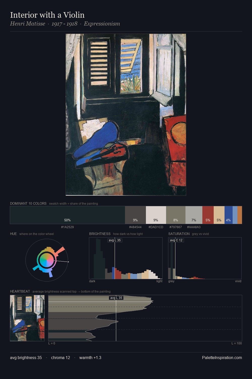
Otto Gustav Carlsund works in the upper reaches of the value scale, creating an atmosphere of brightness and expansiveness. Otto Gustav Carlsund tilts toward cool - blues and silver-greys carry the structural weight. All colours lean toward grey, building depth through value rather than colour punch. At 41.3%, #D6D6C8 functions less as a colour accent and more as a complete atmospheric environment. At 0.9%, #233664 carries the palette's sharpest chromatic charge: an accent that earns its place precisely because it is withheld. From deepest dark to palest light, the palette traverses 68 units of the value scale - a span that creates natural depth. The mid-to-high key, cool bias, and moderate chroma point to outdoor observation - sky and diffused daylight as the dominant light source. Otto Gustav Carlsund's palette 6 carries its own internal logic while remaining in conversation with the artist's broader colour intelligence.
Example use cases
- ceramics & pottery
- boutique hospitality
- menswear
- heritage food brands
- craft & artisan brands
I Love This!
Copy, export, or download for your project