Neoclassicism Palette 4
Gleaming Aureolin
Gleaming Bright and polished - high-key, often warm, suggesting reflective or luminous surfaces.
Aureolin Bright transparent yellow - a clear, luminous lemon-gold pigment hue.

Palette Analysis
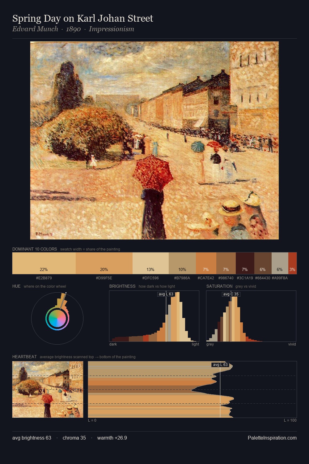
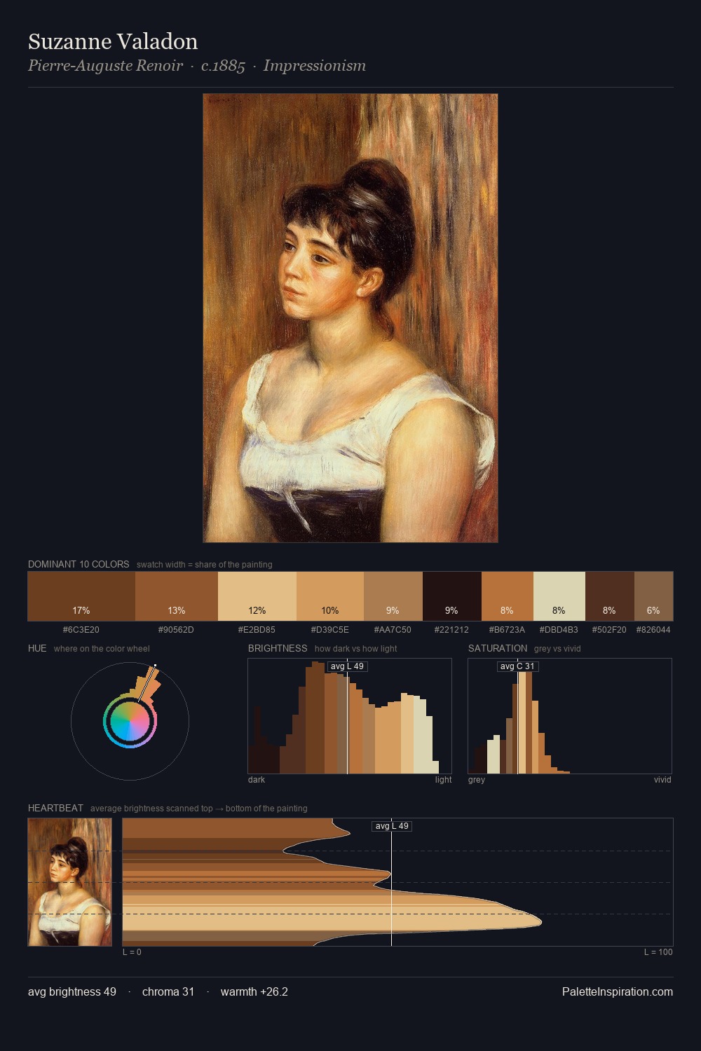
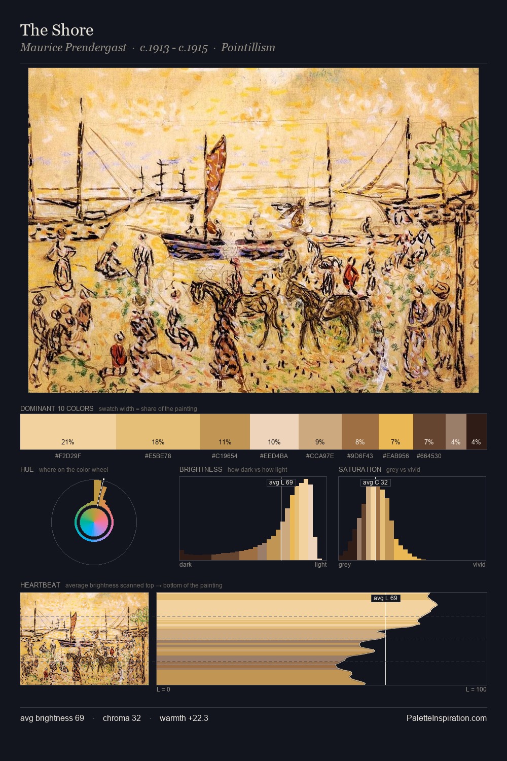
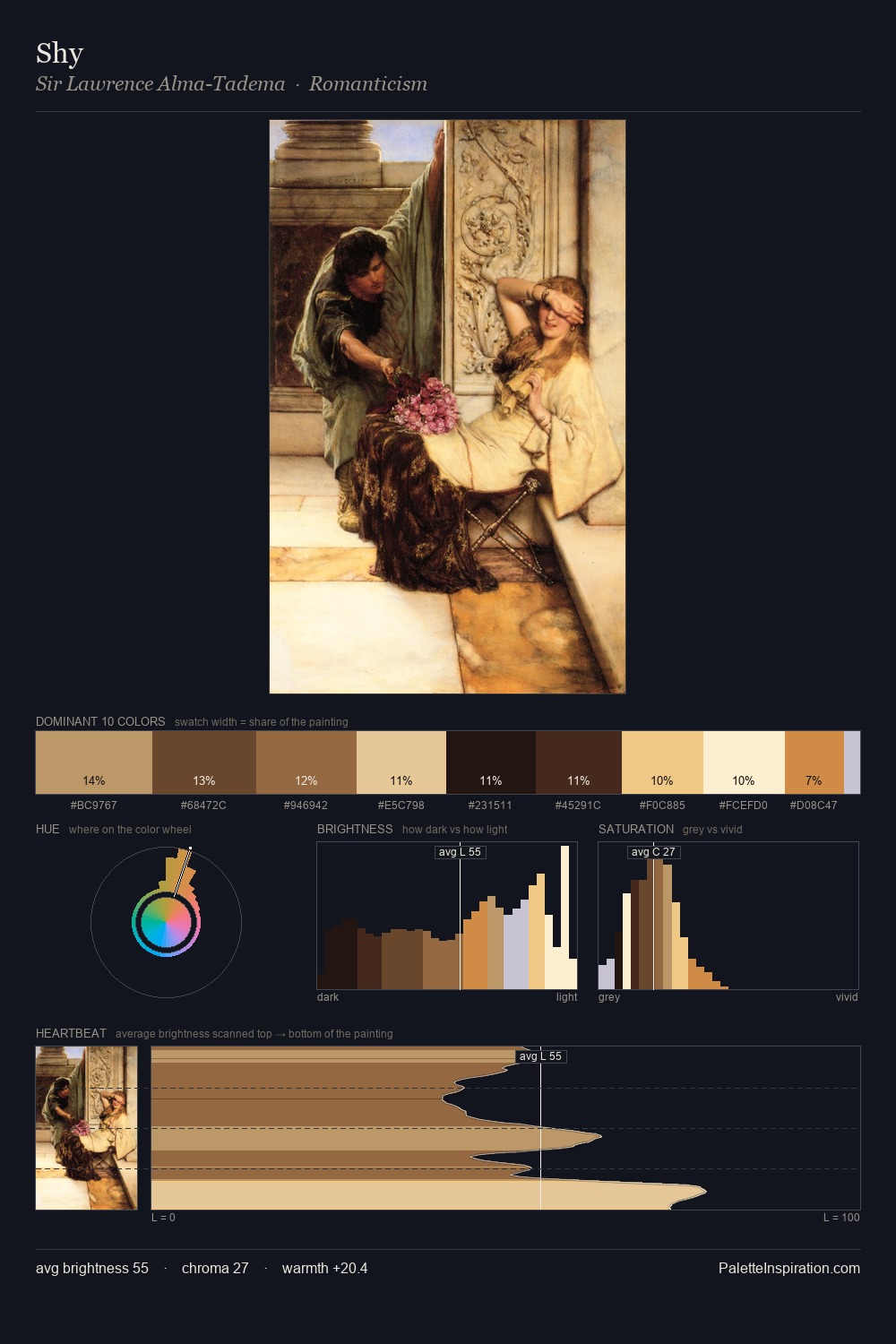
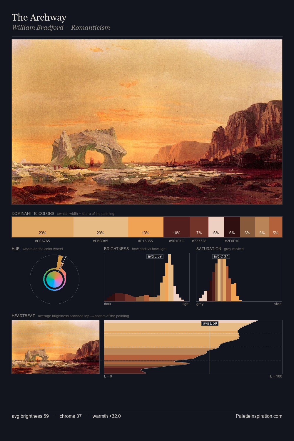
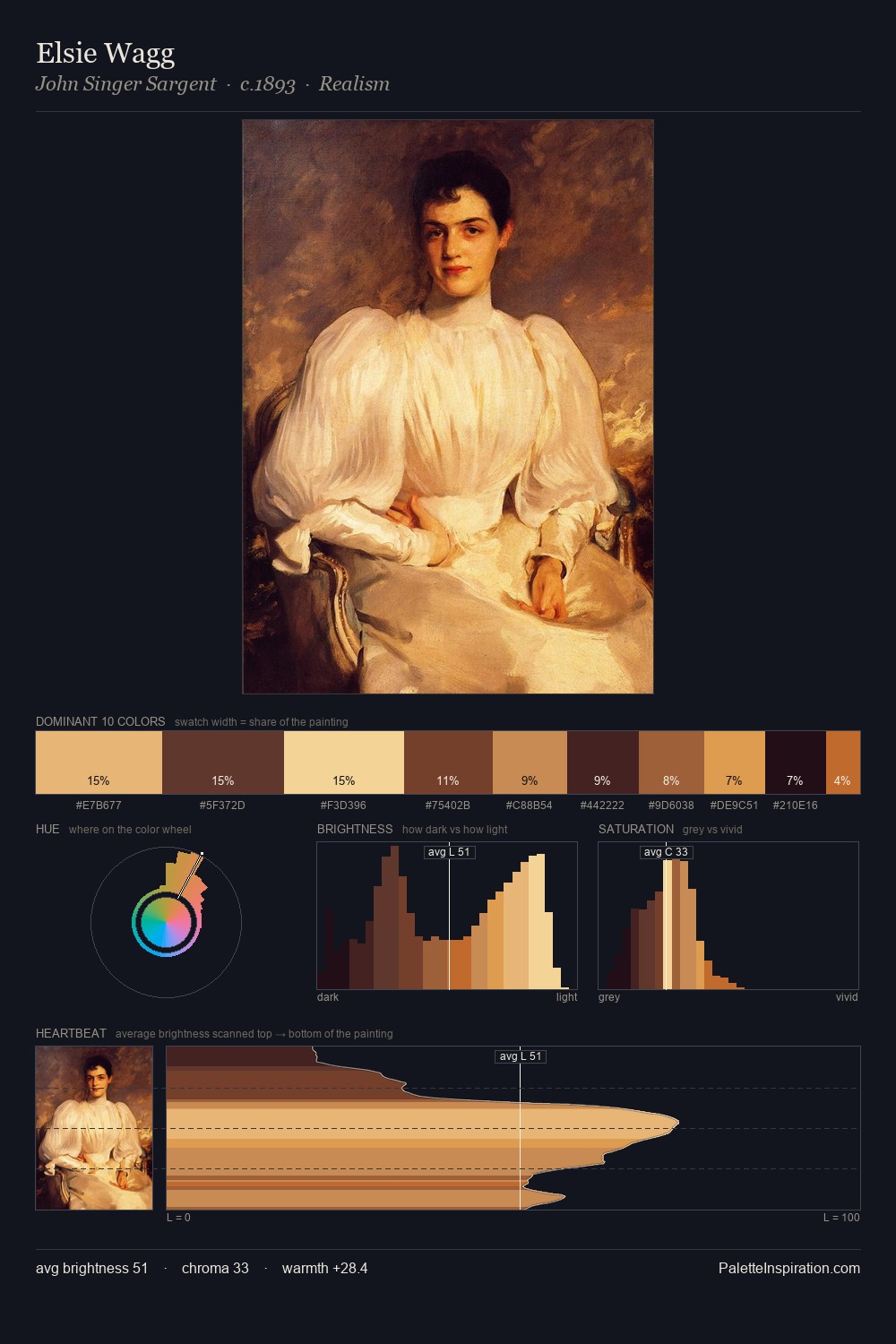
Neoclassicism works in the upper reaches of the value scale, creating an atmosphere of brightness and expansiveness. The palette orchestrates warmth above all else - reds, ambers, and siennas take the lead. Saturation is measured and controlled, giving the palette presence without visual aggression. The highest-chroma note - #DB944A - appears at just 7.1%, deployed as a precision accent against the quieter ground. At 65 units of value range, the palette has the tonal breadth to sustain complex spatial readings.
Example use cases
- publishing
- corporate identity
- consumer apps
- hospitality
- design agencies
I Love This!
Use This Palette
Copy, export, or download for your project
Copy, export, or download for your project
Copy:
Download:
Share: