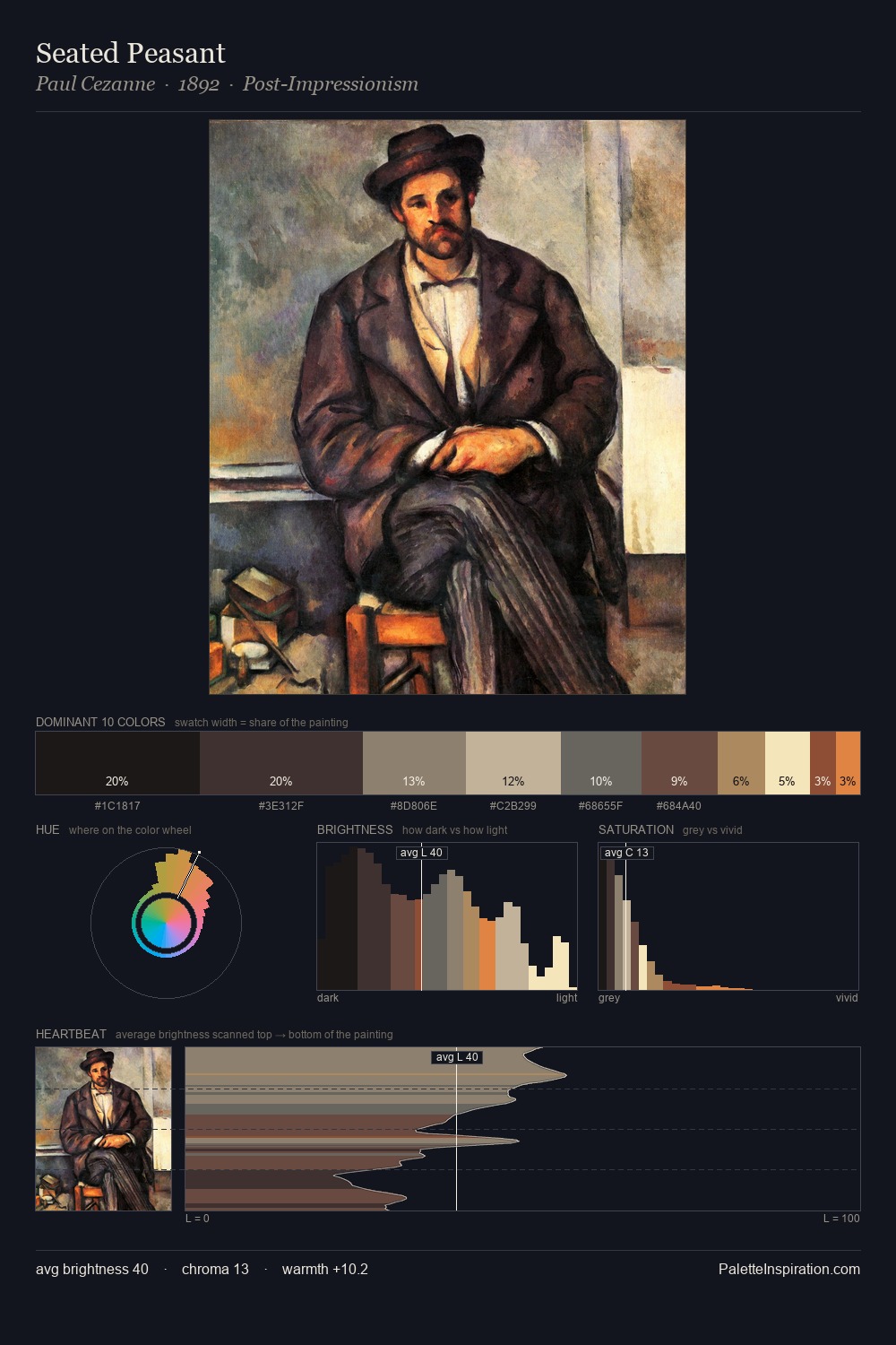
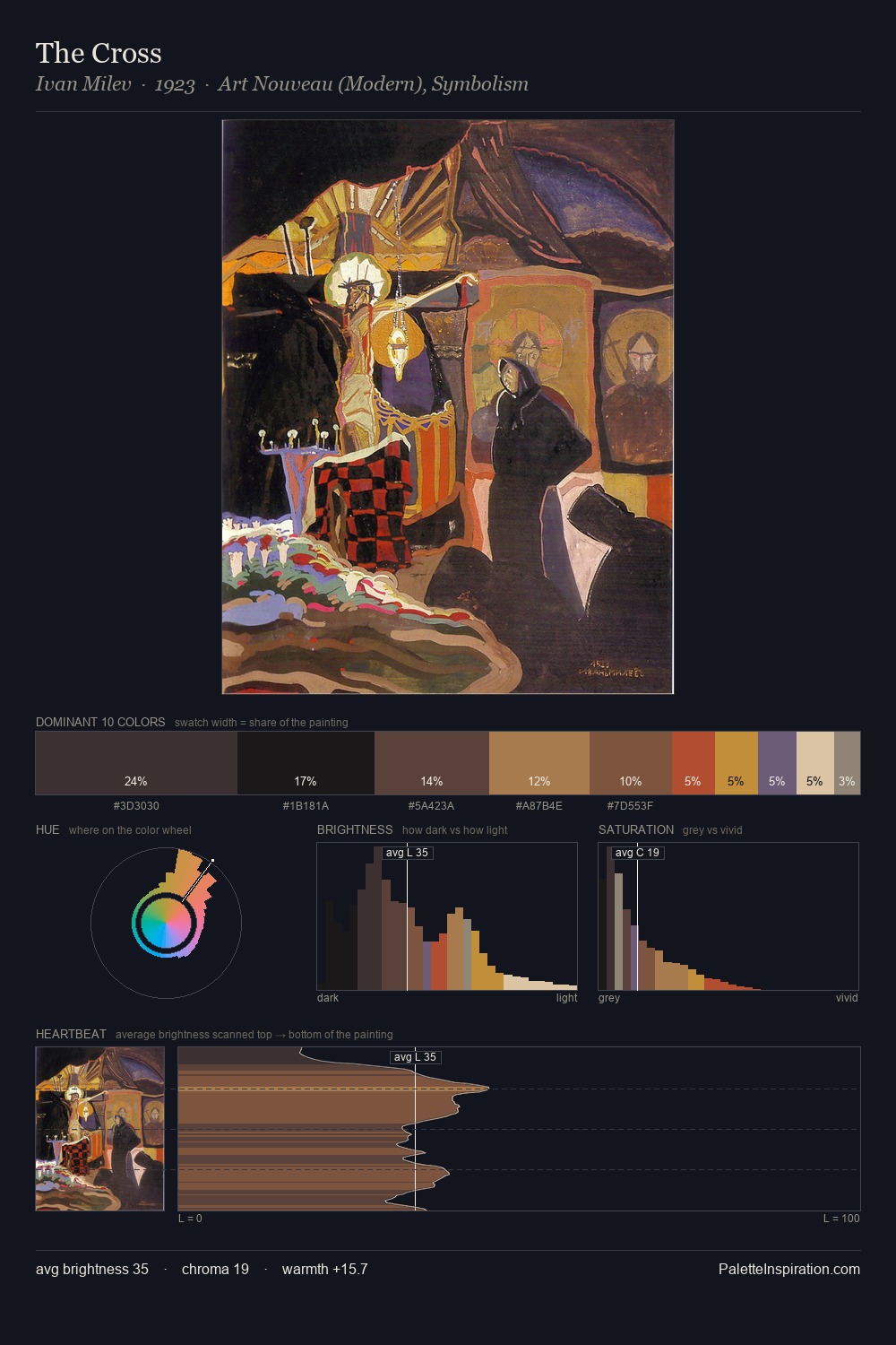
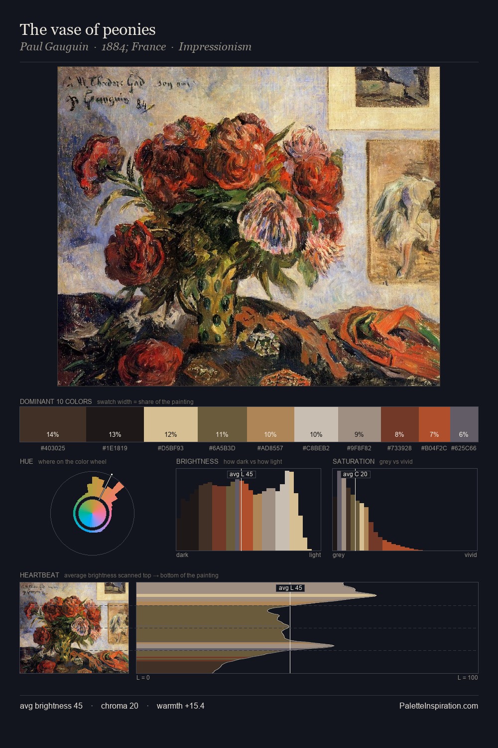
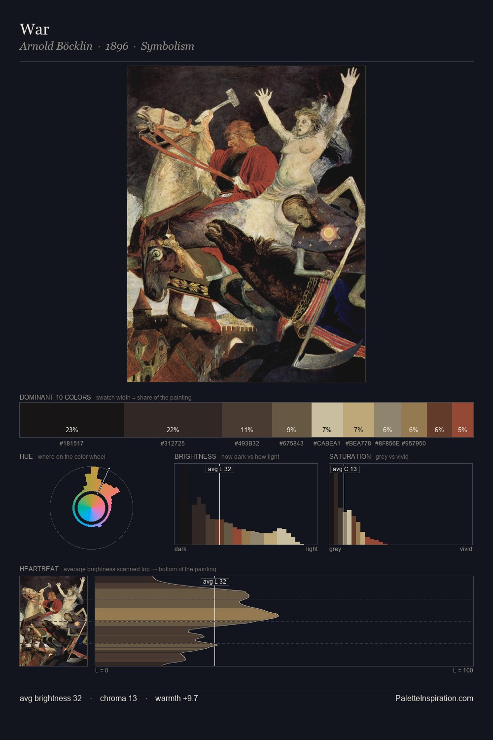
Neoclassicism Palette 36
Nocturnal Sienna
Nocturnal Night-register palette - very low values, the world after dark.
Sienna Warm red-brown earth - named after the Sienese pigment, a fundamental artist earth color.
Palette Analysis
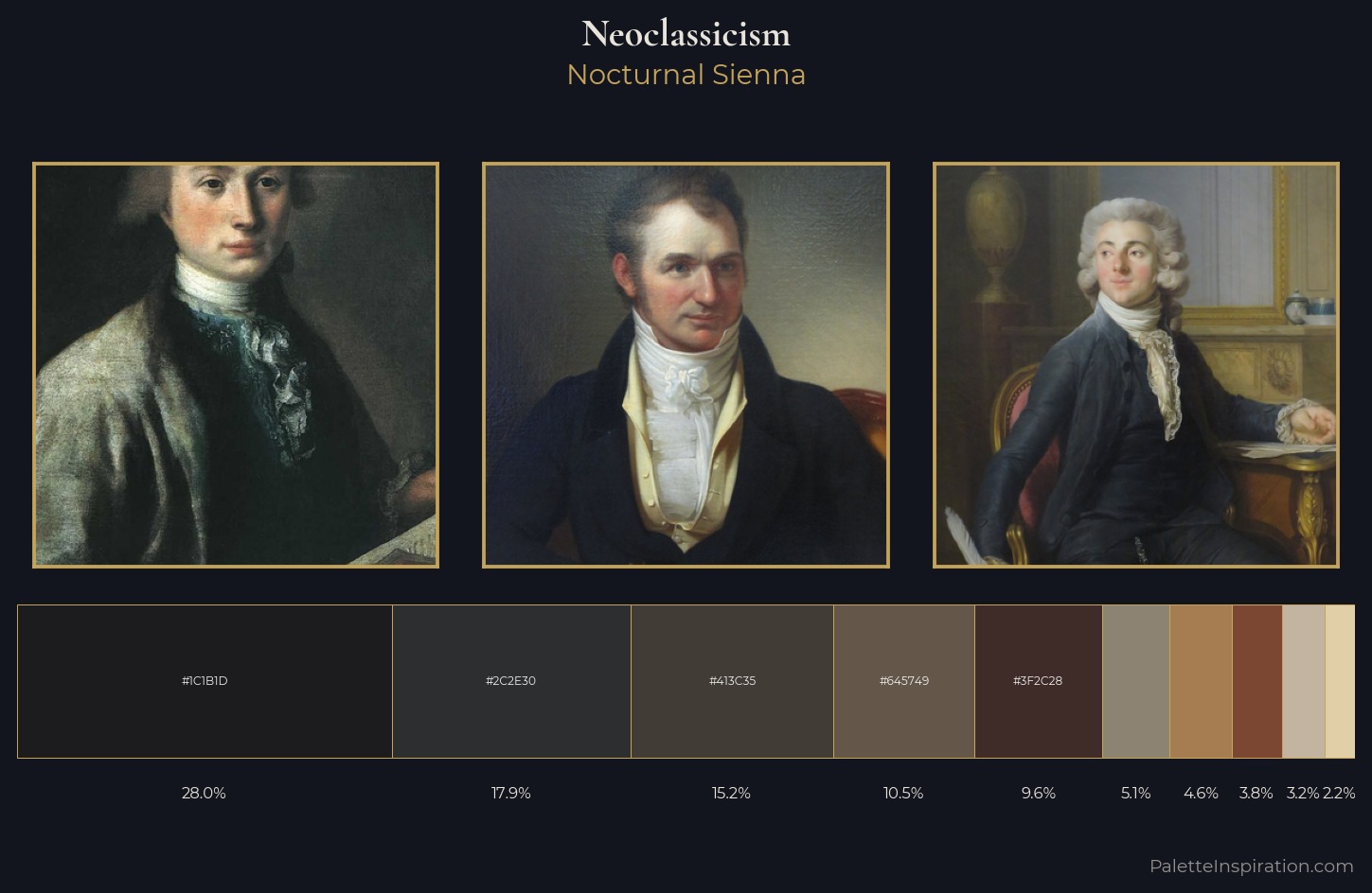
Neoclassicism keeps values measured and balanced, a hallmark of tonal restraint. Blues and teal-greys govern the palette, lending it an aquatic or atmospheric quality. All colours lean toward grey, building depth through value rather than colour punch. The dominant colour, #1C1B1D, takes 28.0% of the total area, establishing the overall mood before any other hue is introduced. The most saturated colour, #E1CFA7, is reserved to 2.2% of the surface, where it acts as a focal punctuation. 64 units of value range underpin the palette's structural clarity: the eye always knows where light falls. The palette has the character of outdoor light: cool, mid-bright, with colour rendered faithfully rather than expressively.
Example use cases
- theater design
- jewelry brands
- tobacco-adjacent retail
- event branding
- film & entertainment
I Love This!
Use This Palette
Copy, export, or download for your project
Copy, export, or download for your project
Copy:
Download:
Share: