Mary Lizzie Macomber Palette 3

Palette Analysis
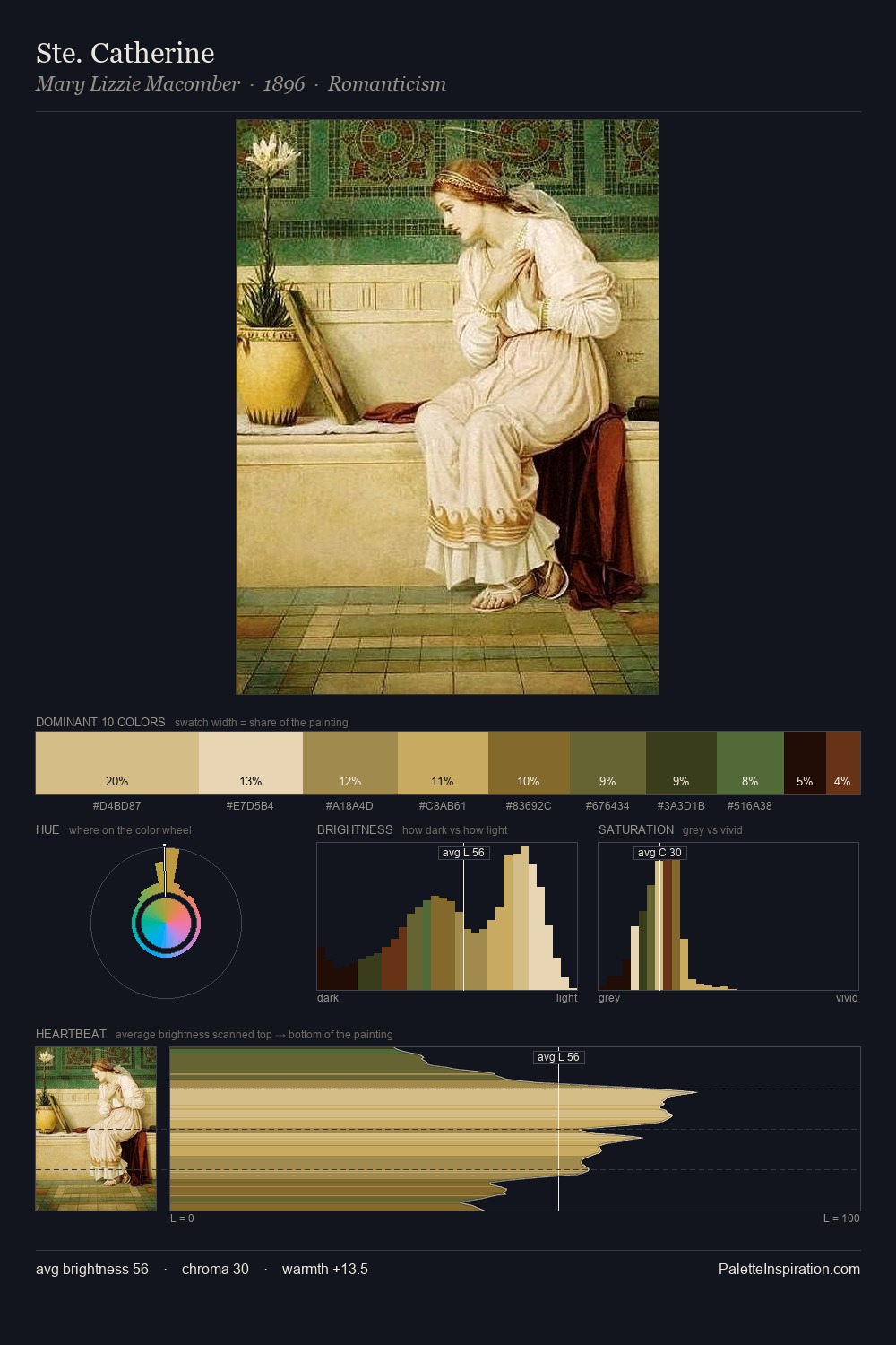
Mary Lizzie Macomber is strongly light-biased - shadow is suggested rather than declared. Temperature is cool-dominant, with blue and green families claiming the largest areas. Colours are neither washed out nor blazing; they occupy the productive middle ground of the chroma scale. #D5BD85 at 26.0% of the palette: an overwhelming presence that pulls all other colours into its gravitational field. The saturated accent, #6E5224, registers at 4.7% - sparse enough to feel like a deliberate surprise. A value spread of 69 units gives the palette both depth and air - shadows are genuinely dark, lights genuinely light. The palette has the character of outdoor light: cool, mid-bright, with colour rendered faithfully rather than expressively. Mary Lizzie Macomber's palette 3 carries its own internal logic while remaining in conversation with the artist's broader colour intelligence.
Example use cases
- publishing
- corporate identity
- consumer apps
- hospitality
- design agencies
I Love This!
Copy, export, or download for your project