Marianne von Werefkin Palette 8

Palette Analysis
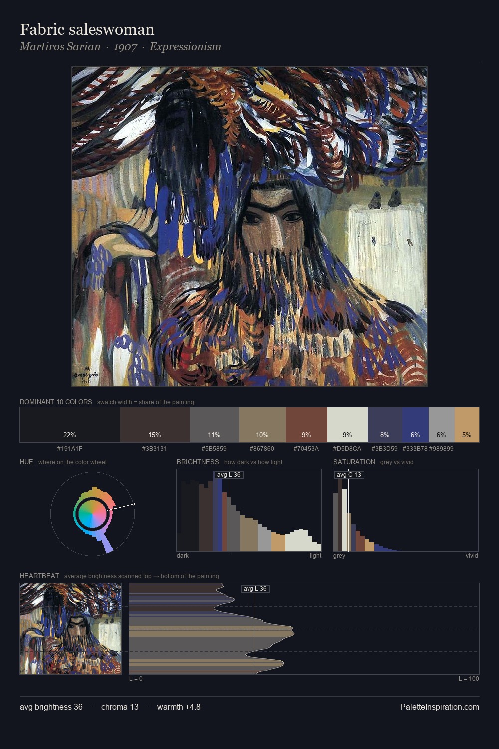
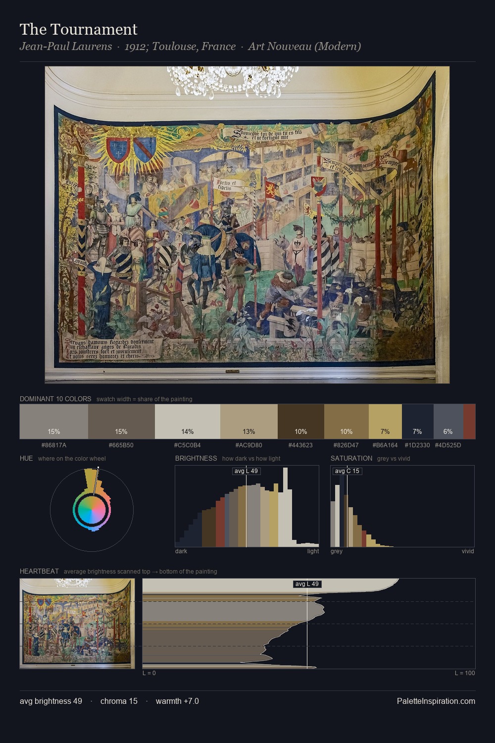
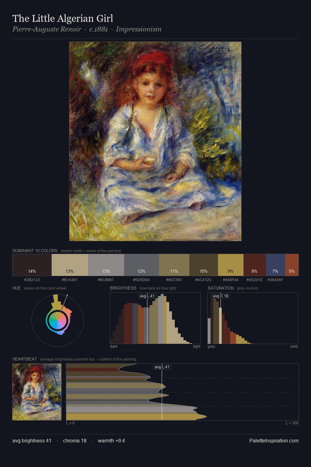
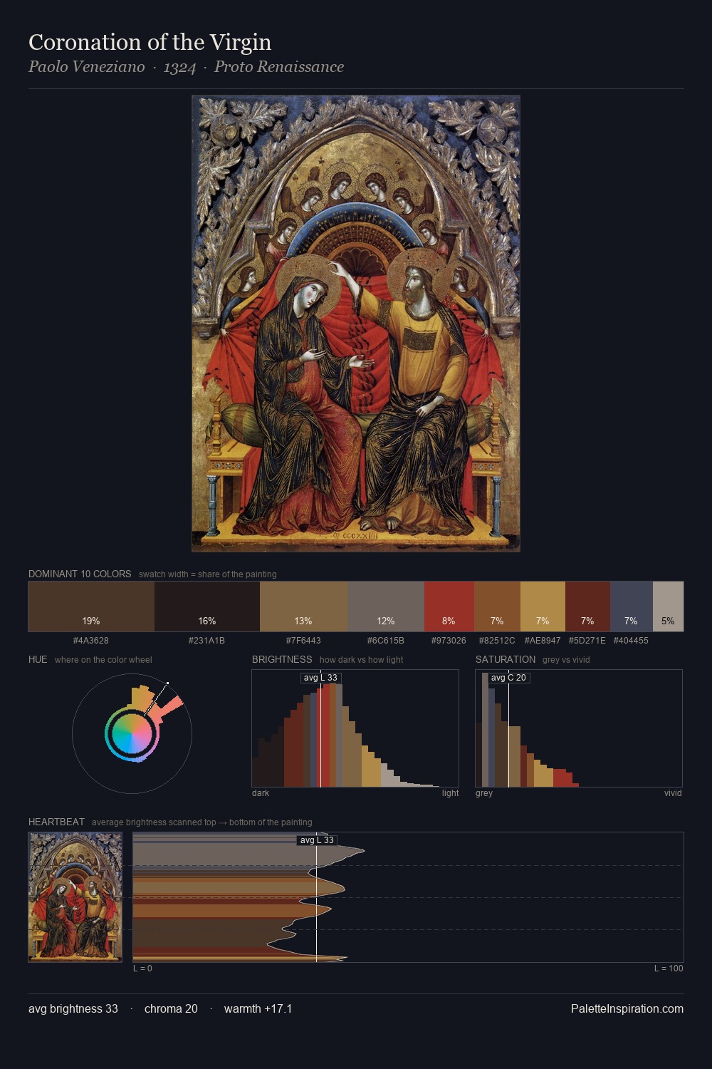
Mid-key values give Marianne von Werefkin its characteristic quietness - nothing blazes, nothing disappears. Cool hues prevail: blues, greens, and greys anchor the palette's emotional temperature. Chroma hovers near zero; colour declares itself through subtle shifts in hue rather than outright saturation. Only 3.6% is devoted to #AC934B, yet that small allocation delivers the palette's entire chromatic tension. At 47 units across the value scale, the palette keeps contrast readable without letting it dominate. The palette has the character of outdoor light: cool, mid-bright, with colour rendered faithfully rather than expressively. Palette 8 sits within the larger chromatic argument that Marianne von Werefkin's complete body of work advances.
Example use cases
- luxury automotive
- premium electronics
- private banking
- B2B platforms
- developer tools
I Love This!
Copy, export, or download for your project