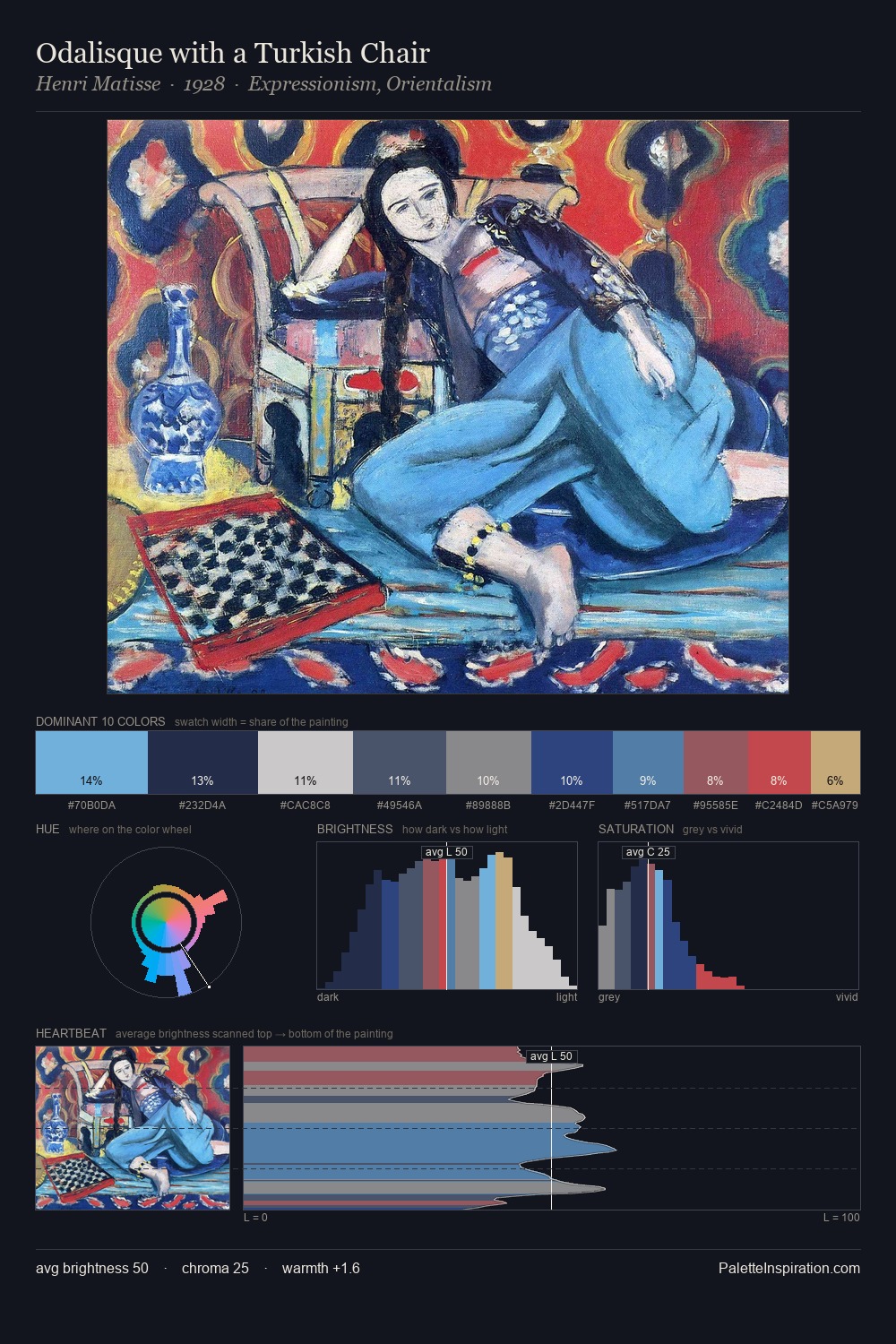
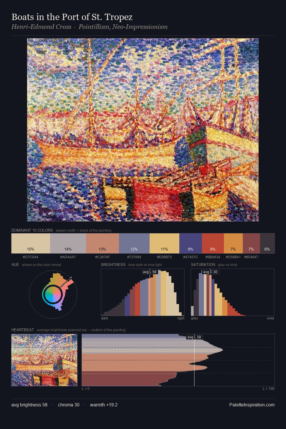
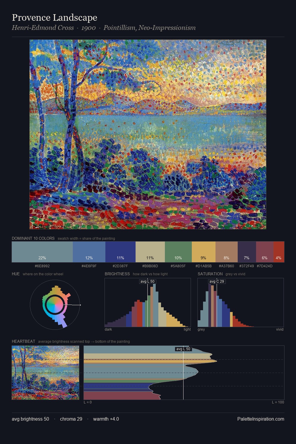
Marianne von Werefkin Palette 5

Palette Analysis
Values in Marianne von Werefkin rest in the mid-range - neither dramatically lit nor steeped in shadow. Cool hues prevail: blues, greens, and greys anchor the palette's emotional temperature. Chroma is moderate: colours carry enough saturation to be read as colour, but the palette stops well short of garish intensity. The highest-chroma note - #CBBA6A - appears at just 0.6%, deployed as a precision accent against the quieter ground. At 49 units across the value scale, the palette keeps contrast readable without letting it dominate. The palette has the character of outdoor light: cool, mid-bright, with colour rendered faithfully rather than expressively. In the context of Marianne von Werefkin's full range of palettes, group 5 represents one movement in an ongoing chromatic dialogue.
Example use cases
- publishing
- corporate identity
- consumer apps
- hospitality
- design agencies
I Love This!
Copy, export, or download for your project