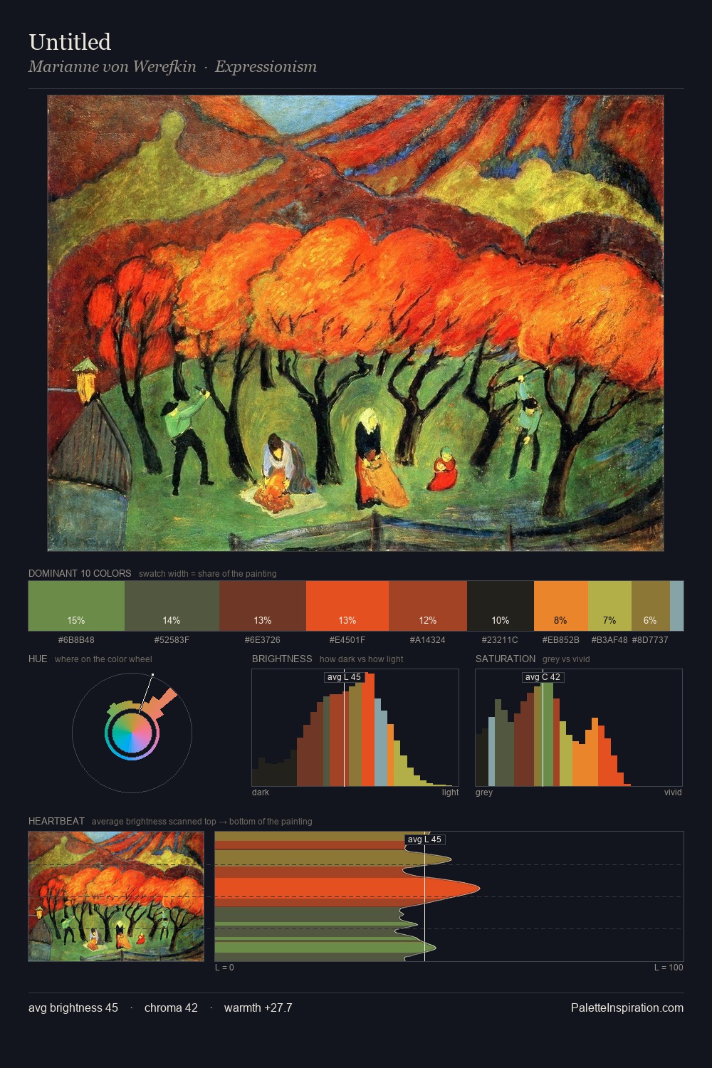
Marianne von Werefkin Palette 2

Palette Analysis
Values in Marianne von Werefkin rest in the mid-range - neither dramatically lit nor steeped in shadow. Cool tones set the register here - the blues and greens easily outweigh any warm accents. Colours are neither washed out nor blazing; they occupy the productive middle ground of the chroma scale. The dominant colour, #33322A, takes 31.0% of the total area, establishing the overall mood before any other hue is introduced. #E85320 delivers the chromatic peak at only 7.6% - a small shot of colour with outsized visual impact. At 55 units of value range, the palette has the tonal breadth to sustain complex spatial readings. The palette has the character of outdoor light: cool, mid-bright, with colour rendered faithfully rather than expressively. In the context of Marianne von Werefkin's full range of palettes, group 2 represents one movement in an ongoing chromatic dialogue.
Example use cases
- theater design
- jewelry brands
- tobacco-adjacent retail
- event branding
- film & entertainment
I Love This!
Copy, export, or download for your project