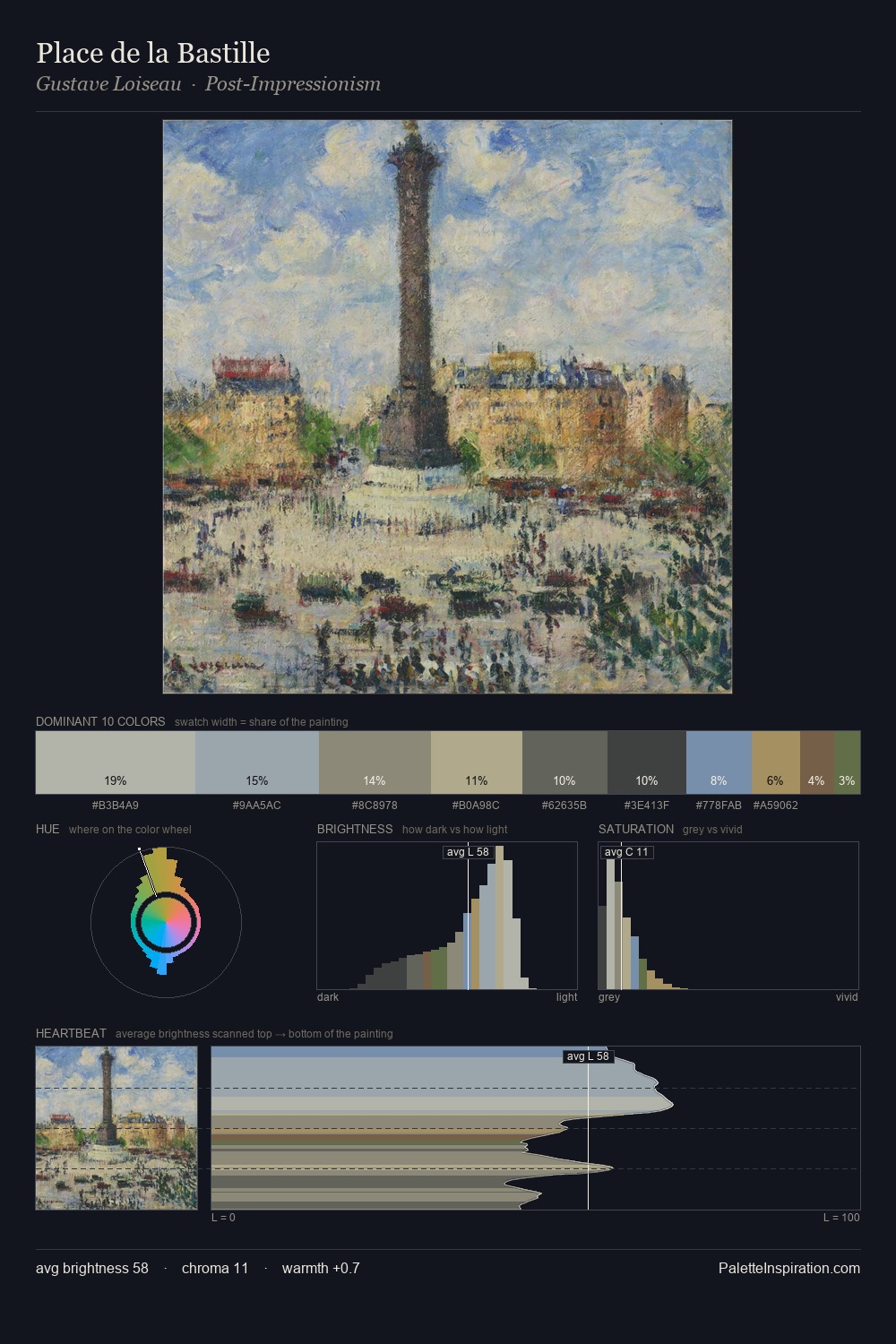
Konstantin Gorbatov Palette 5

Palette Analysis
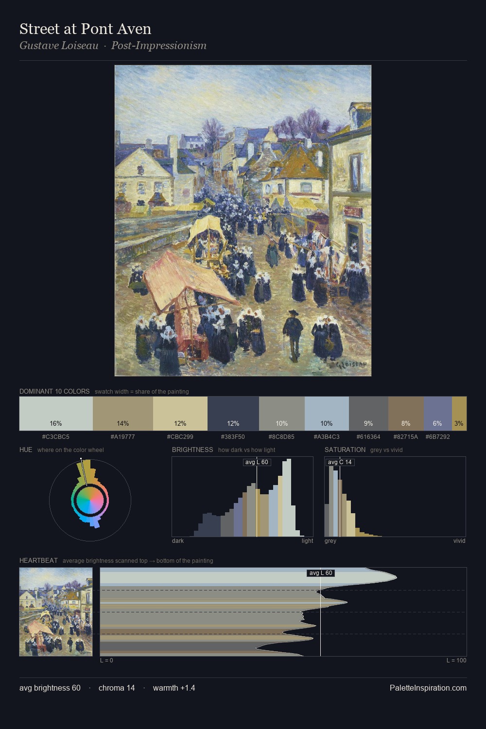
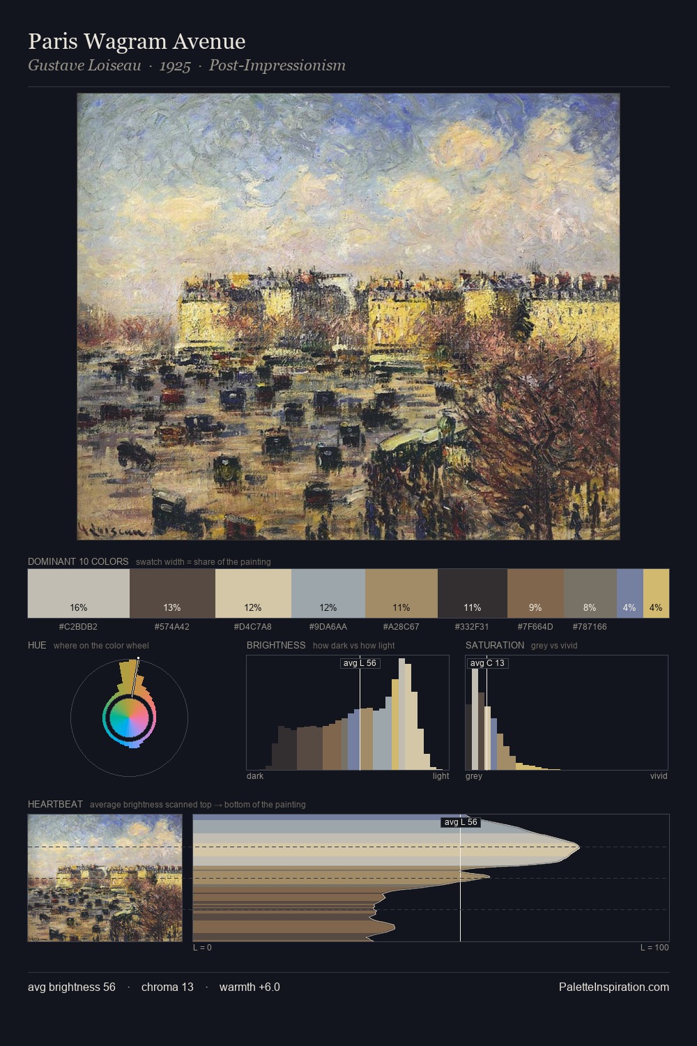
Konstantin Gorbatov is strongly light-biased - shadow is suggested rather than declared. Cool hues prevail: blues, greens, and greys anchor the palette's emotional temperature. Chroma hovers near zero; colour declares itself through subtle shifts in hue rather than outright saturation. Only 5.0% is devoted to #AF996C, yet that small allocation delivers the palette's entire chromatic tension. 47 units of value spread create a palette that is varied but unified - contrast in the service of harmony. The palette has the character of outdoor light: cool, mid-bright, with colour rendered faithfully rather than expressively. In the context of Konstantin Gorbatov's full range of palettes, group 5 represents one movement in an ongoing chromatic dialogue.
Example use cases
- exhibition design
- foundation branding
- estate management
- art education
- museums & galleries
I Love This!
Copy, export, or download for your project