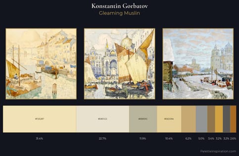
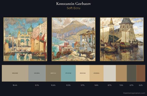
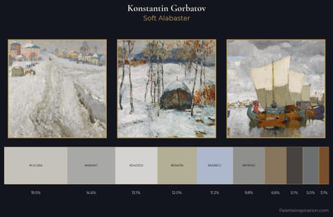
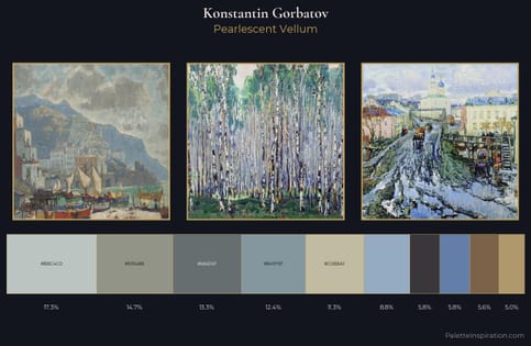
Konstantin Gorbatov Palette 4
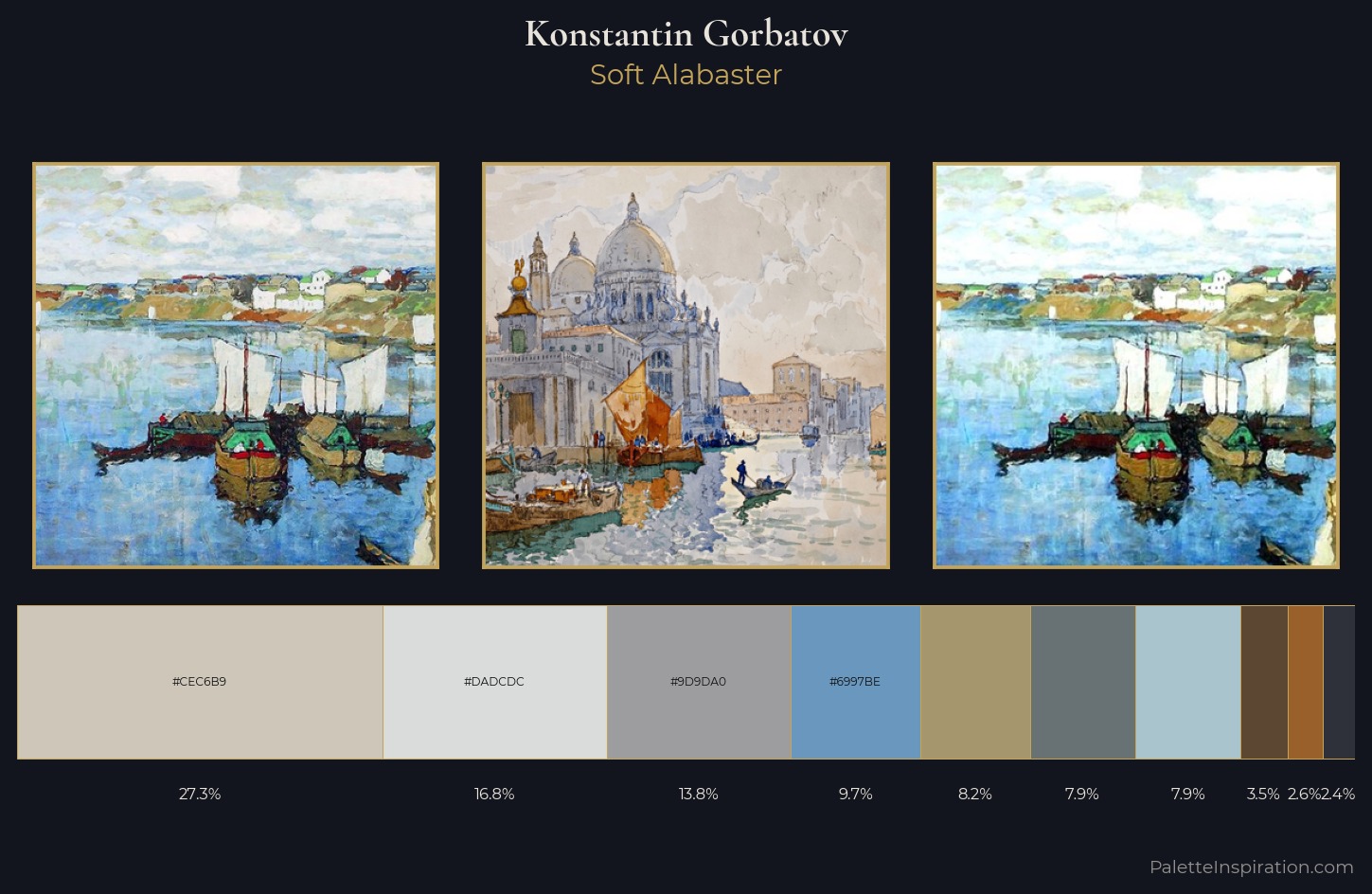
Palette Analysis
Konstantin Gorbatov is strongly light-biased - shadow is suggested rather than declared. Cool hues prevail: blues, greens, and greys anchor the palette's emotional temperature. All colours lean toward grey, building depth through value rather than colour punch. At 27.3%, #CEC6B9 functions less as a colour accent and more as a complete atmospheric environment. The most saturated colour, #5B4732, is reserved to 3.5% of the surface, where it acts as a focal punctuation. From deepest dark to palest light, the palette traverses 58 units of the value scale - a span that creates natural depth. High luminosity and cool temperature suggest the plein-air condition: unfiltered daylight and open sky. This is palette 4 of Konstantin Gorbatov's sequence - a single chapter in a chromatic story told across many works.
Example use cases
- print magazines
- beauty brands
- real estate
- high-end packaging
- editorial design
I Love This!
Copy, export, or download for your project