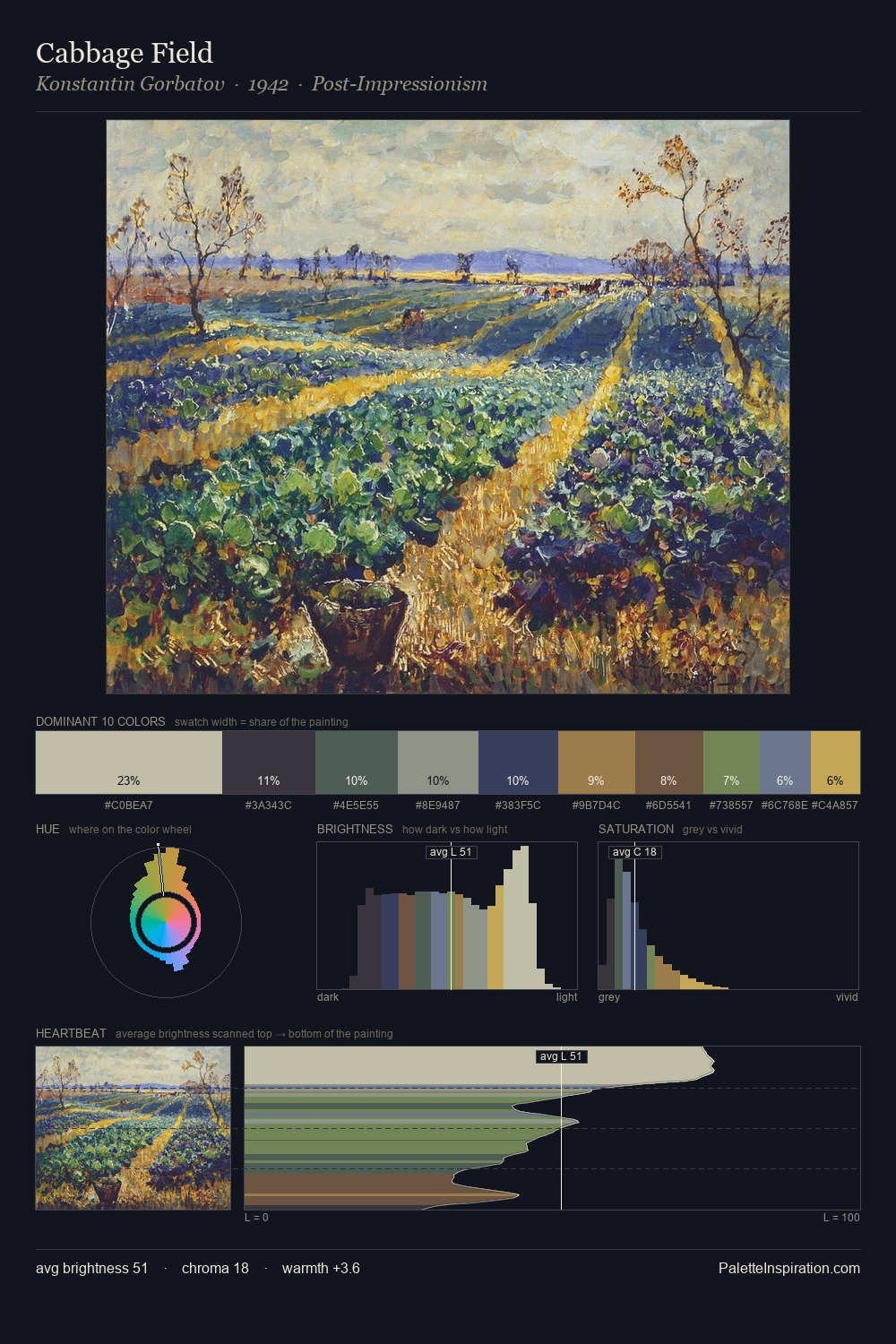
Konstantin Gorbatov Palette 14

Palette Analysis
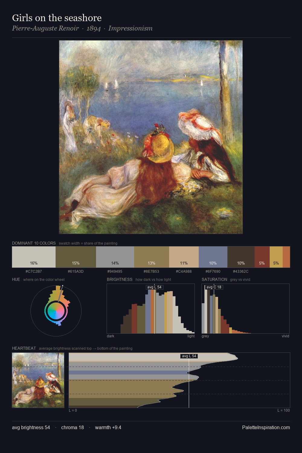
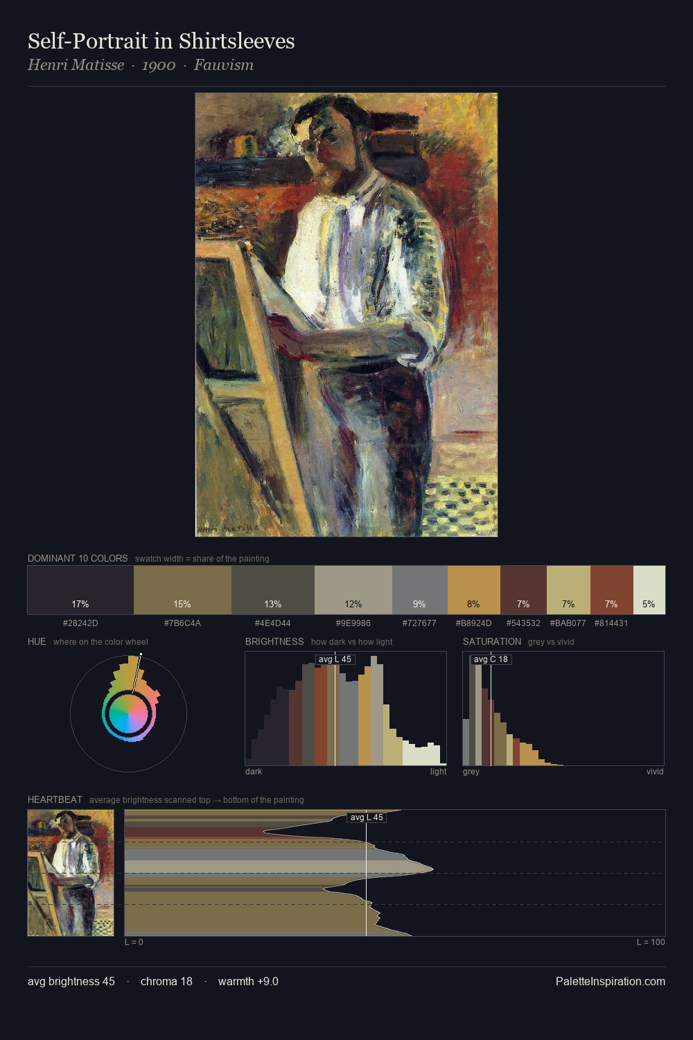
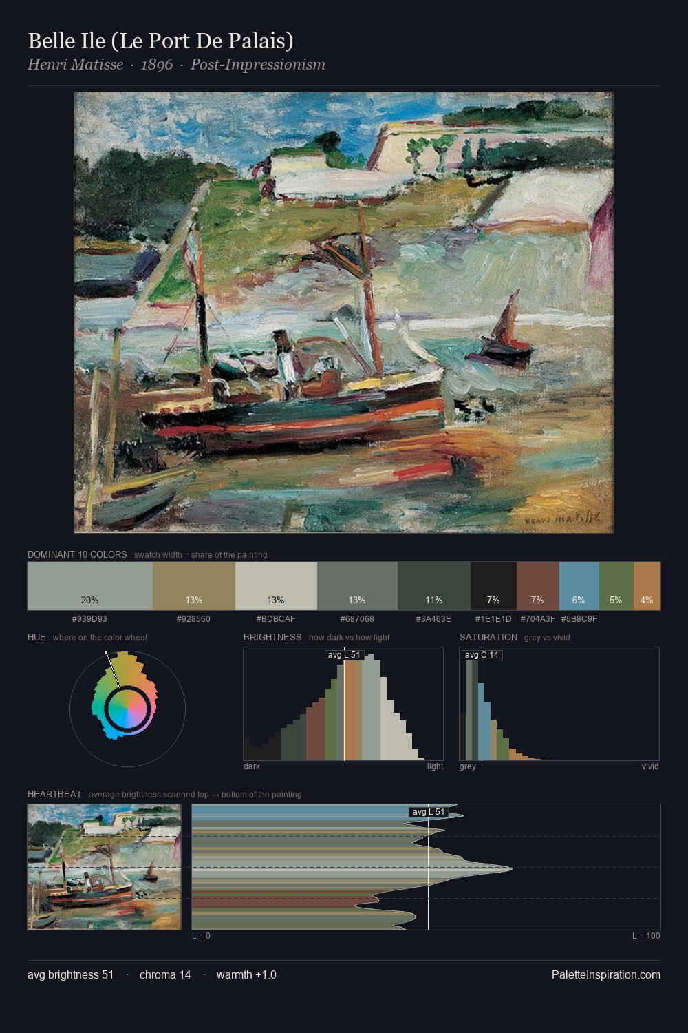
Values in Konstantin Gorbatov rest in the mid-range - neither dramatically lit nor steeped in shadow. Konstantin Gorbatov builds on cool foundations: the palette favours the blue-cyan-green arc. All colours lean toward grey, building depth through value rather than colour punch. The most saturated colour, #695539, is reserved to 10.7% of the surface, where it acts as a focal punctuation. 50 units of value spread create a palette that is varied but unified - contrast in the service of harmony. The mid-to-high key, cool bias, and moderate chroma point to outdoor observation - sky and diffused daylight as the dominant light source. Konstantin Gorbatov's palette 14 carries its own internal logic while remaining in conversation with the artist's broader colour intelligence.
Example use cases
- theater design
- jewelry brands
- tobacco-adjacent retail
- event branding
- film & entertainment
I Love This!
Copy, export, or download for your project