Konstantin Cretius Palette 5
Penumbral Tawny
Penumbral Partial shadow - the transitional zone between light and full dark, soft-edged.
Tawny Warm orange-brown - a traditional term for the color of tanned leather or lion fur.

Palette Analysis
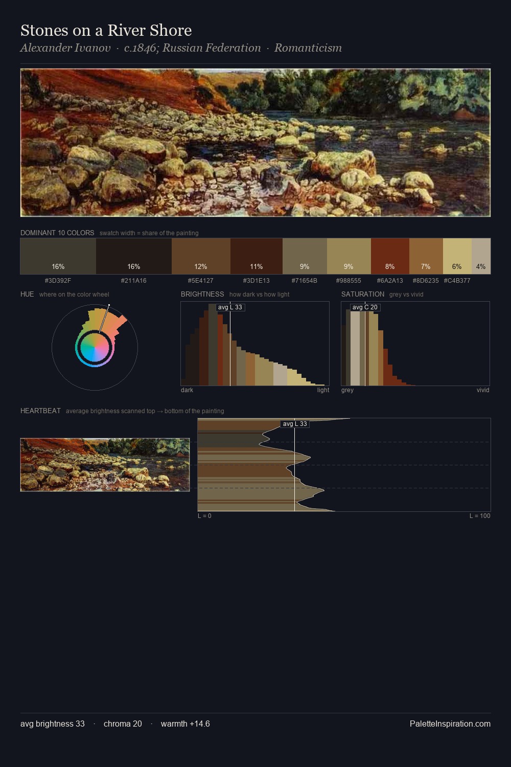
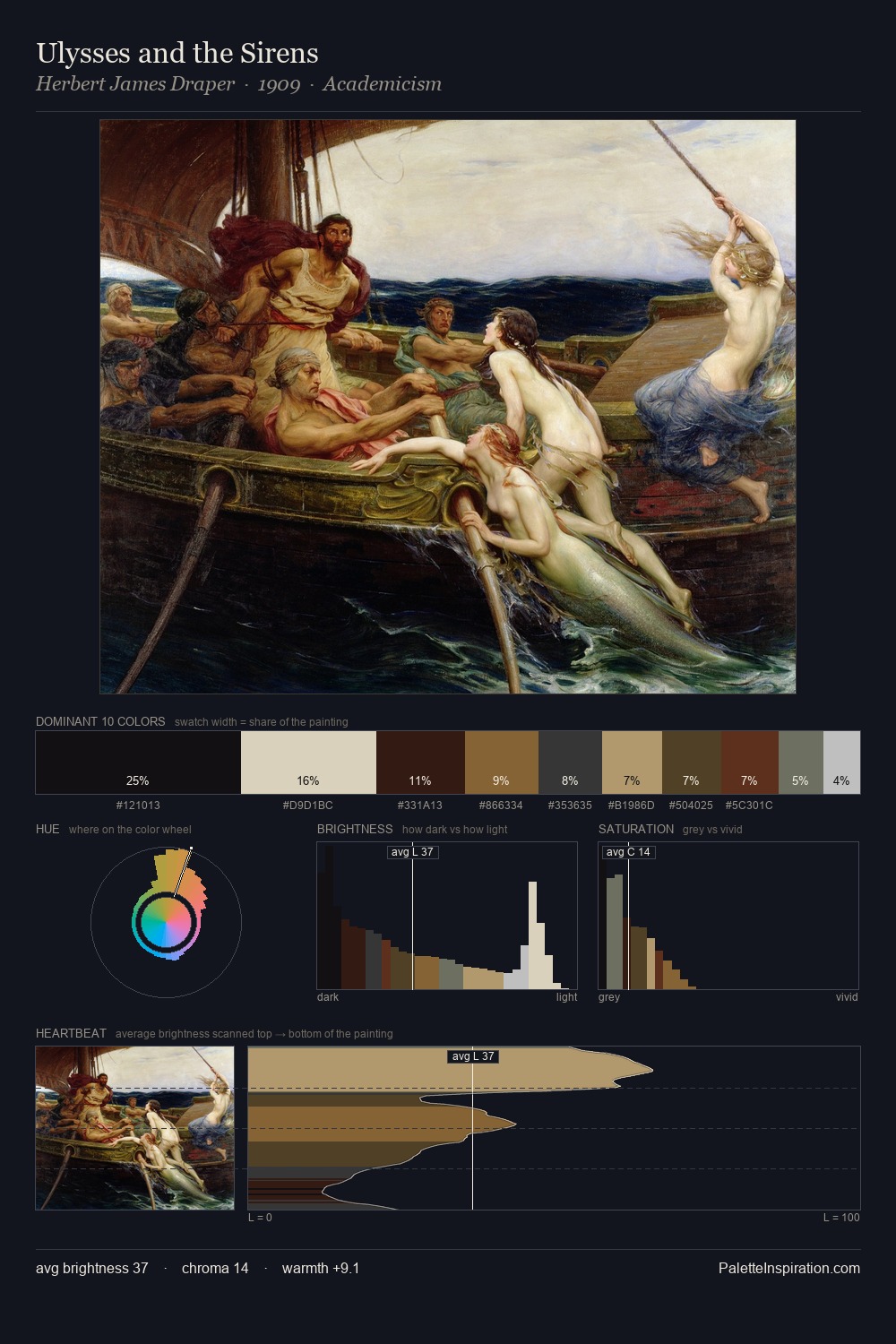
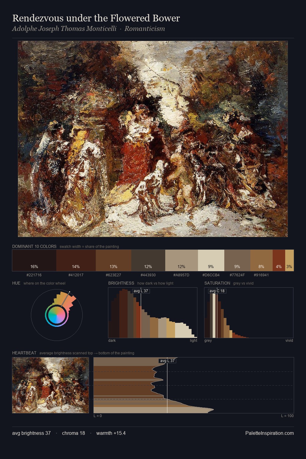
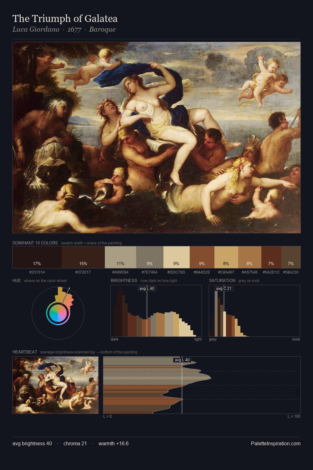
Konstantin Cretius distributes its values across the middle register, creating harmony without high contrast. Warmth dominates - the palette of Konstantin Cretius leans heavily on the yellow-orange-red arc of the colour wheel. All colours lean toward grey, building depth through value rather than colour punch. The most saturated colour, #381B0F, is reserved to 7.7% of the surface, where it acts as a focal punctuation. At 66 units of value range, the palette has the tonal breadth to sustain complex spatial readings. Palette 5 sits within the larger chromatic argument that Konstantin Cretius's complete body of work advances.
Example use cases
- theater design
- jewelry brands
- tobacco-adjacent retail
- event branding
- film & entertainment
I Love This!
Use This Palette
Copy, export, or download for your project
Copy, export, or download for your project
Copy:
Download:
Share: