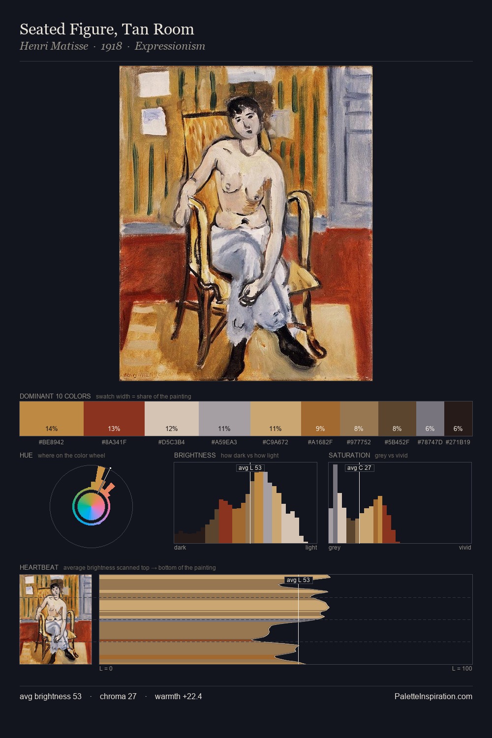
Konstantin Cretius Palette 1
Pale Ecru
Pale High-key and low-chroma - delicate, bleached, washed with light.
Ecru Unbleached linen - warm mid-neutral, slightly grayed, raw and natural.

Palette Analysis
Konstantin Cretius is high-key - luminous, open, and weighted toward light. Heat pervades this palette; warm chromatic identities outweigh cool ones at almost every weight. Chroma hovers near zero; colour declares itself through subtle shifts in hue rather than outright saturation. At 5.6%, #CA894B carries the palette's sharpest chromatic charge: an accent that earns its place precisely because it is withheld. The value range of 54 units sits in the comfortable middle: enough depth, enough light, neither extreme. This is palette 1 of Konstantin Cretius's sequence - a single chapter in a chromatic story told across many works.
Example use cases
- interior design
- furniture brands
- cookbook publishing
- wine & spirits
- food packaging
I Love This!
Use This Palette
Copy, export, or download for your project
Copy, export, or download for your project
Copy:
Download:
Share: