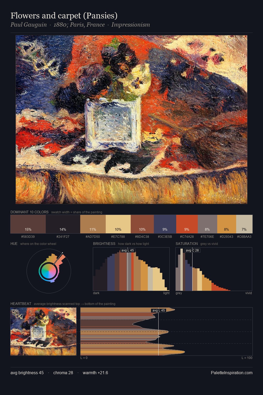
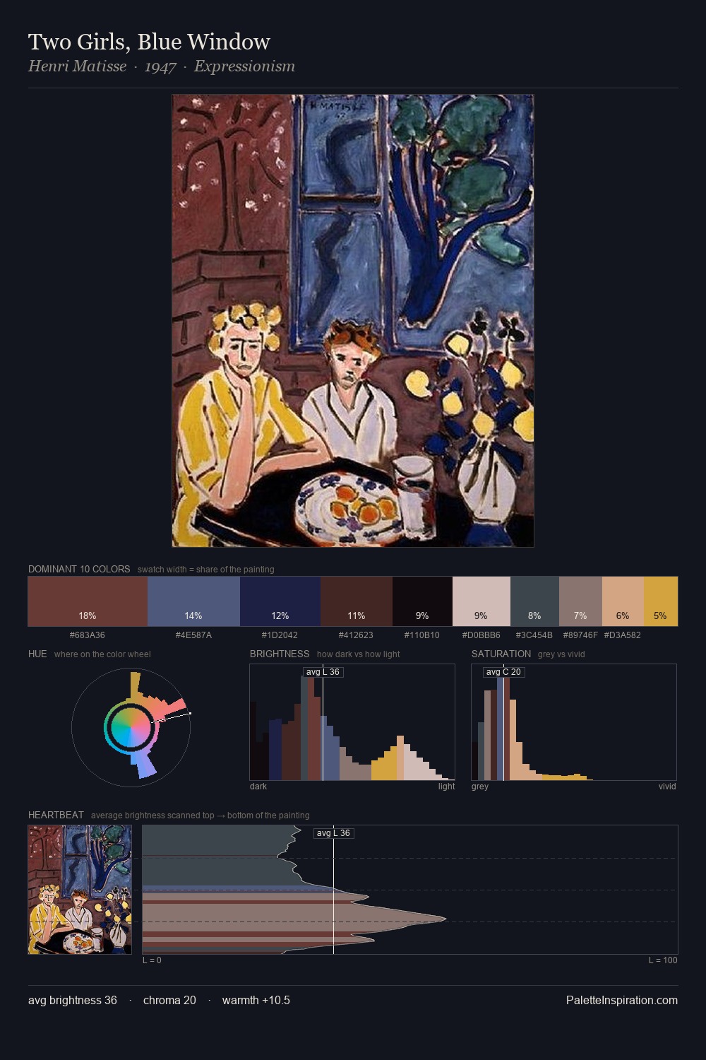
Kees van Dongen Palette 4

Palette Analysis
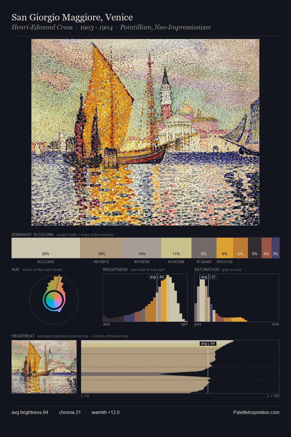
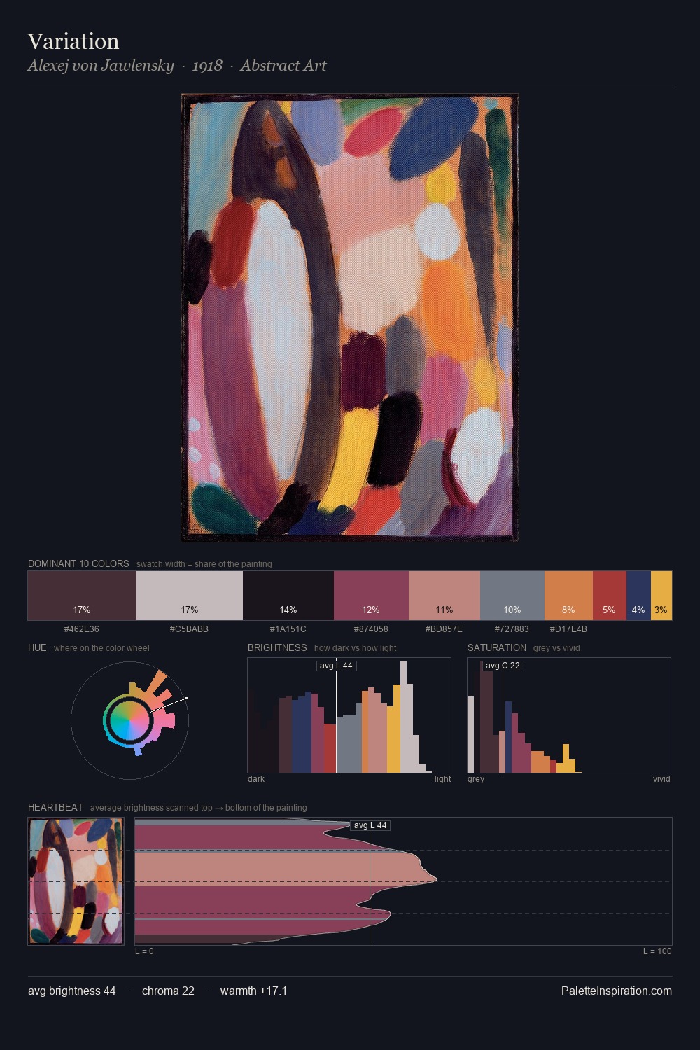
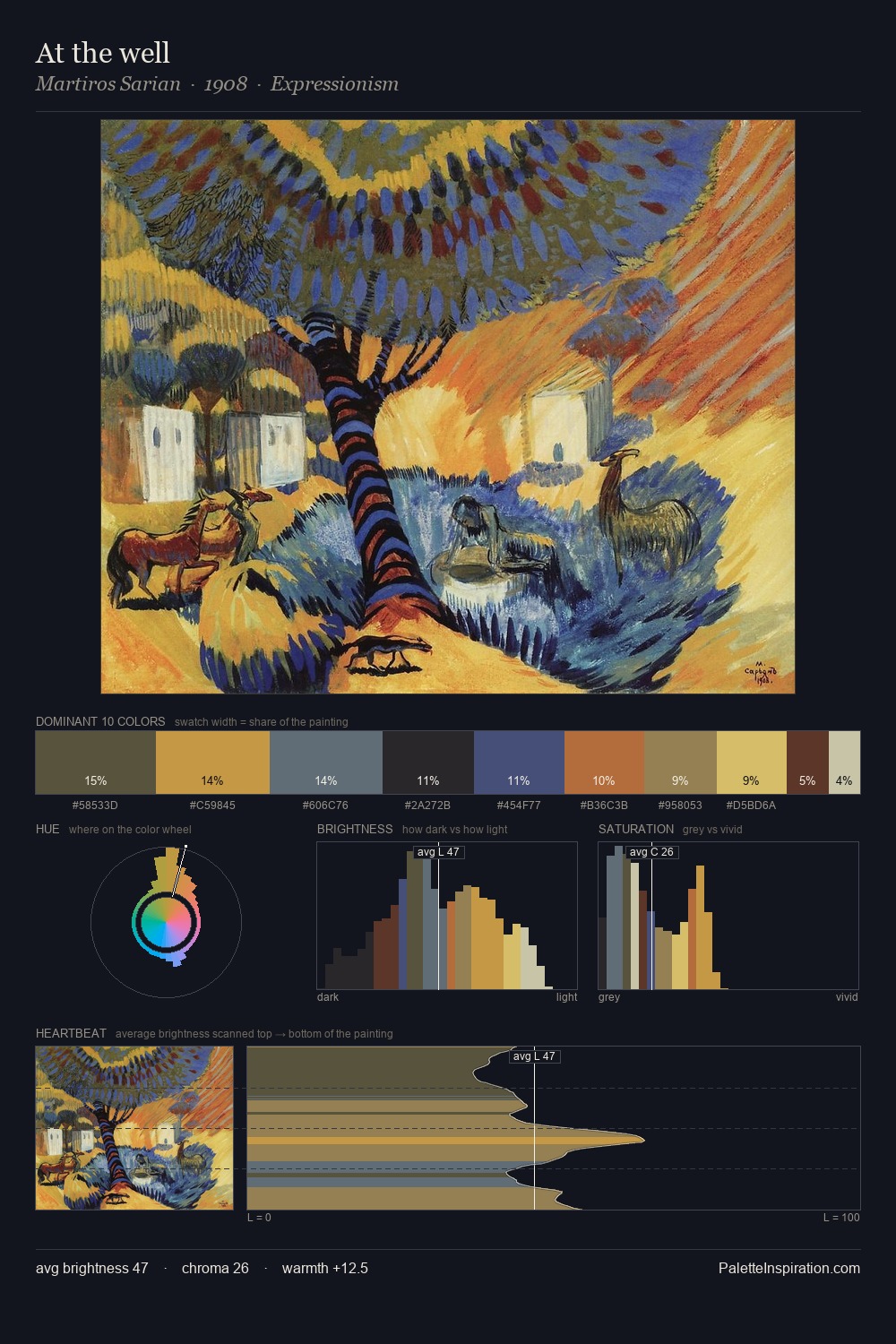
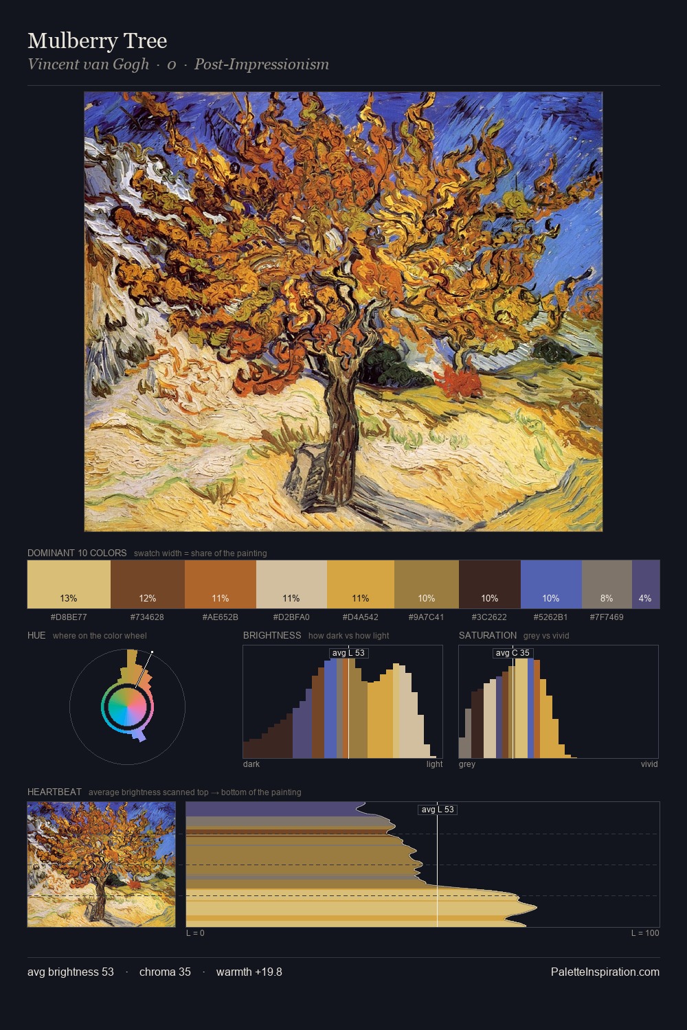
Values in Kees van Dongen rest in the mid-range - neither dramatically lit nor steeped in shadow. Kees van Dongen builds on cool foundations: the palette favours the blue-cyan-green arc. Chroma is moderate: colours carry enough saturation to be read as colour, but the palette stops well short of garish intensity. The dominant colour, #CE8E16, takes 28.6% of the total area, establishing the overall mood before any other hue is introduced. The saturated accent, #50262C, registers at 5.0% - sparse enough to feel like a deliberate surprise. From deepest dark to palest light, the palette traverses 58 units of the value scale - a span that creates natural depth. The palette has the character of outdoor light: cool, mid-bright, with colour rendered faithfully rather than expressively. Kees van Dongen's palette 4 carries its own internal logic while remaining in conversation with the artist's broader colour intelligence.
Example use cases
- art galleries
- creative studios
- consumer goods
- lifestyle media
- professional services
I Love This!
Copy, export, or download for your project