Kees van Dongen Palette 2

Palette Analysis
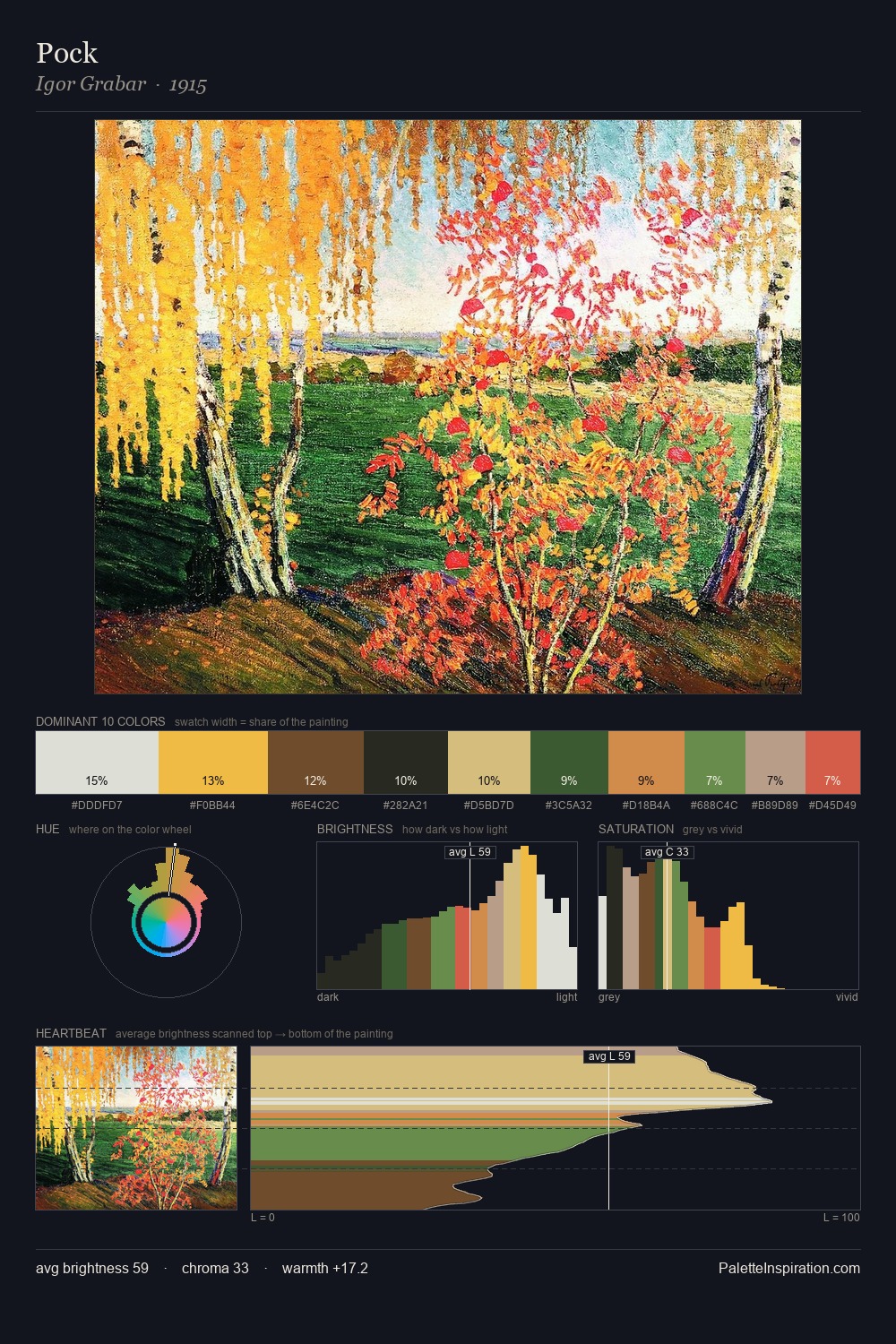
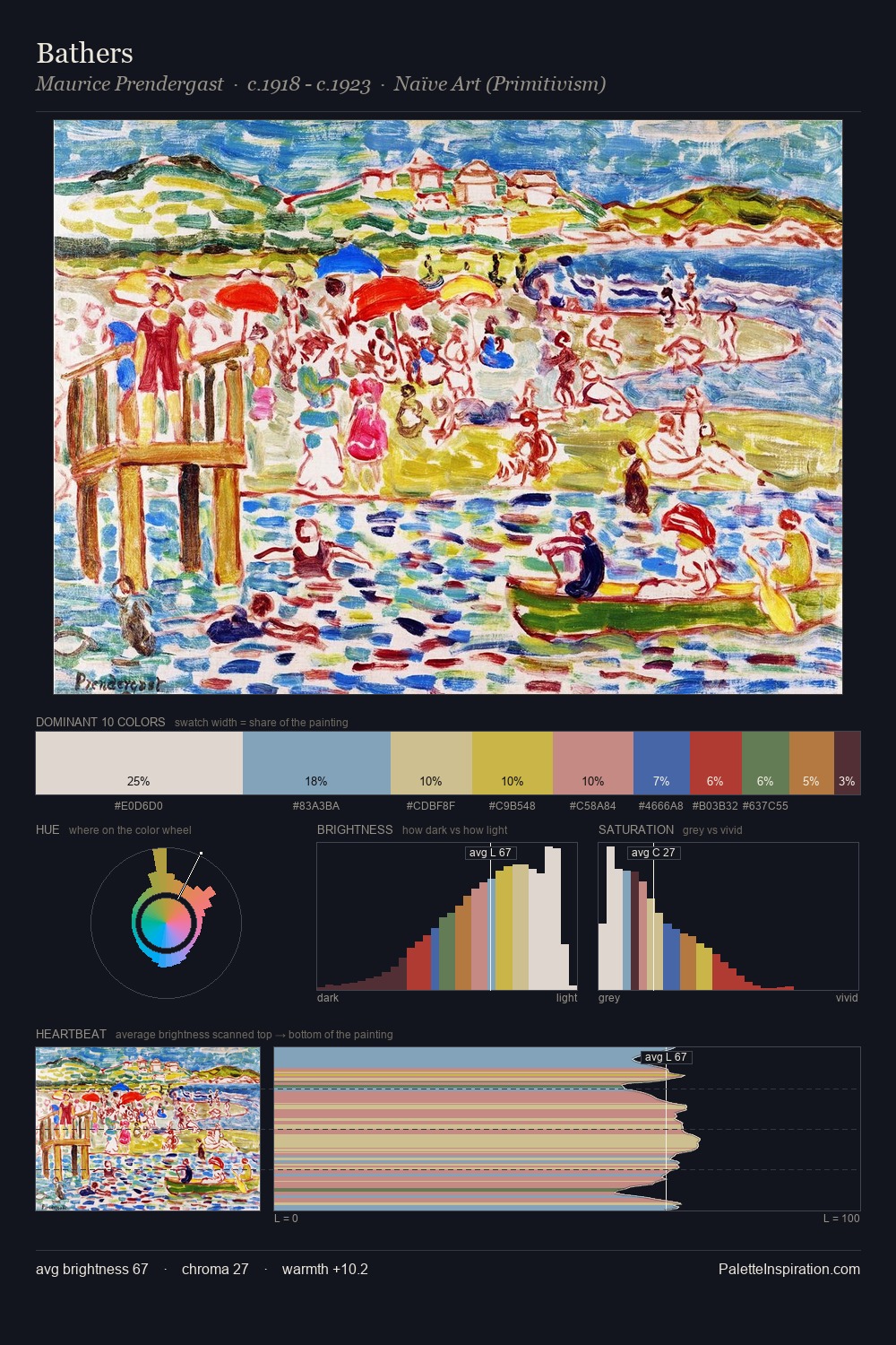
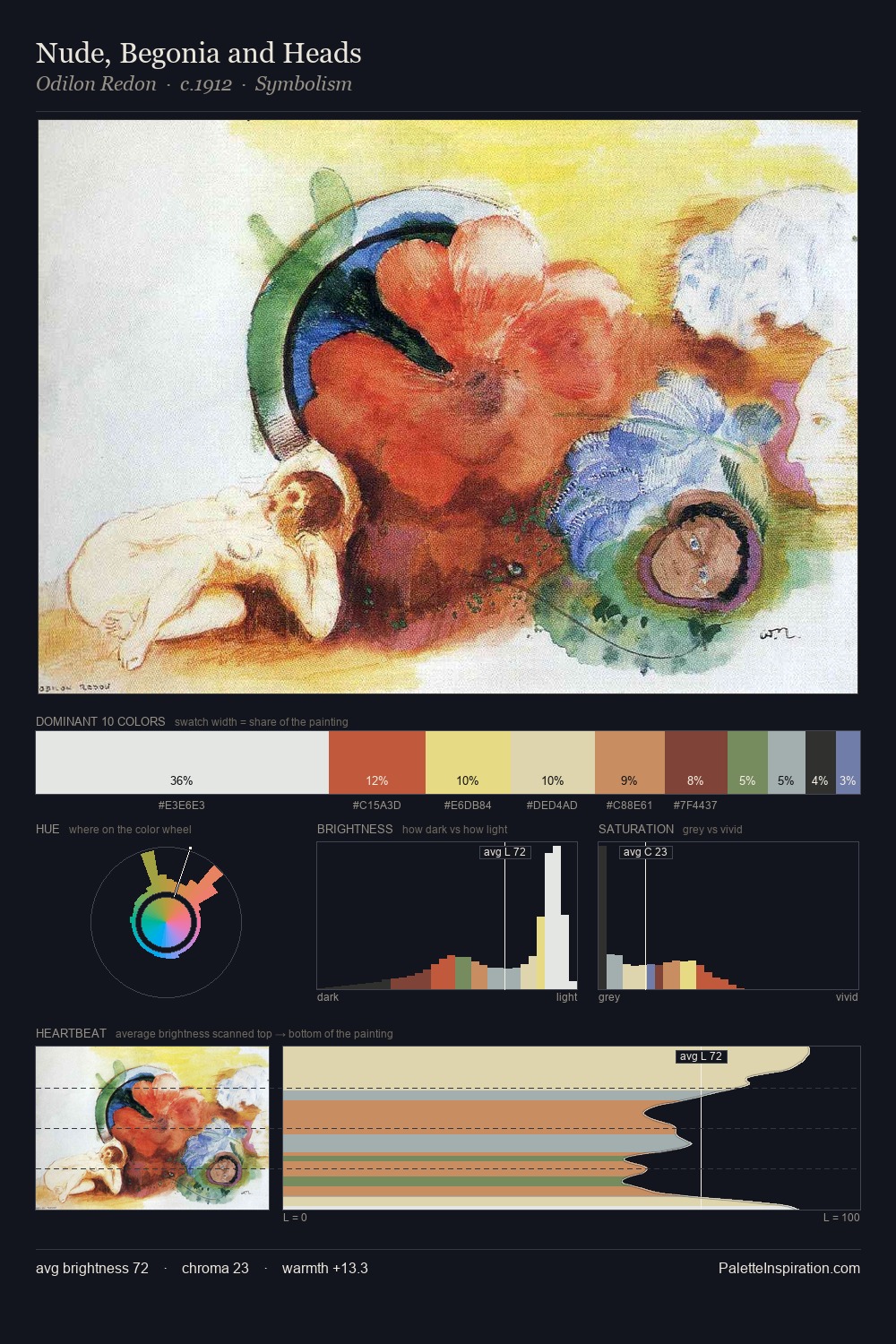
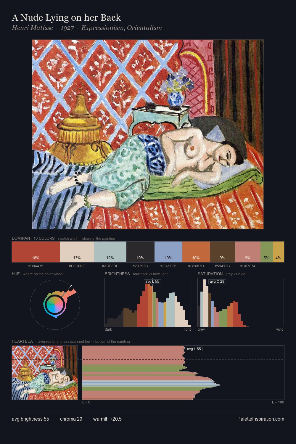
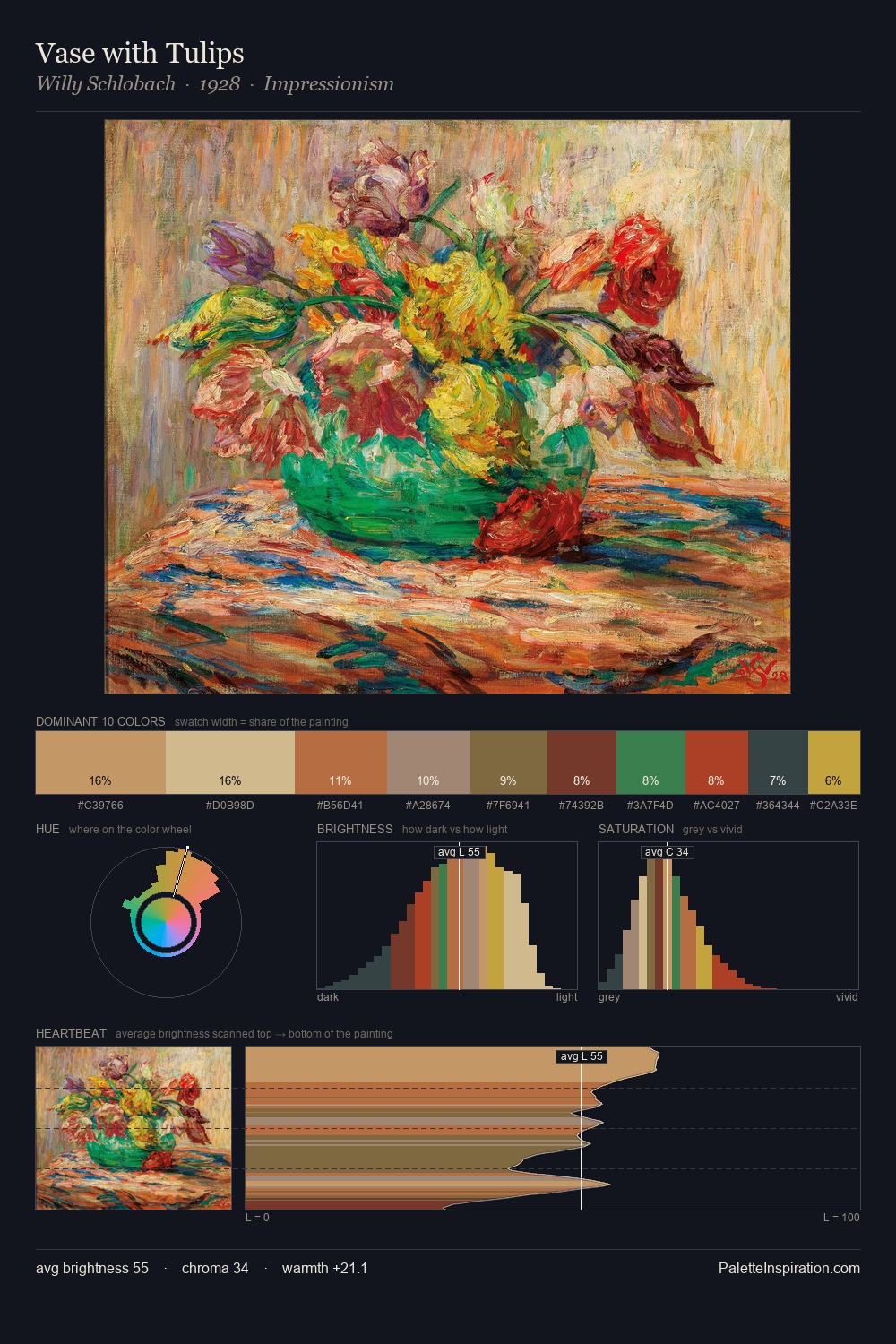
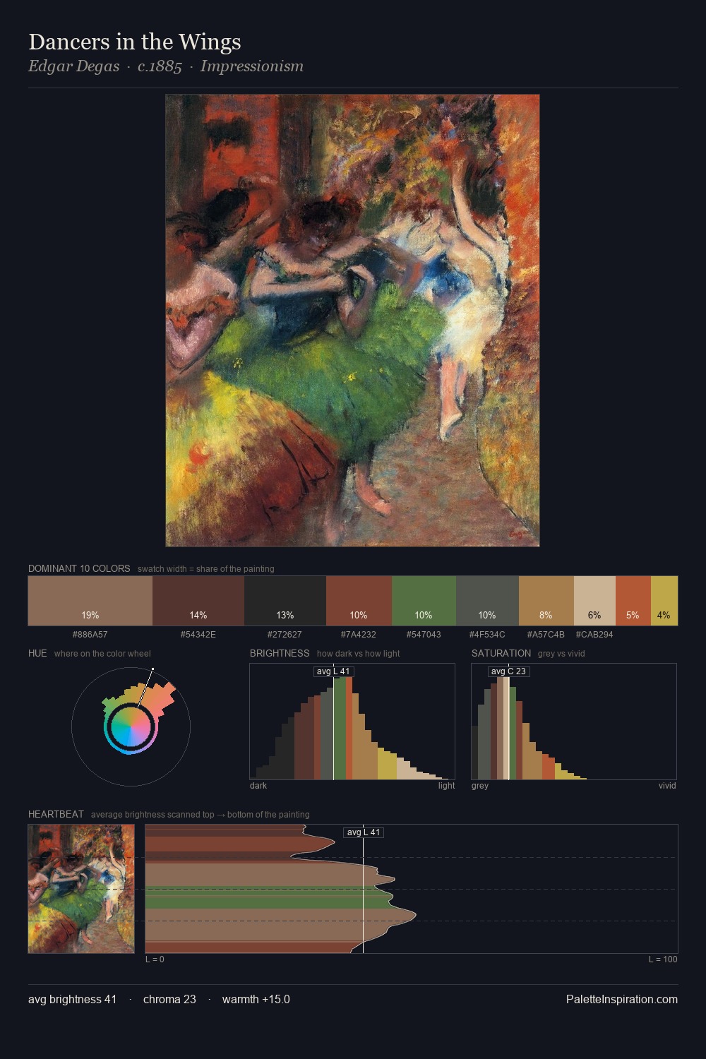
Kees van Dongen is high-key - luminous, open, and weighted toward light. Kees van Dongen keeps warm and cool in parity, a balance that lends the work a perceptual shimmer. Mid-saturation across the board: the palette has colour character without chromatic excess. #9D7A2F is not a small accent - at 4.6% it qualifies as a major presence and gives the palette its chromatic identity. At 59 units of value range, the palette has the tonal breadth to sustain complex spatial readings. The combination of mid-to-high key, balanced temperature, and elevated chroma is characteristic of Impressionist observation: light broken into its component hues. Kees van Dongen's palette 2 carries its own internal logic while remaining in conversation with the artist's broader colour intelligence.
Example use cases
- publishing
- corporate identity
- consumer apps
- hospitality
- design agencies
I Love This!
Copy, export, or download for your project