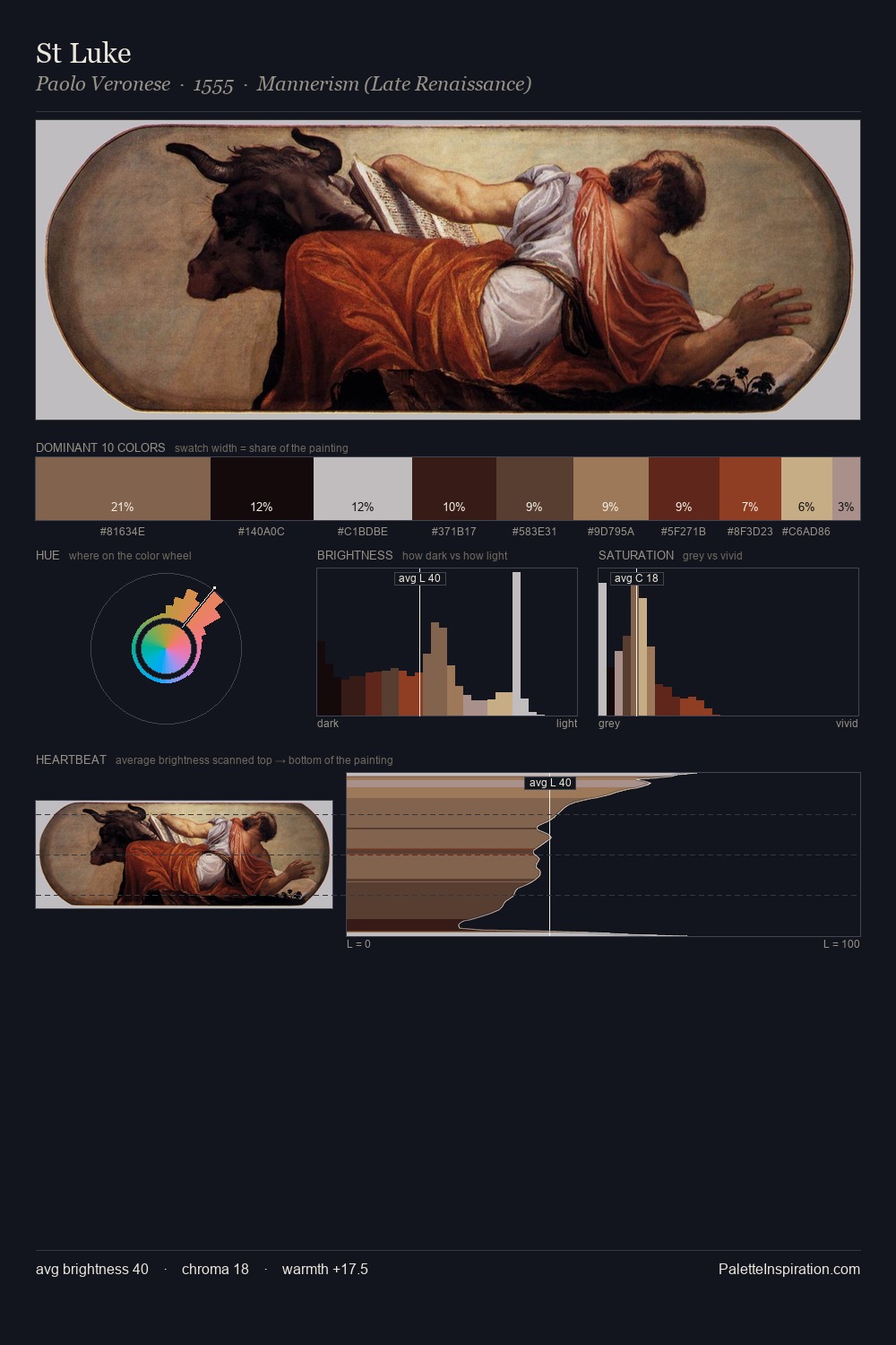
Juriaen van Streeck Palette 4

Palette Analysis
Juriaen van Streeck is built on dark foundations, with values clustered toward shadow. Temperature reads distinctly warm: the reds and earth tones from Juriaen van Streeck carry the compositional weight. Saturation is deliberately withheld - the beauty here lies in the near-monochromatic gradations rather than colour difference. #3A1918 functions as the palette's exclamation mark: highest chroma, lowest percentage (8.2%). 65 units of value range underpin the palette's structural clarity: the eye always knows where light falls. Together these qualities place Juriaen van Streeck firmly in the tonal tradition - concerned with mood and atmosphere rather than chromatic display. Juriaen van Streeck's palette 4 carries its own internal logic while remaining in conversation with the artist's broader colour intelligence.
Example use cases
- theater design
- jewelry brands
- tobacco-adjacent retail
- event branding
- film & entertainment
I Love This!
Copy, export, or download for your project