Juriaen van Streeck Palette 3

Palette Analysis
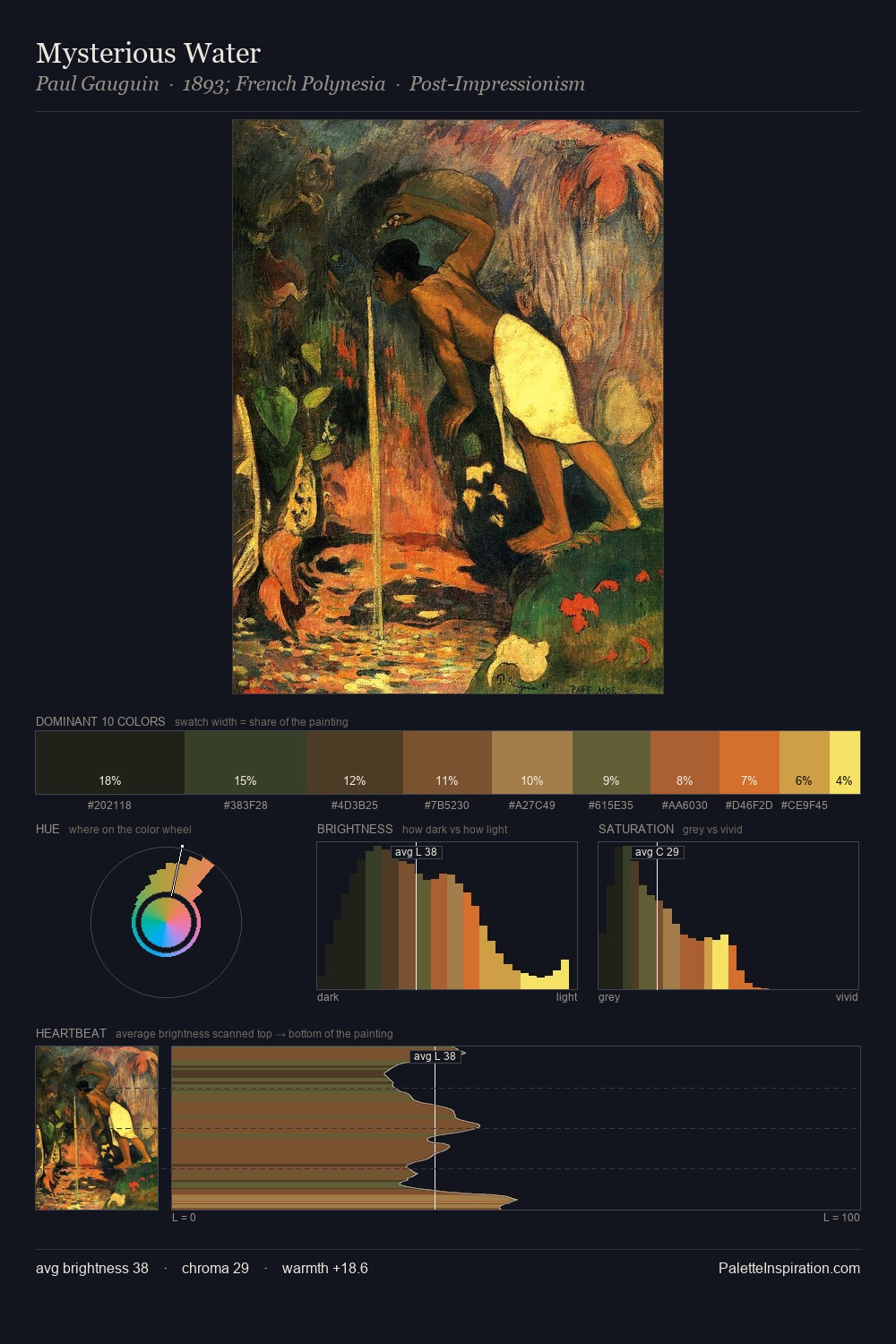
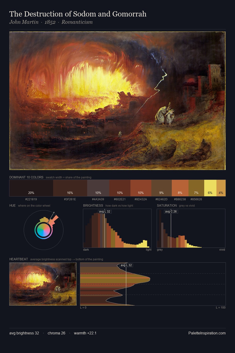
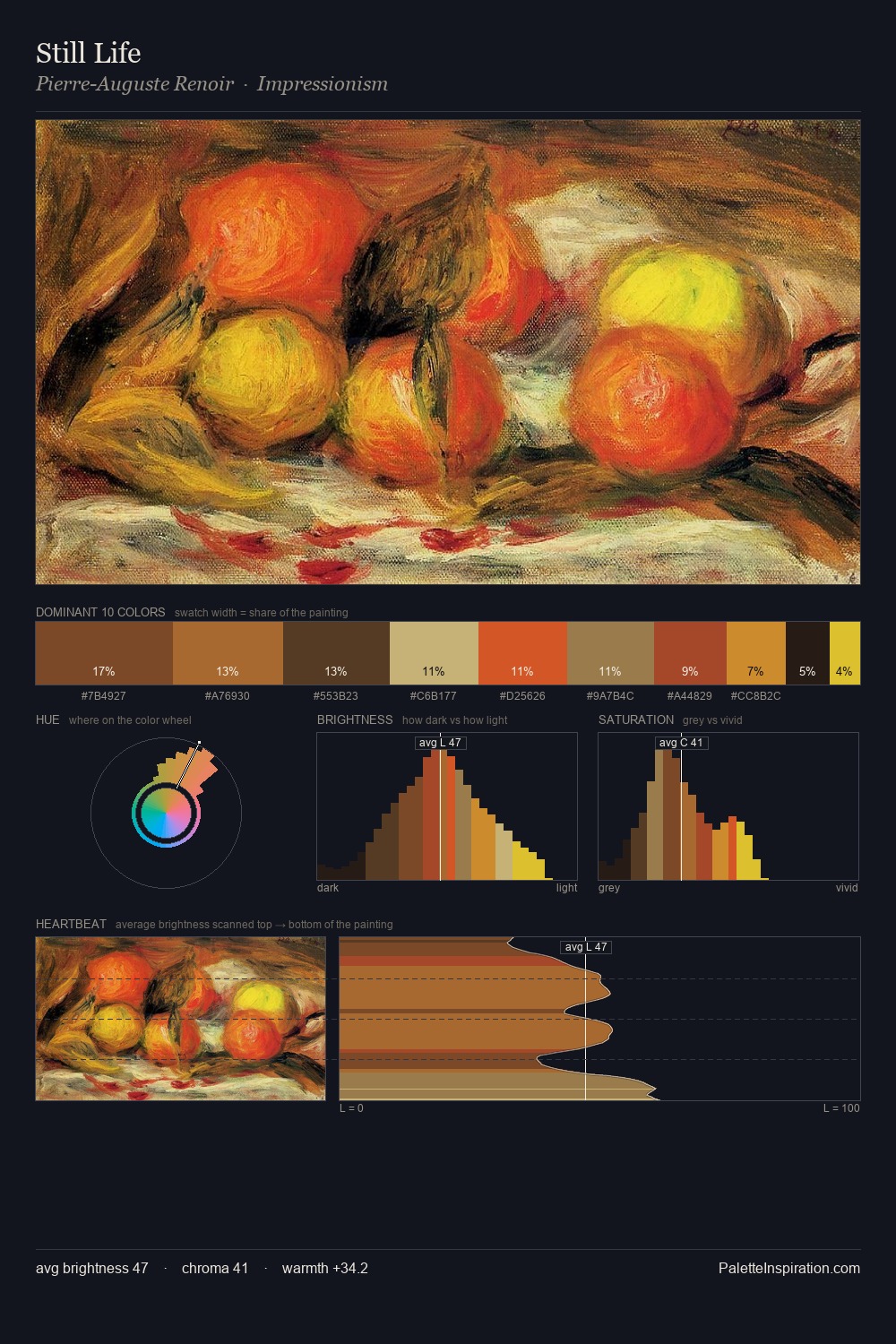
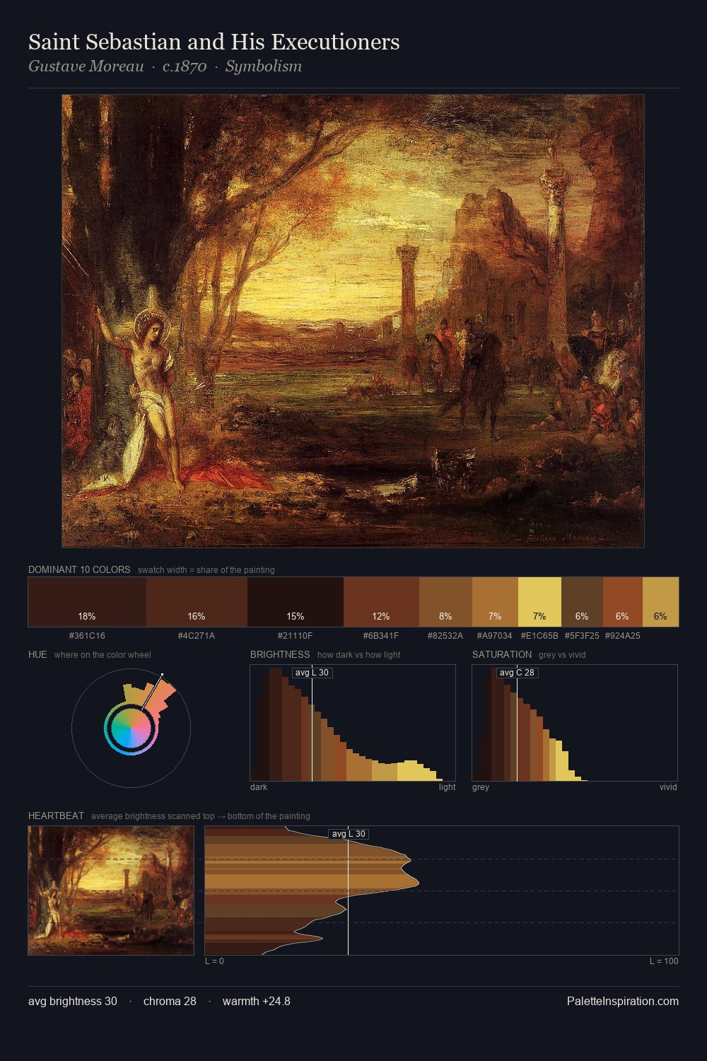
Darkness anchors Juriaen van Streeck; light is rationed, creating dramatic contrast rather than open air. Yellow, ochre, sienna: warm hues that Juriaen van Streeck deploys as the palette's primary energy. The absence of saturated colour is itself an expressive choice: this is a palette of restraint and atmosphere. A single dominant - #19130E at 30.8% - sets the character of the whole composition. The most saturated colour, #D39D42, is reserved to 1.9% of the surface, where it acts as a focal punctuation. From deepest dark to palest light, the palette traverses 71 units of the value scale - a span that creates natural depth. Together these qualities place Juriaen van Streeck firmly in the tonal tradition - concerned with mood and atmosphere rather than chromatic display. This is palette 3 of Juriaen van Streeck's sequence - a single chapter in a chromatic story told across many works.
Example use cases
- theater design
- jewelry brands
- tobacco-adjacent retail
- event branding
- film & entertainment
I Love This!
Copy, export, or download for your project