Juan van der Hamen Palette 7

Palette Analysis
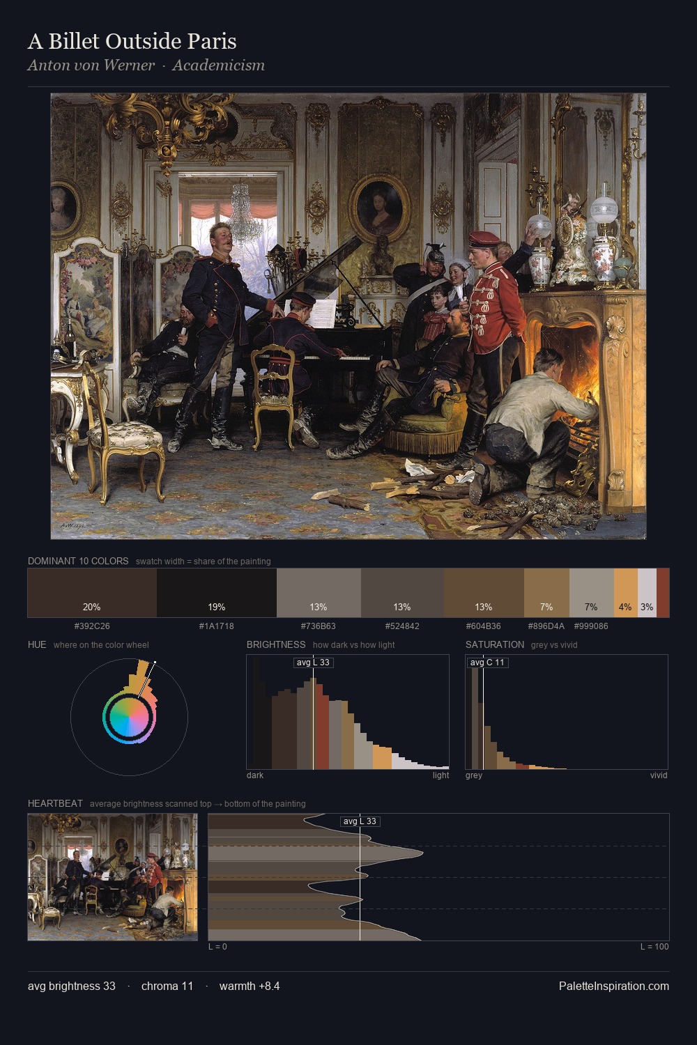
Juan van der Hamen distributes its values across the middle register, creating harmony without high contrast. Temperature is cool-dominant, with blue and green families claiming the largest areas. Every colour is desaturated; the palette proceeds through near-neutrals and gently-coloured greys. Juan van der Hamen gives 38.9% of the composition to a single #1A1916 - a decisive chromatic anchor. #B99241 delivers the chromatic peak at only 2.4% - a small shot of colour with outsized visual impact. 63 units of value range underpin the palette's structural clarity: the eye always knows where light falls. The palette has the character of outdoor light: cool, mid-bright, with colour rendered faithfully rather than expressively. Palette 7 sits within the larger chromatic argument that Juan van der Hamen's complete body of work advances.
Example use cases
- theater design
- jewelry brands
- tobacco-adjacent retail
- event branding
- film & entertainment
I Love This!
Copy, export, or download for your project