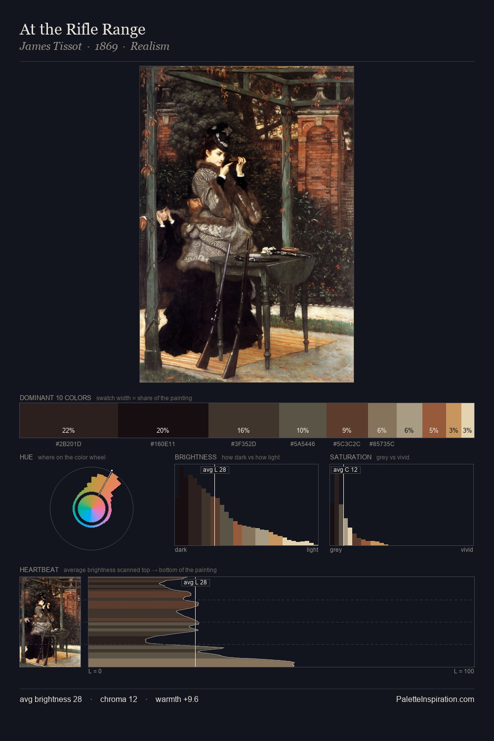
Juan van der Hamen Palette 10
Nocturnal Bister
Nocturnal Night-register palette - very low values, the world after dark.
Bister Dark warm brown - a traditional ink and wash pigment made from wood soot.

Palette Analysis
The value structure of Juan van der Hamen is mid-key: quiet, controlled, and cohesive. Temperature is cool-dominant, with blue and green families claiming the largest areas. All colours lean toward grey, building depth through value rather than colour punch. The highest-chroma note - #A94B2C - appears at just 3.0%, deployed as a precision accent against the quieter ground. A value spread of 56 units gives the palette both depth and air - shadows are genuinely dark, lights genuinely light. High luminosity and cool temperature suggest the plein-air condition: unfiltered daylight and open sky. Palette 10 sits within the larger chromatic argument that Juan van der Hamen's complete body of work advances.
Example use cases
- theater design
- jewelry brands
- tobacco-adjacent retail
- event branding
- film & entertainment
I Love This!
Use This Palette
Copy, export, or download for your project
Copy, export, or download for your project
Copy:
Download:
Share: