Juan van der Hamen Palette 3

Palette Analysis
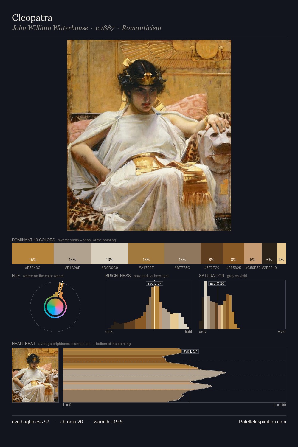
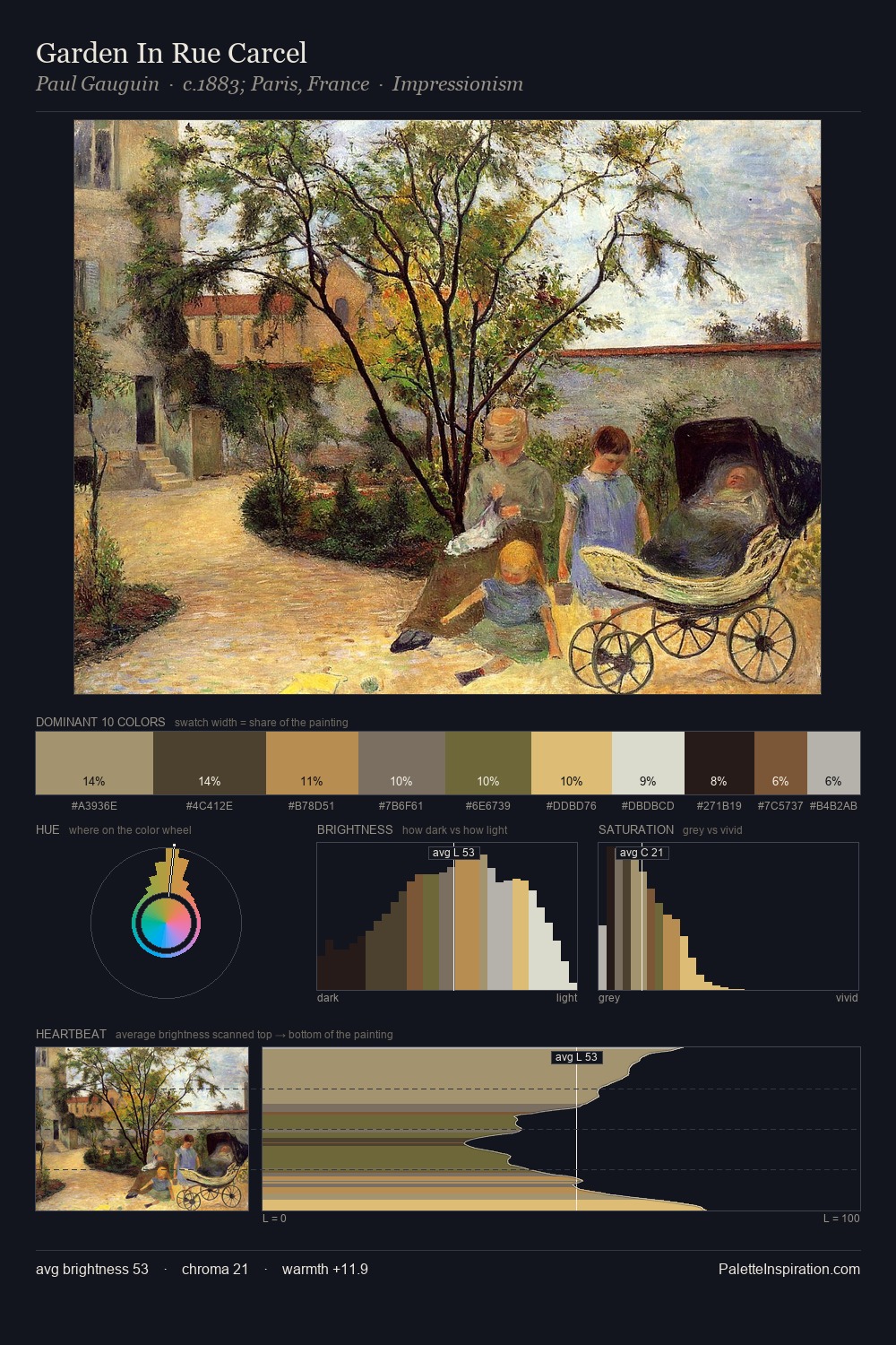
Juan van der Hamen distributes its values across the middle register, creating harmony without high contrast. Temperature is cool-dominant, with blue and green families claiming the largest areas. Chroma is kept low across all colours, producing the soft, enveloping quality that characterises tonal painting. The dominant colour, #1B1B17, takes 28.0% of the total area, establishing the overall mood before any other hue is introduced. #814F27 functions as the palette's exclamation mark: highest chroma, lowest percentage (6.5%). 65 units of value range underpin the palette's structural clarity: the eye always knows where light falls. High luminosity and cool temperature suggest the plein-air condition: unfiltered daylight and open sky. This is palette 3 of Juan van der Hamen's sequence - a single chapter in a chromatic story told across many works.
Example use cases
- theater design
- jewelry brands
- tobacco-adjacent retail
- event branding
- film & entertainment
I Love This!
Copy, export, or download for your project